
Arumya: Medtech App
When you start taking various vitamins or medications, sometimes it is difficult to do on time and not miss it. Sometimes it is just necessary to follow the right dosage and the exact time of intake. It is especially difficult to remember all the information for the elderly people, people with diseases of the nervous system and just after a long break in treatment. Wouldn’t it be great if someone monitored such important processes and reminded us when it was time for the medication intake? We will discuss such an assistant in our article today!
About the product
The Arumya application allows you to create a schedule for medication intake and remind the user of the intake time through notifications. Our main task was to make the design attractive and as convenient as possible for perception, as well as to improve the functionality.
Work process
Since the client already had design experience, we didn’t have to build the workflow from scratch: our main task was to analyze the existing product, identify its weaknesses, inconveniences and scenario dead ends, and it was also necessary to refresh the visual side of the application and adapt it to Arabic.
UX Stage
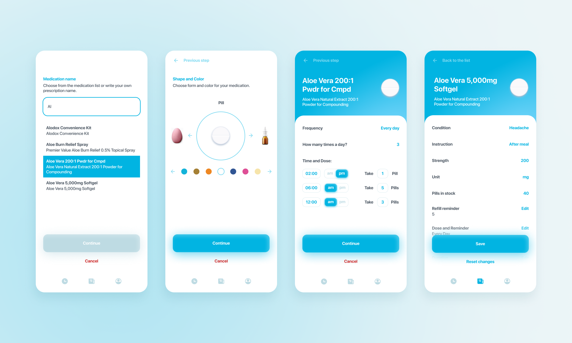
We’ve added a couple of additional screens to the medication creation process so that you can separately select the frequency, duration of intake, and a reminder to refill your medication.
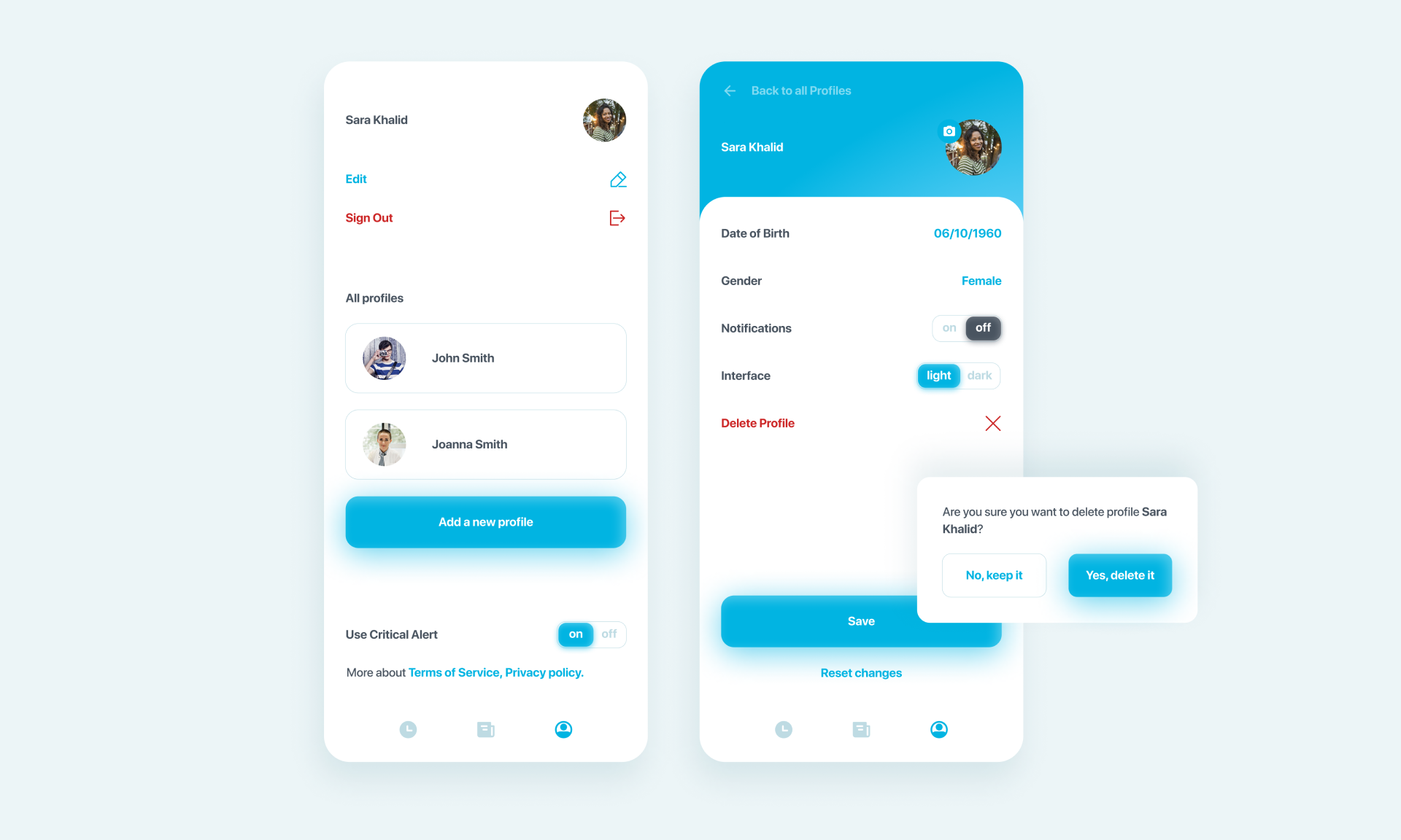
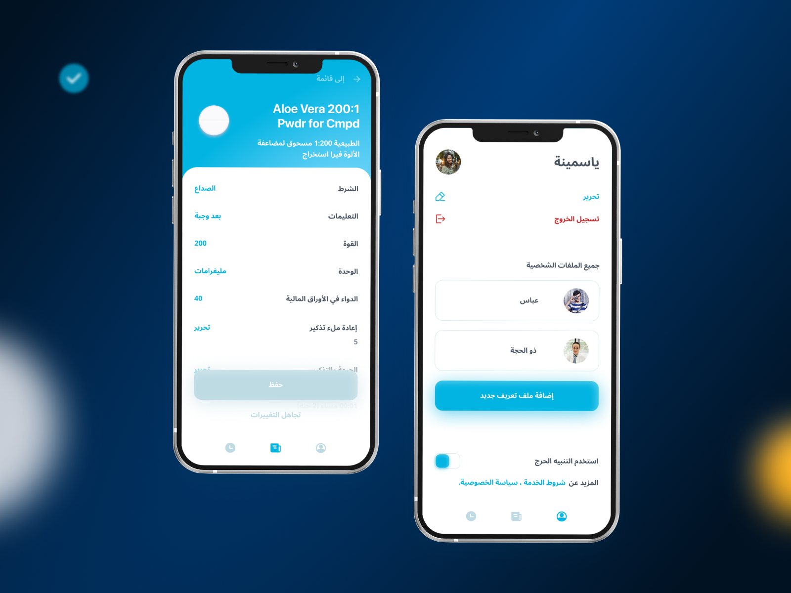
Since several people can use the account at the same time (family access), the ability to turn off reminders for individual profiles and turn on important notifications for everyone has been added.
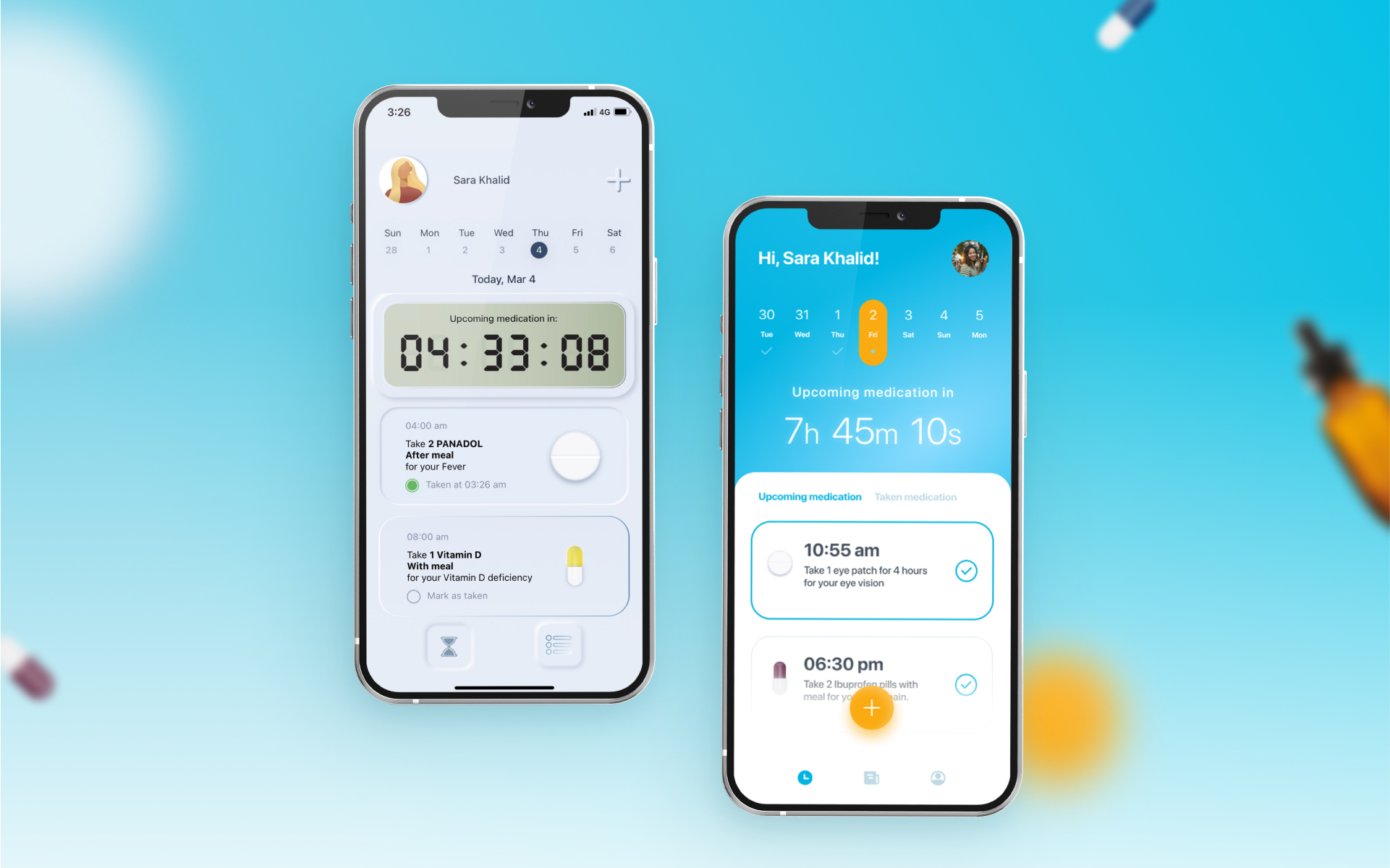
The main page and the list of medicines have undergone changes. Now a checkmark under the number and day of the week shows on which of the previous days the medication plan was completed in full, and on which day the medication can be cancelled.
In the list of medications taken, the user can monitor the compliance status of the plan: next to the name of the medication, the time remaining until the end of the treatment is displayed as a percentage.
UI Stage
A significant part of the application’s users are elderly people who do not have good eyesight and are not included in the category of advanced users. Therefore, it was decided to abandon the neomorphism used in the original design, as this style does not offer sufficient contrast.
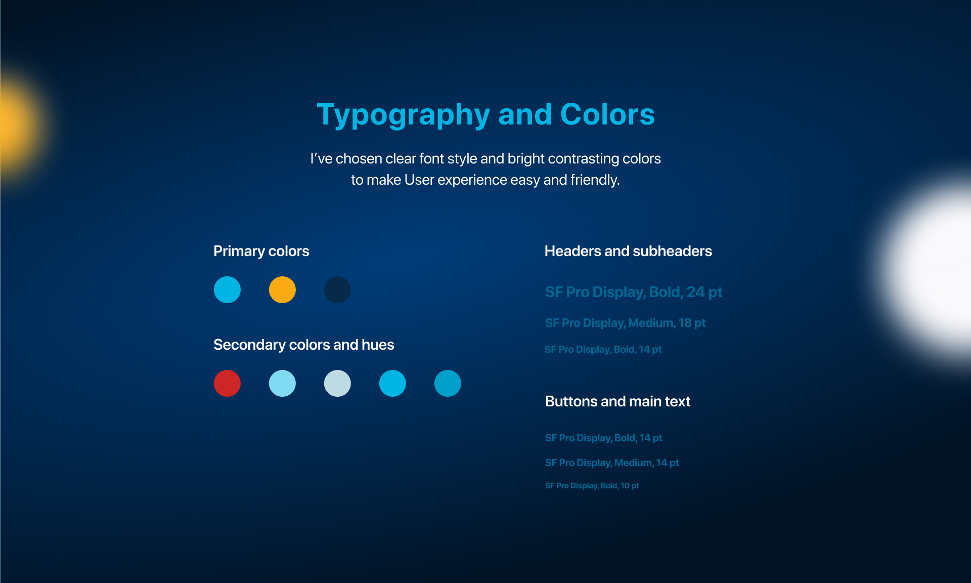
White and bright blue were chosen as the main colours, which are the most familiar palette in the field of medicine. And yellow as an accent, creating a warm and friendly atmosphere.
The next step was to adapt the interface to Arabic. This was probably the most time-consuming task, since it required a rethinking of the interface. In the process of creating the Arabic version, it was necessary not only to mirror the interface, but also take into account the length of phrases and sentences, change the typeface and font size, and somewhere completely abandon the text in favour of a conventional switch.
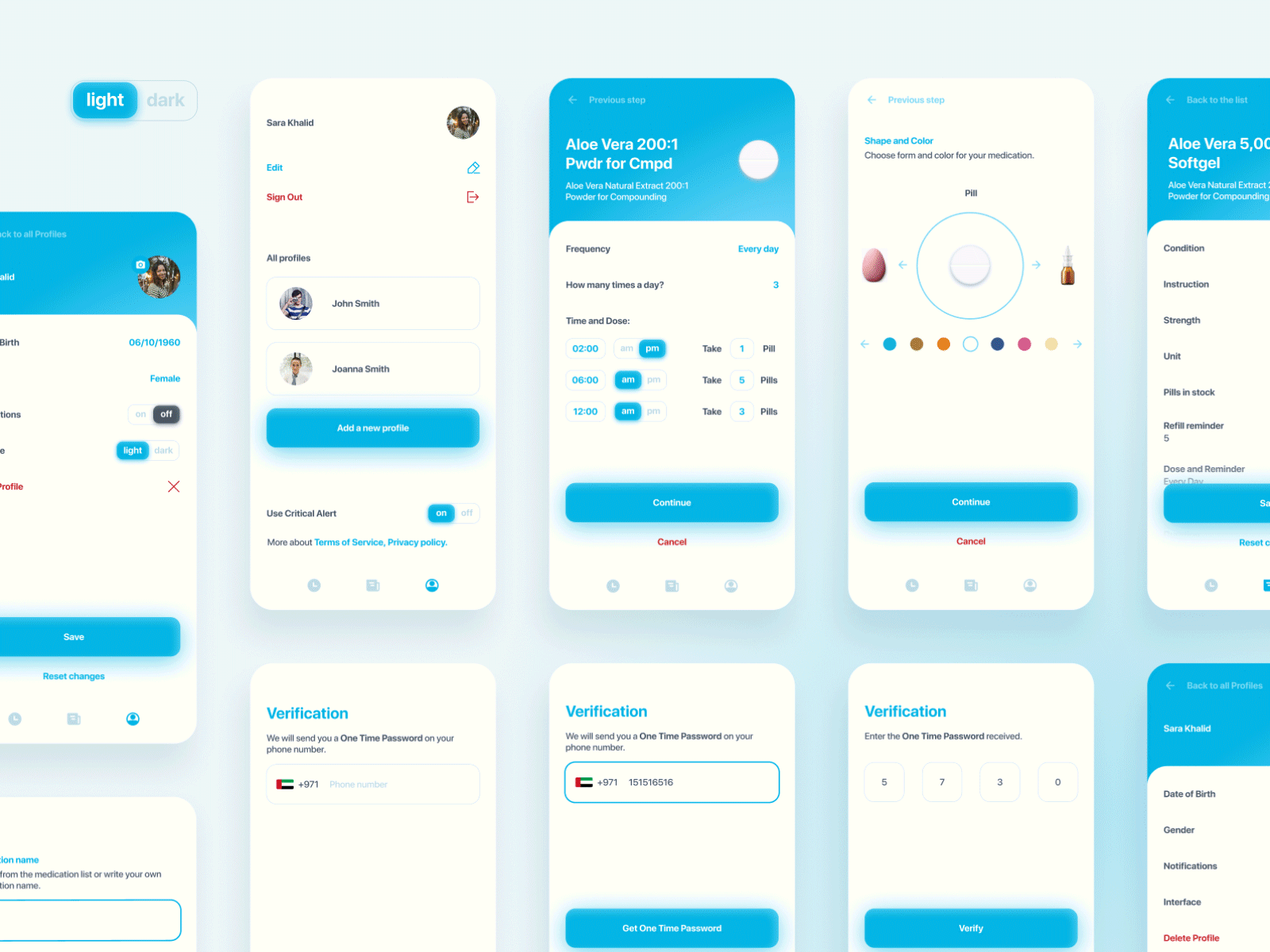
A dark theme of the application has also been prepared, which can be independently turned on in the settings of a separate profile.
Conclusion
There are many reminder and scheduling apps out there, but well thought-out tools for specific purposes are rare. When it comes to health, a user-friendly interface is especially important. Working with the Arabic version allowed me to take a look at the creation of interfaces literally “from the other side”, which undoubtedly brought a useful experience.
Август 24, 2022