
My Health Buddy App System
Remote work, distance learning, Zoom meetings - the pandemic has changed our lives and leisure. Many products are moving online, and the world of sports is no exception. People have mastered home workouts, and began to pay more attention to healthy eating and a healthy lifestyle in general. However, our knowledge is not always enough to organize everything on your own, and then help from experts is needed. But what if there was a product that brought these experts and users together? A product with which certified trainers would monitor the quality of online training, make an individual diet taking into account all indicators, answer any questions and give advice? A dream? Actually, no! This is the My Health Buddy app system, which we designed from scratch.
About the product
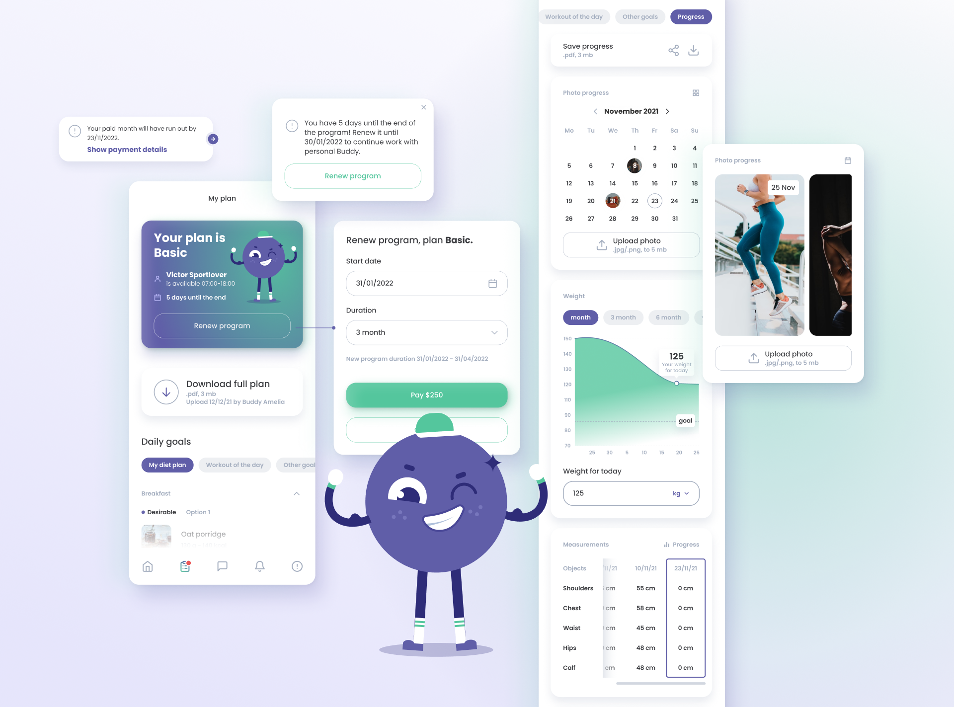
My Health Buddy—a product that teams trainers with their clients up. A trainer can create nutrition and training plans, as well as track all the progress. The service includes a system of both mobile and web applications, including a whole team of specialists and a huge number of users.
Problem
The main problem was the large number of roles and their interaction with each other. It was necessary to think not only about the structure of each application locally, but also how this huge ecosystem would work effectively, solving everyone's issues.
It was also quite difficult to think of ways to monetize the application for customers. How to gently and naturally push the user to buy a subscription and use all the advantages of the service?
Solution
Our goal, as well as the solution, was to create an intuitive interface for application aimed at the needs of each of the participants. To implement this plan, our team built the entire design process from scratch, where step by step we solved problems of various scales. Also, we applied our knowledge in the fields of user behavior’s psychology, heuristics and, of course, visual design.
Process
We had only a very basic list of requirements before the start of work. Perhaps the most difficult stage was the beginning itself, because there was a lot to analyze and piece together the overall functionality. Gradually, we increased the volume of practical work and most of the time we worked on the principle of “idea-call-edits". But still, each of the stages should be covered in a little more detail.
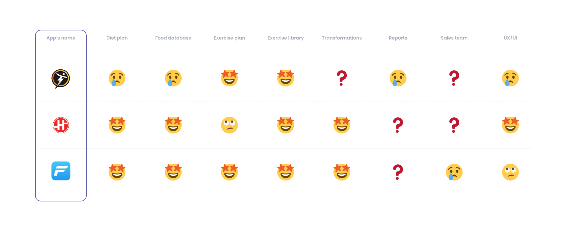
1. Competitor analysis
To understand what features we need and for what types of users, it was necessary to identify the strengths and weaknesses of similar applications. The main difficulty was that the product has no analogues, its idea is collective, and the goal is to unite all those involved in the world of diets and training: trainers who make schedules and plans for training and diets; wards who communicate with the trainer and follow his instructions, and sometimes compose something themselves; managers who monitor the quality work of trainers; administrators managing all; and SMM managers who create beautiful content and attract new users.
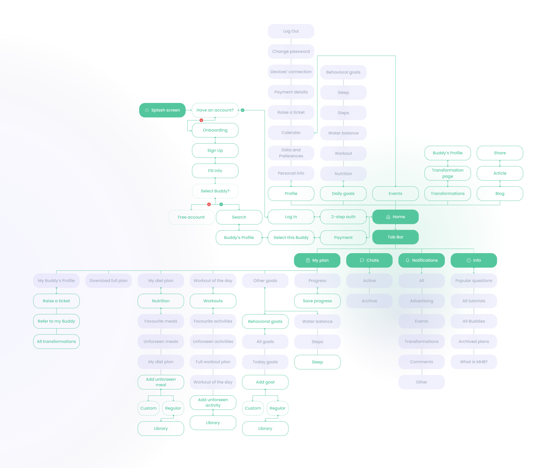
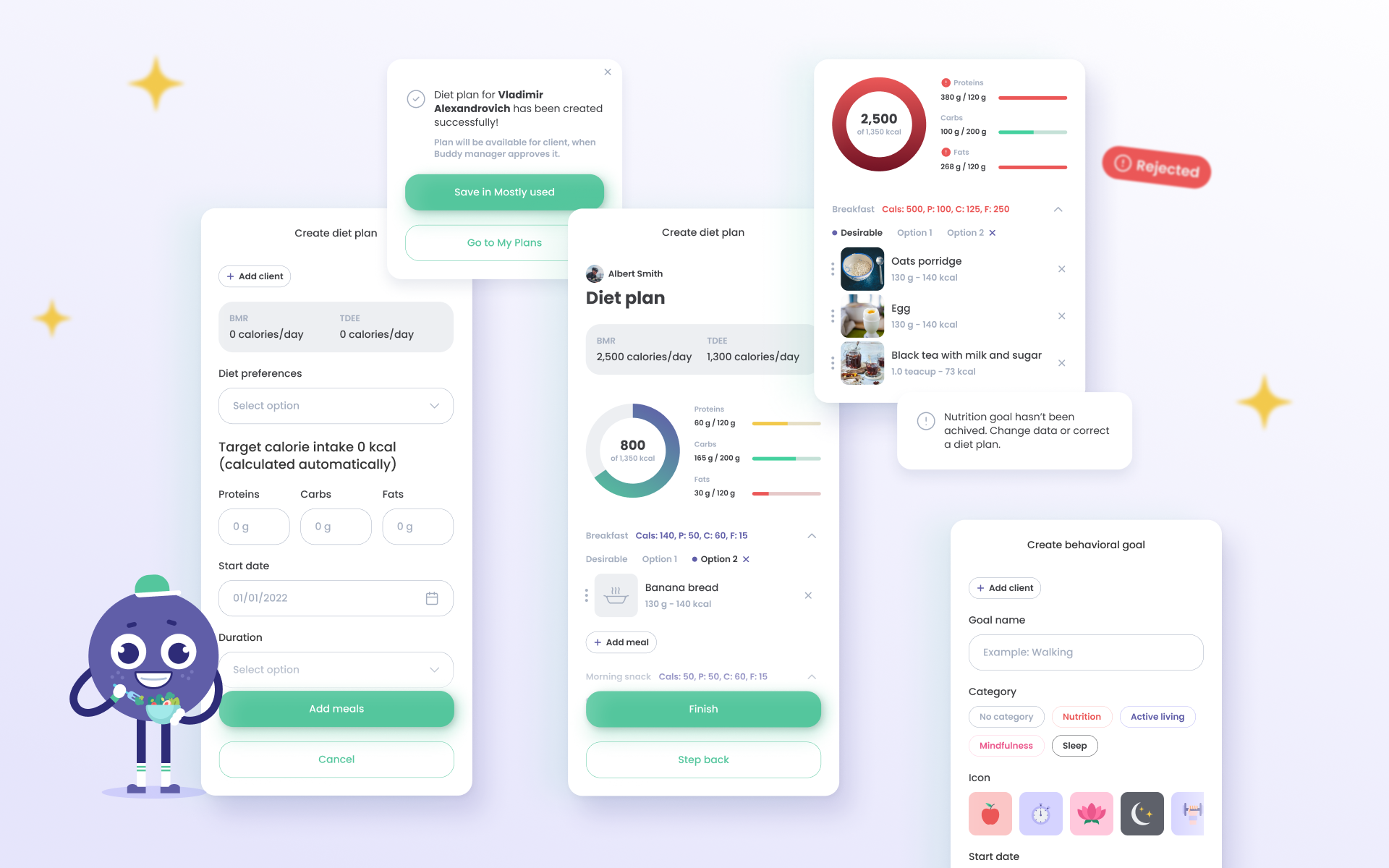
2. Defining the structure
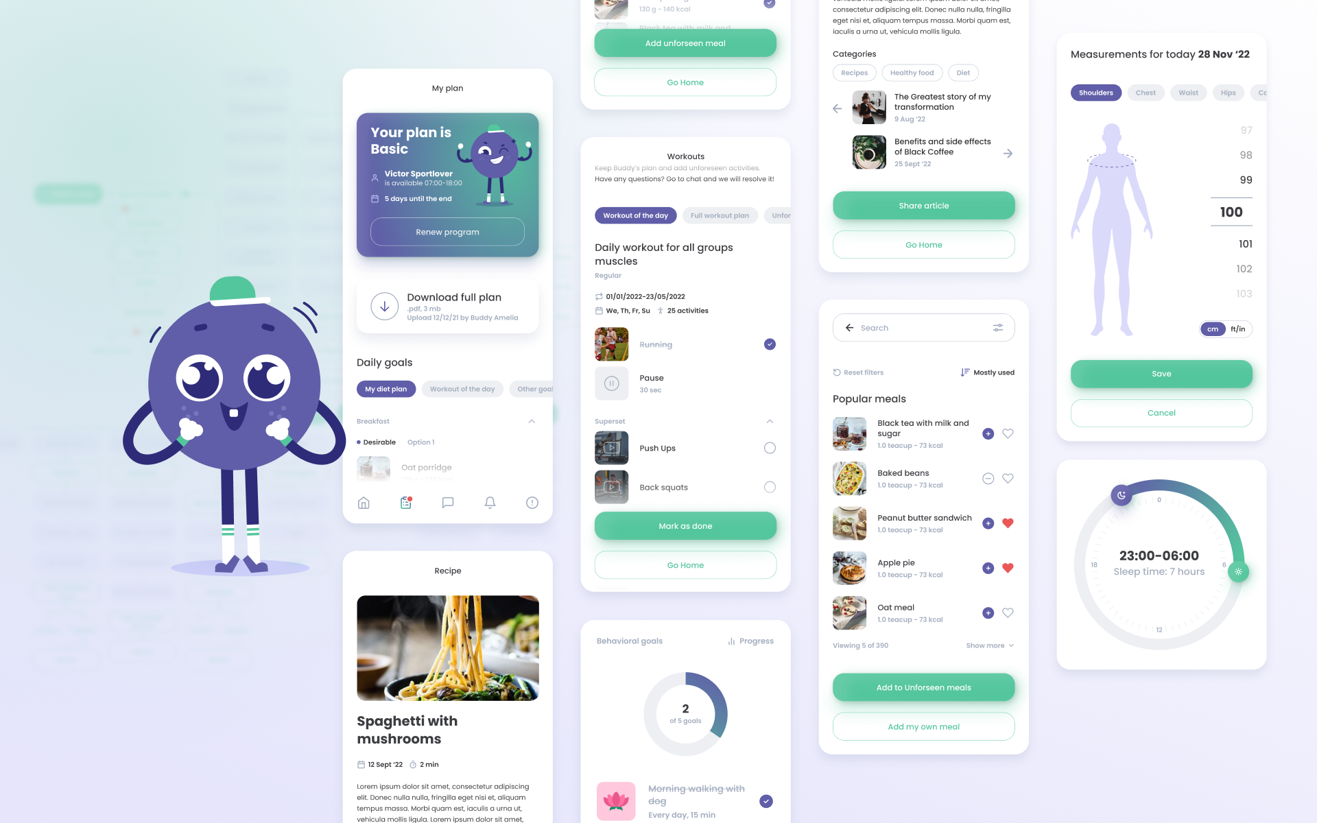
The main source of MHB monetization is plans. The user buys a plan for a certain period, and then a trainer is assigned to him. The trainer creates an individual menu for each day, a training plan, edits and creates behavioral goals. In addition, the trainer constantly interacts with the client through a chat in the application, thereby providing him with constant support.
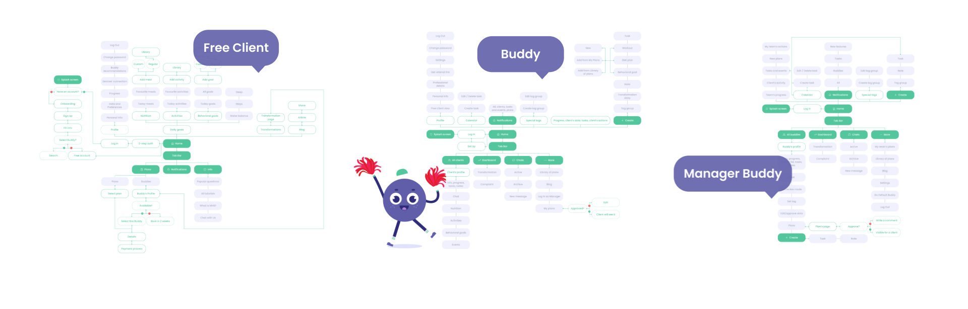
To focus trainer’s attention completely on the client and make the workflow productive, it was decided to create some additional roles.
Working on such a complex system of roles required constant brainstorming with clients and, as a result, constant search for the best solutions. The user flow was the most difficult, but at the same time the most productive stage.
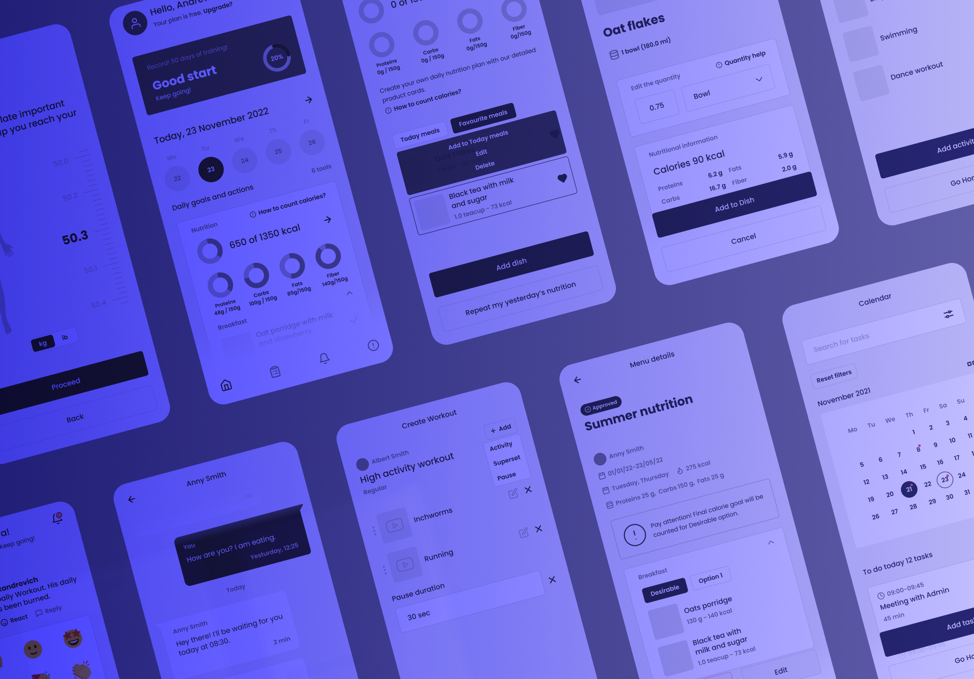
3. Wireframing
At this stage, we were looking for the most convenient features and must-have elements for each page of application. We also paid a lot of attention to statistical data.
Our goal was to give the user as much information as possible, but at the same time, not to overload him.
4. Visual design
Our goal here was to determine the color scheme, as well as the fonts and general stylistics.
In order for the user to easily interact with the application, we decided to use a minimalistic and modern design, rounded edges and soft shadows gave a kind of friendliness to the product.
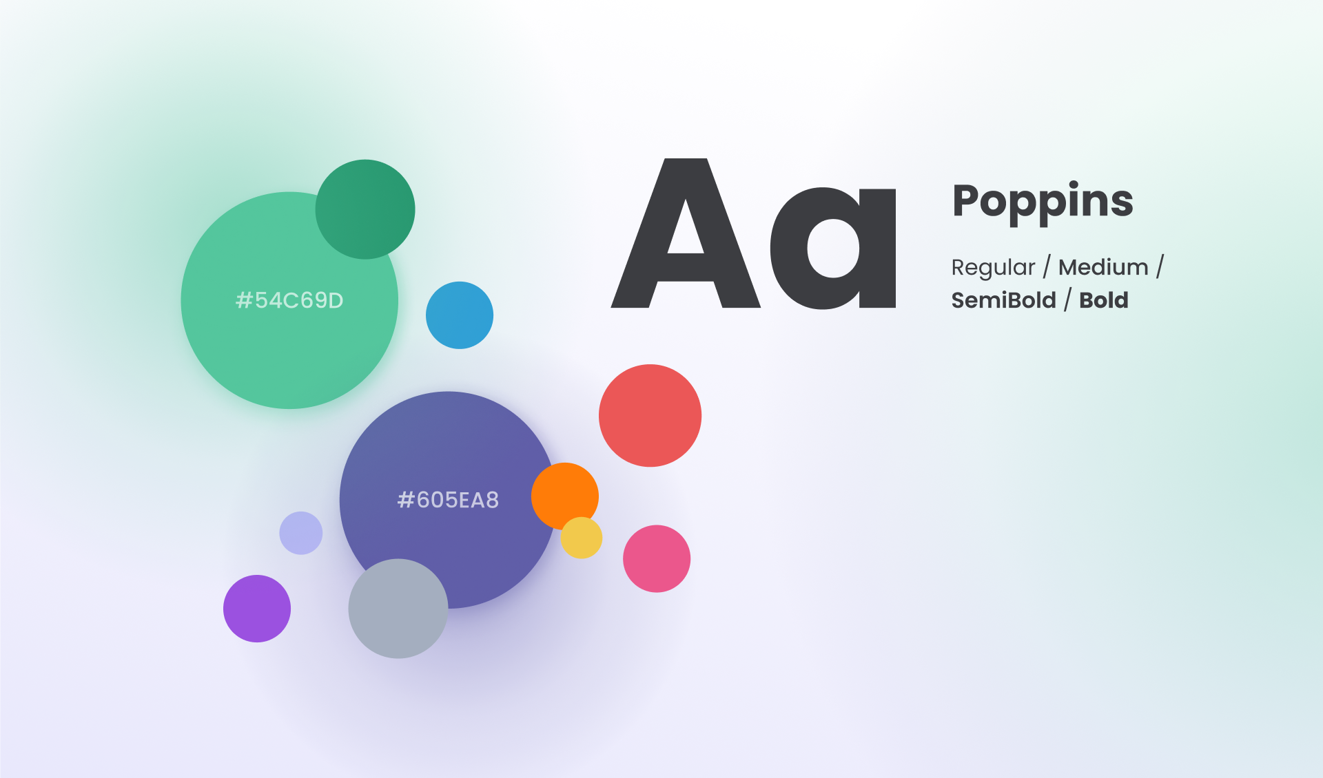
Poppins is a well-balanced sans-serif font that is great for our purpose. It has a large selection within the family, which allows it to be used quite flexibly. We also used gender-neutral green and purple colors from the MHB logo as the main palette.
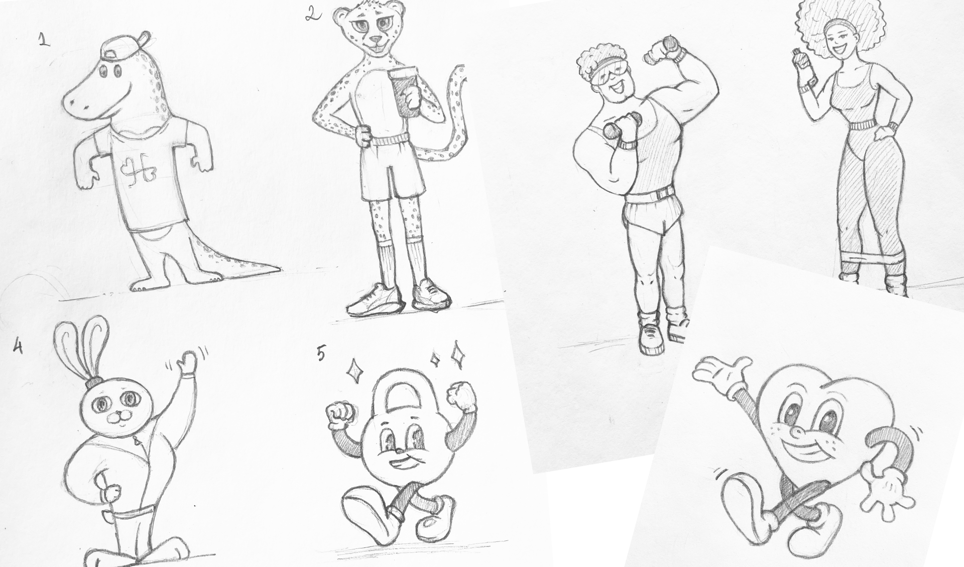
5. Mascot design
The mascot was a mandatory requirement in the brief—thus, the customers wanted to draw more attention to the product through social networks, because a recognizable and vivid image is a powerful marketing tool.
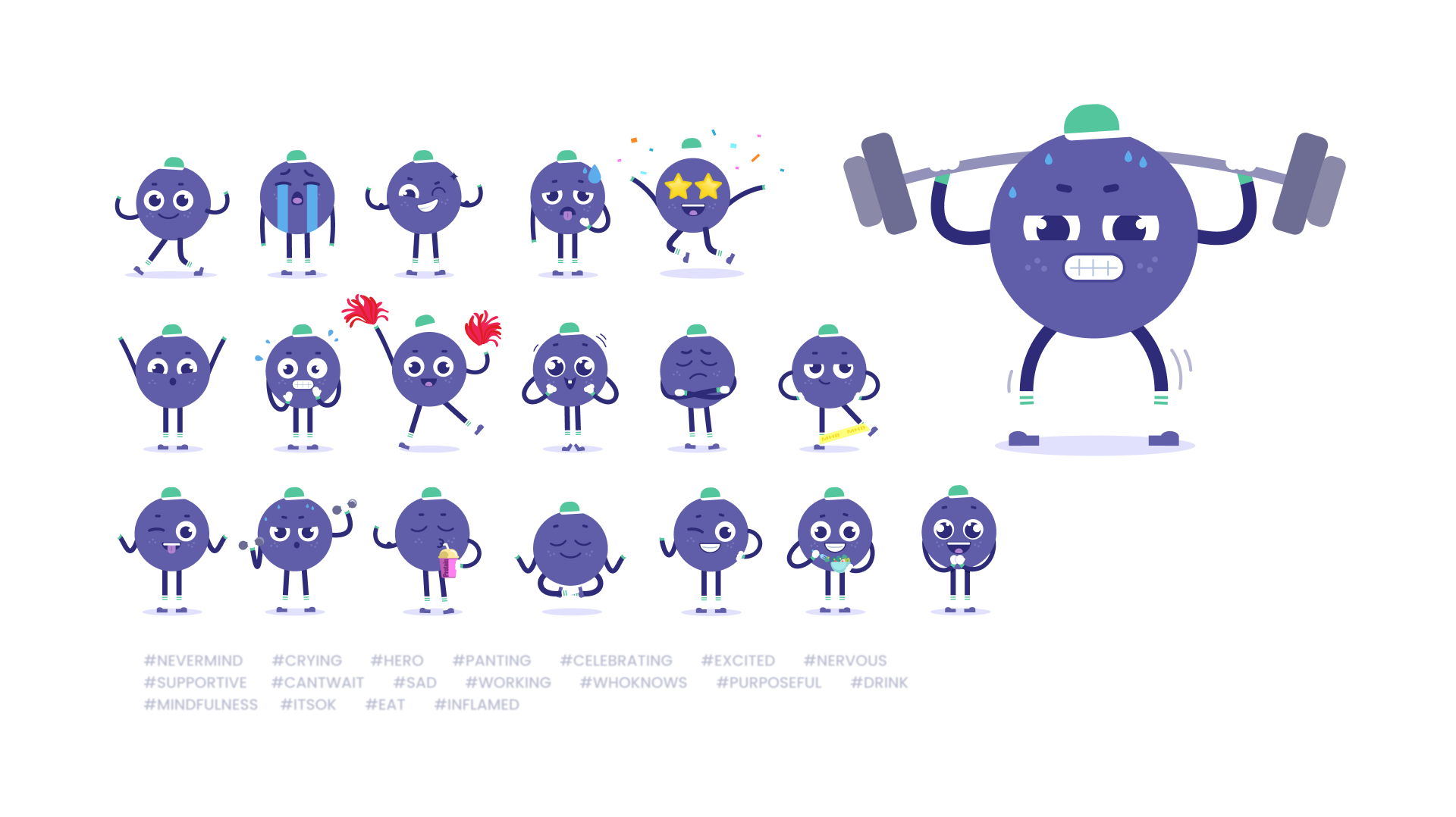
We made a lot of sketches in search of the “Miss Right” idea, basically, in the animalistic direction - it had to be a certain animal with certain qualities of character. However, this idea was rejected; then the customers came to the rescue and offered to use something from sports equipment—so the ball appeared (unfortunately, it does not have a name yet).
Conclusion
We have mastered another industry with all the nuances and its pitfalls, talked with trainers and managers, learned how to calculate calories and even make up our diets.:) We are always open to new challenges, no matter how difficult they may be. Find the new cases in our next articles!
📭 We are open for new projects welcome@fusion-tech.pro
Explore our portfolio on Dribbble and Behance
Июнь 1, 2022