
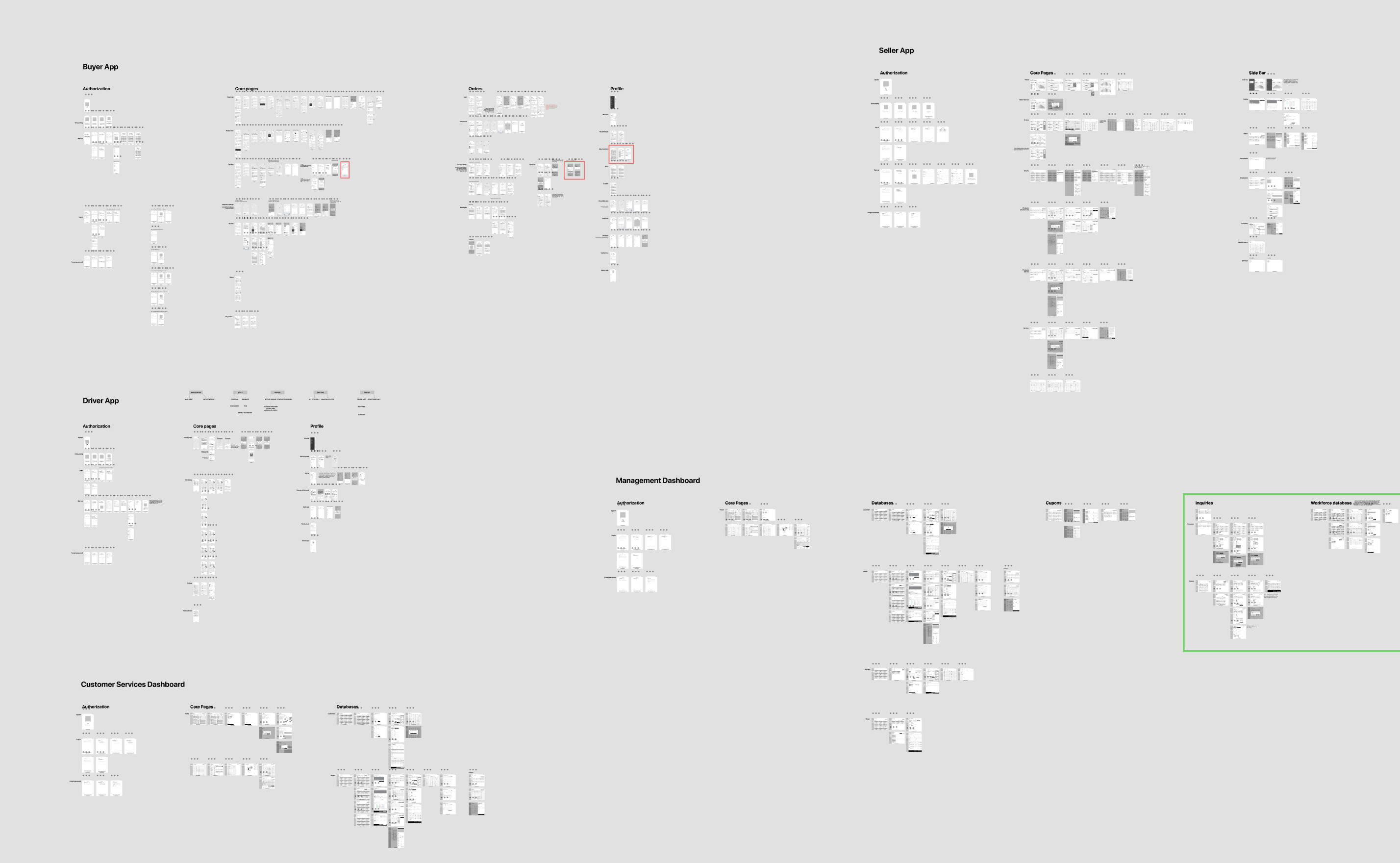
Silal App Ecosystem
Introduction
The e-commerce market is developing by leaps and bounds and is acquiring new features for the convenience of users. The trend towards rapid technological progress has already taken place over the past few years, but the special circumstances caused by the pandemic have further influenced this process. The new life conditions, not so mobile and social, have caused the need for safer ways of selling and have prepared the most fertile ground for the development of a commercial market, primarily for the delivery of food and other small non-food items. Often, this complex multi-sided process requires the creation of an application ecosystem. In this article, we will talk about how we worked on the Silal project, what difficulties we encountered and how we overcame them. Let’s go!
About the project
Silal is an ecosystem that includes five applications: for users, couriers, sellers, as well as for internal company employees — managers and technical support. The MVP of the project included the requirement to have two versions for each of the presented roles: a mobile application and an adaptive one for a tablet.
Challenge
The main difficulty was the multilateral structure of the project — it was necessary to take into account all the points of contact for each of the roles and build bridges that would allow them to interact correctly with each other. Buyer-seller, buyer-courier, seller-courier — and this is only 60% of the total number of user paths. But we immediately understood that we had a long work ahead with a huge number of tasks and challenges. We also took into account the fact that the target audience of end users is concentrated in Israel and the UAE, where the color semantics are somewhat different from UI design standards. With such a slightly exciting, but cheerful mood, we began to dive into the study of documentation and building a workflow.
Start of work
After reviewing the TOR, it was decided to create a user flow for each application. After agreeing on all user paths with the customer, we faced the question — first make wireframes for all applications and then the whole design, or create each application in turn (wireframes + design). We chose the first option, and here’s why:
- multi-level logic requires a detailed approach, there will be no need to constantly switch between ui and ux from application to application — it was important to first think over a convenient, and only then a beautiful interface;
- it is easier to navigate the subsequent logical changes from the client side, since we knew what additional changes should be made in all applications when introducing a new feature.
The wireframing process took us about three months. The customer was open to new suggestions and ideas, communication went smoothly, which is very important when working with such large projects.
User types
As we mentioned earlier, the app ecosystem has 5 roles:
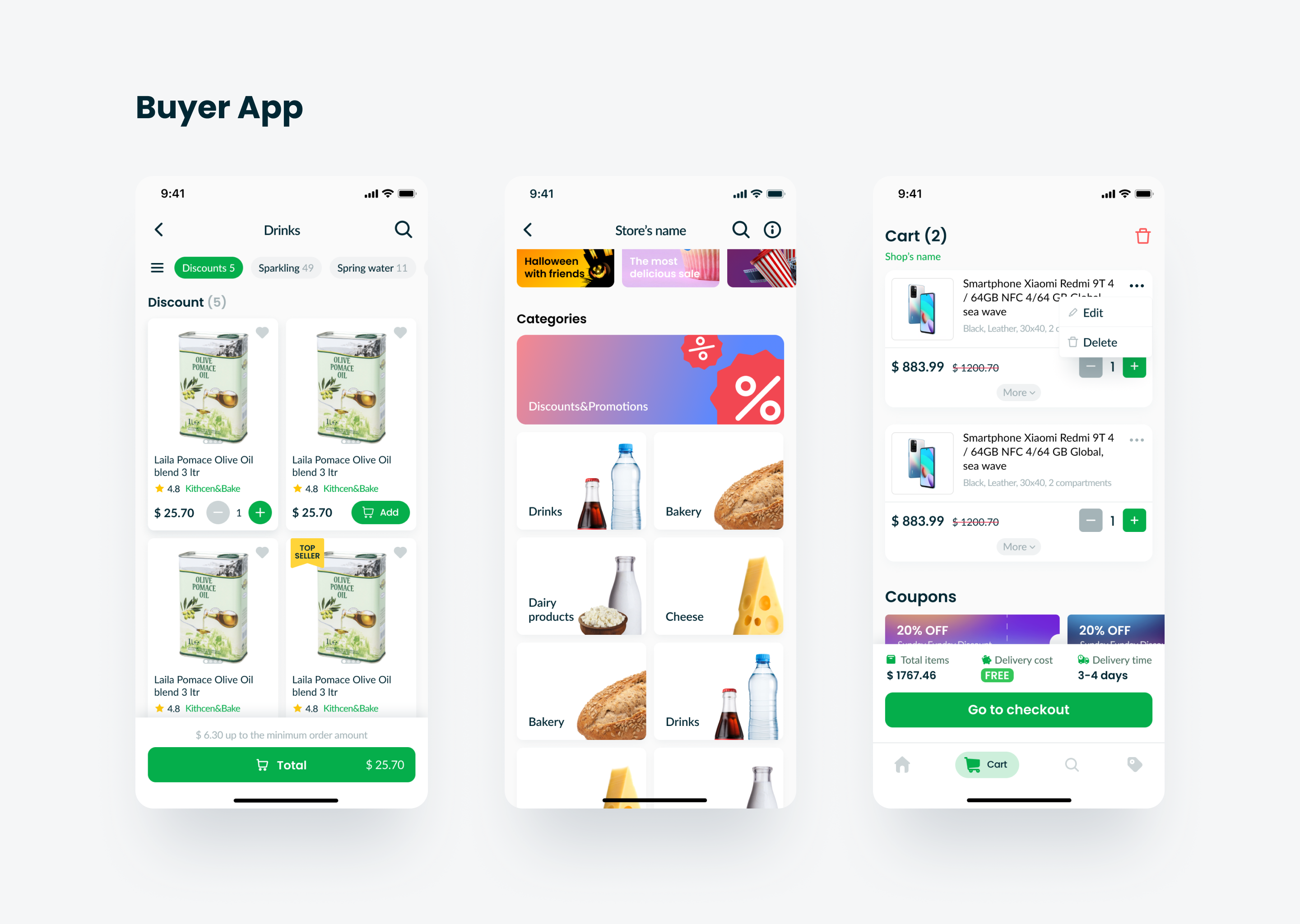
- Buyer (end user)
The structure of the application is built on the principle of a classic marketplace. The user can order food from restaurants, as well as food and non-food items from stores, arrange delivery, track their order on a map or using statuses, add any items to Favorites and distribute them into thematic folders, and use coupons.
2. Courier
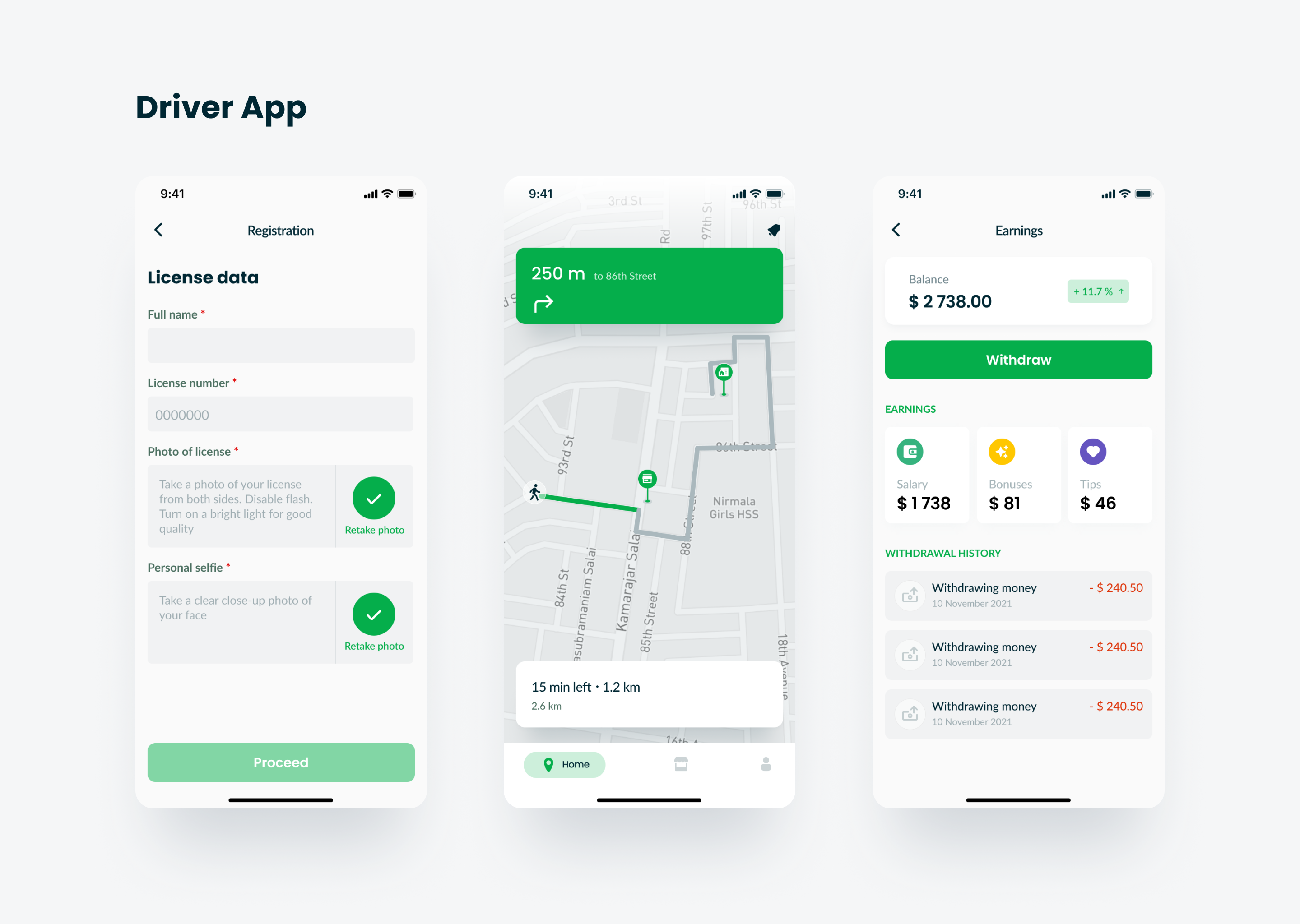
In order to become a courier, at the registration stage, you need to fill out a special form and send it for moderation. After approval for the courier, the functions of receiving an order, navigating the map are available. At each point in the route (from the seller to the buyer), you need to scan a QR code to track the status of the order. It is also possible to see a section with the history of orders that the courier worked with and link a card for withdrawing funds from the application.
3. Salesman
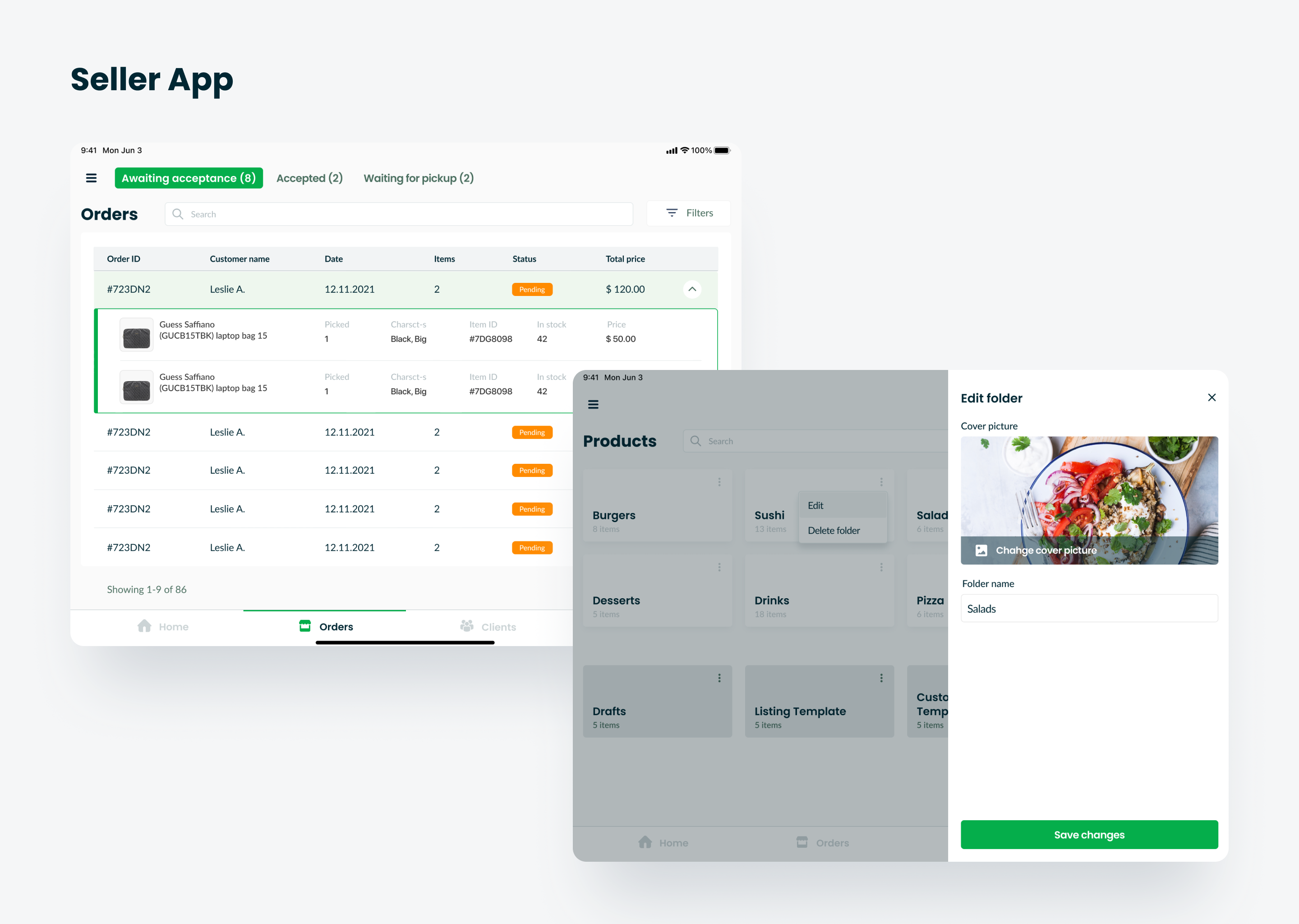
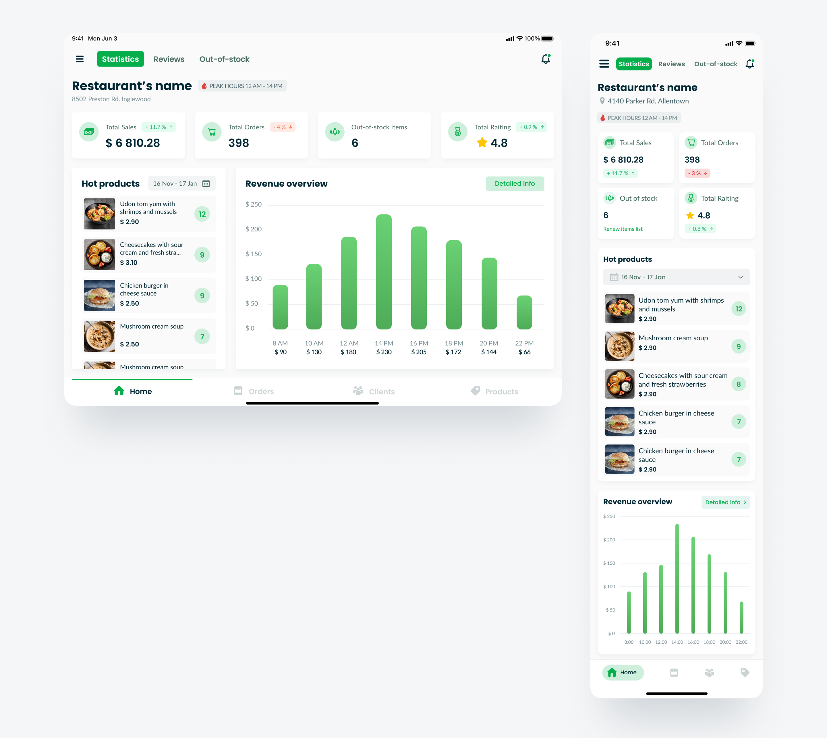
The peculiarity of this application was that the interface changed depending on the type of seller — a restaurant or a store. For the restaurant, a visual was designed for “quick” orders, where you can change the order preparation time in real time in case of a high load of a joint. For a store with delivery more than a day, a table was designed to track the shipment. Also, the seller can add and edit the range of their products, edit the visual of their public page, have access to the client base, change the operating mode, see customer reviews, create coupons and see statistics in the form of a dashboard on the home screen. Added goods are sent for moderation to managers.
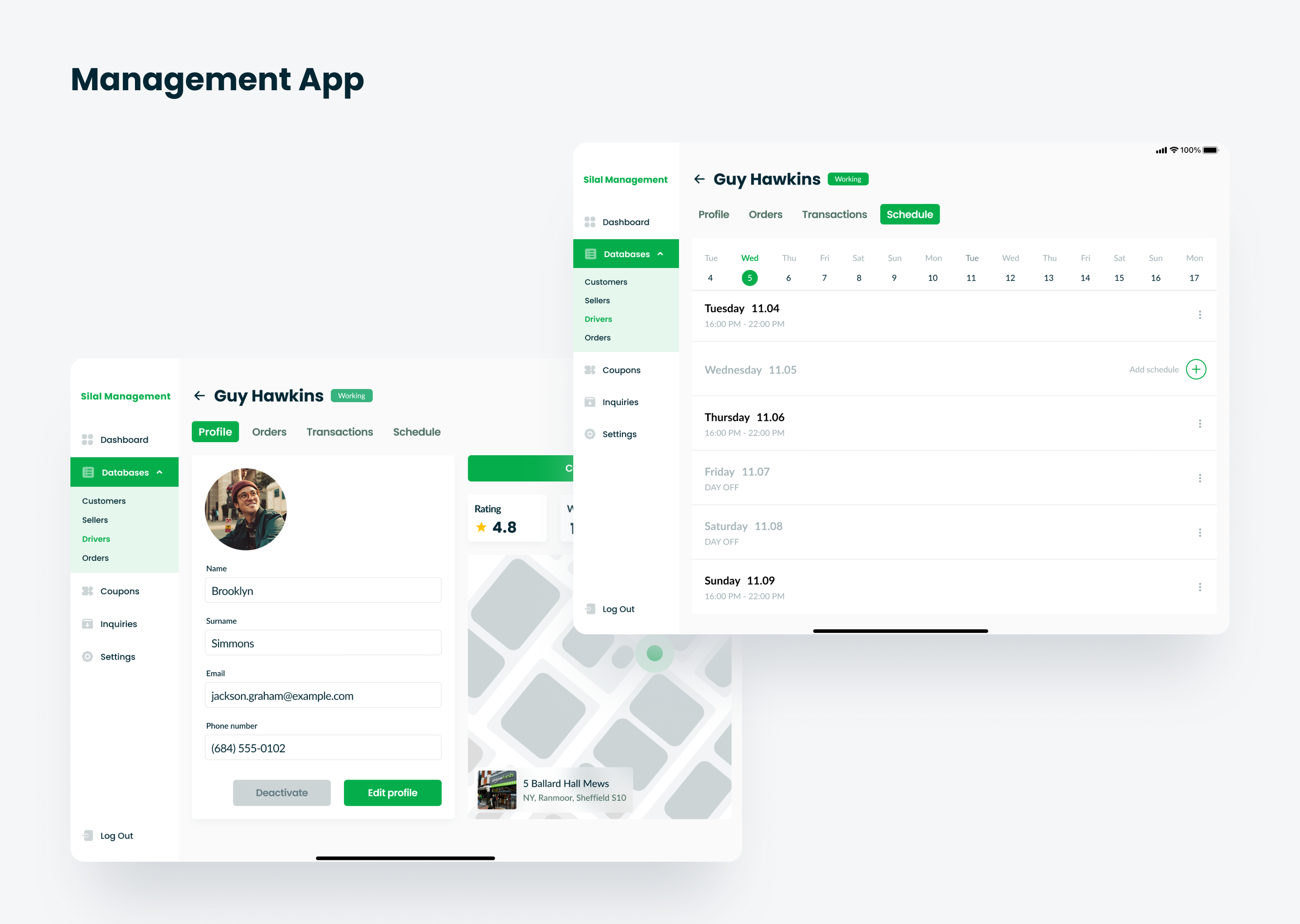
4. Management
The rights of managers allow them to confirm the arrival of an order after contacting a customer, review courier profiles and sellers’ applications for opening a store/restaurant, moderate coupons sent by sellers, see full statistics on the service’s revenue, and set up a schedule for couriers. They also have access to databases of customers, sellers, couriers and orders.
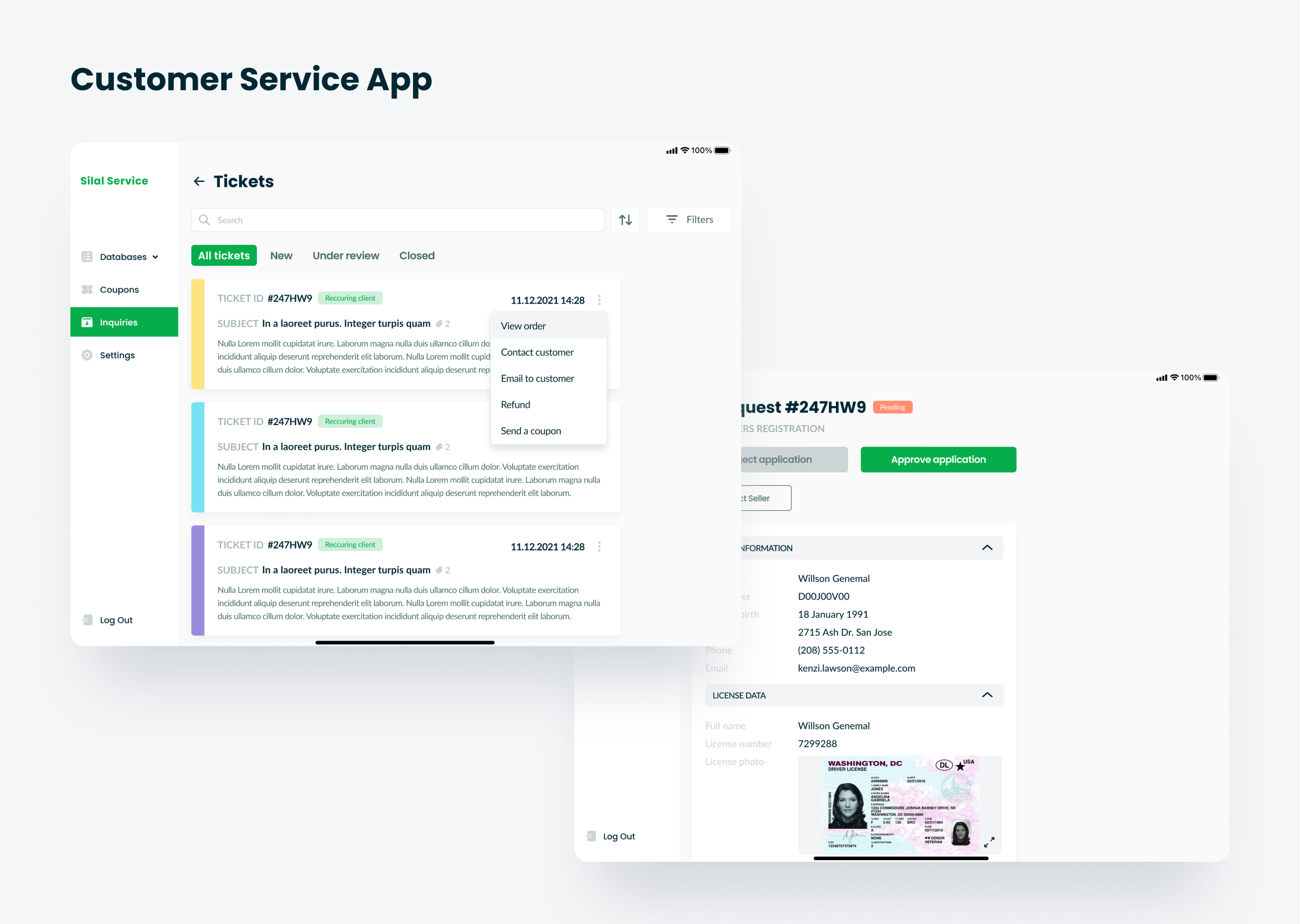
5. Technical support
Considers orders and questions from the Contact us form, solves the problems of users from different parts of applications. It can also issue a refund to the buyer and send him a seller’s coupon.
UI Design
After three months of working on wireframes, making additional changes and agreeing on them, we came to the most interesting part — the visual design of interfaces.
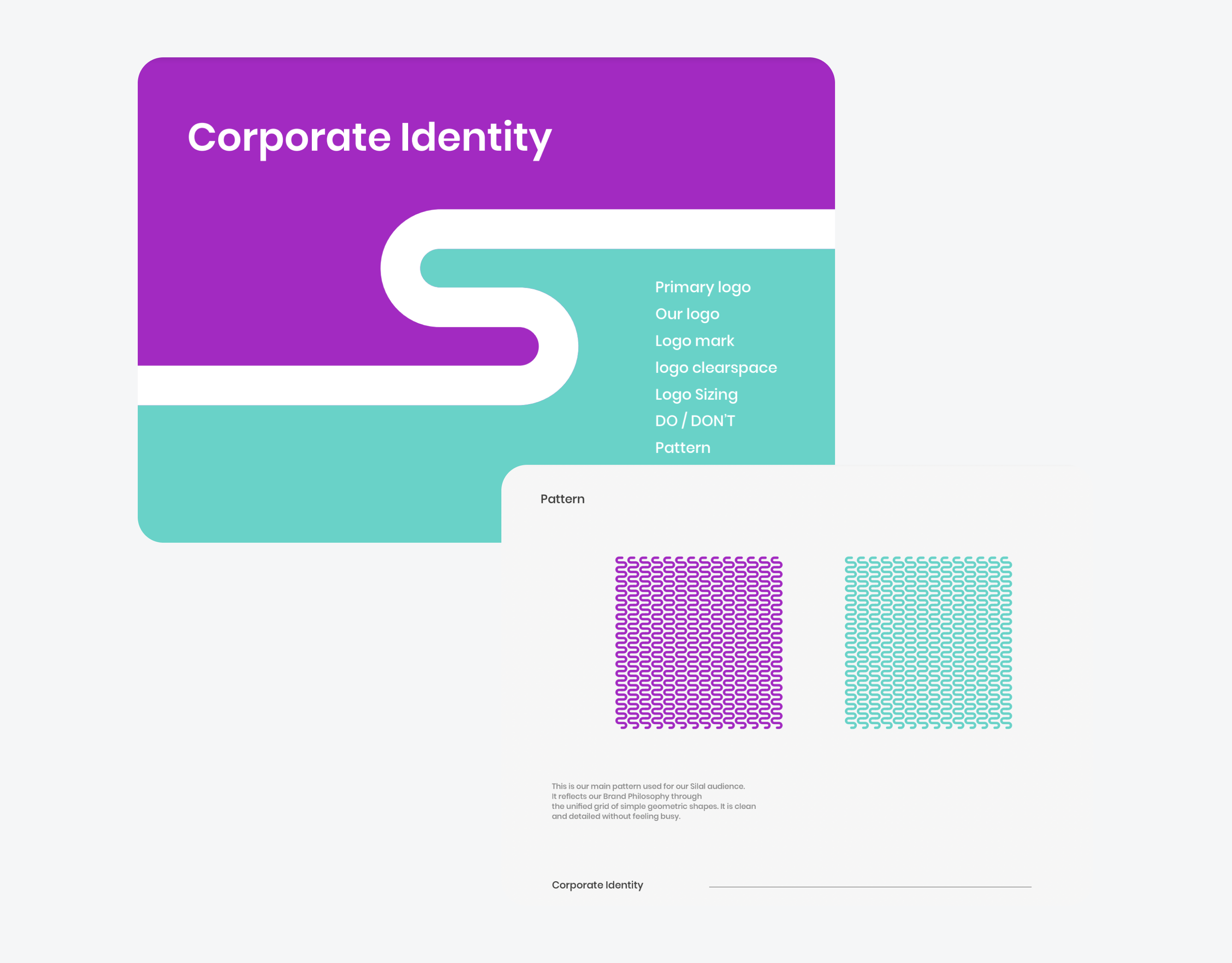
The client initially had a ready-made guide — colors, font, logo and graphic patterns. The Poppins font that was in the guideline was great for headings — massive and geometric. However, for texts, especially in the marketplace, the width of the letters of this font was not suitable, so we convinced a client to add a second font — Lato — easy to read, moderately narrow to accommodate a large amount of text in small elements, for example, in a product card.
Now about the colors. The guideline called for two accent colors: bright turquoise and lilac, but both were too intense. Using them in the interface would mean risking the users’ eyesight, and therefore the time of using the application, which would directly affect the conversion in a negative trend.
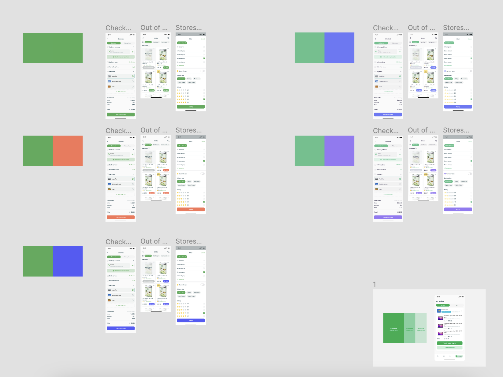
Therefore, we have proposed several color options. We argued our proposal by saying that the abundance of bright colors will irritate the eyesight and reduce attention to key content, and talked about other ways to highlight information. And, we came to a compromise — we use one of the client colors, and make the second one more user friendly. A color has also been added to indicate the types of sellers in the buyer’s app — orange for restaurants.
The client agreed with our proposal at this stage, but warned us that his marketing team may offer a different color option in the future, so he asked us to prepare as much as possible for this opportunity and organize the space in Figma so that the color change would be more painless at any stage. design creation.
At the last stages of the project, we still encountered the client’s request to replace the green/orange color combination with only green (and a couple of its shades). Due to the fact that we were initially ready for this turn of events, it took us about a day to change the colors on all screens of all applications.
The design stage lasted a little over three months. Then came the turn of adaptation. Applications for buyers and couriers were initially executed in a mobile version — they had to be adapted for a tablet. And the remaining three (sellers, management and technical support) — on the contrary — from a tablet version to a mobile one.
Conclusion
For the first time, we worked on a project that had more than three user roles, studied the ins and outs of the interactions between them, once again confirmed our deep communication skills with the client. However, we do not say goodbye to this project waiting for new iterations — MVP expansion, language versions in Hebrew and Arabic, as well as the creation of dark mode.
Август 18, 2022