
Humor in UI/UX
Humor is a powerful marketing and design tool, a driver for purchasing that can strengthen relationships with the client. Today we'll talk about humor in graphic elements. How to add a humorous subtext to a visual so that it not only brings a smile to your face, but also has a positive effect on audience loyalty and motivates you to buy. And the main thing is when it is applicable and where.
So, humor in the visual part of the product can be used in:
- icons;
- illustrations;
- animations;
- photographs;
- any other graphical interface details.
Icons (small images on a website) can act as an independent interface element or work in pairs and reinforce the meaning of the text. As an auxiliary unit, they can be located in categories, cookies, and so on. Icons play an independent role in badges (an interface element in the form of a strip: new product, sale), menu tabs or buttons. But, as you know, it is better to see once than to hear a hundred times. Below are some examples of icons that are based on humor.
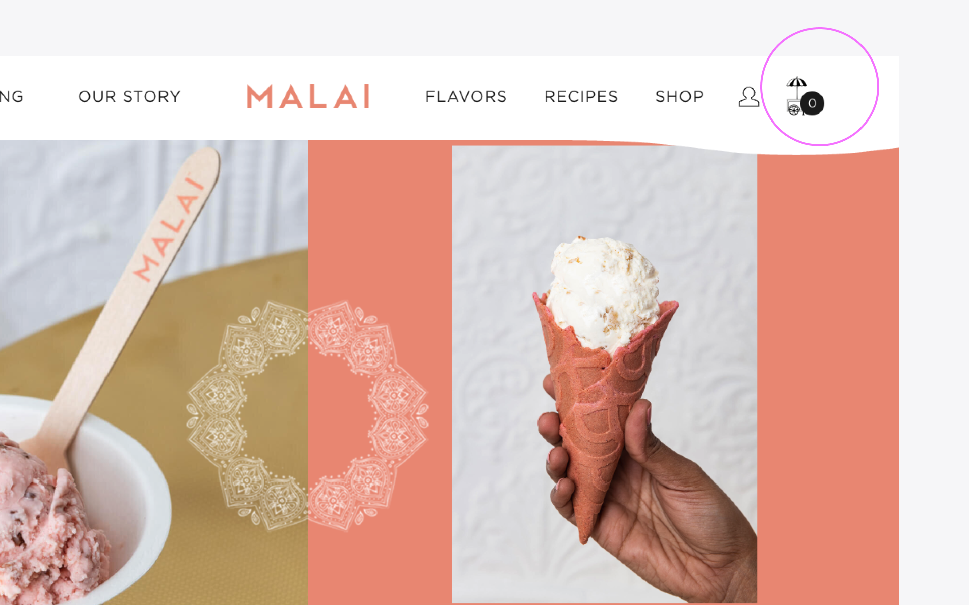
An excellent example of such fun customization (individualization of a product or service) was shown by the Malai online store. The usual basket here looks like an ice cream cart (a reference to the product being sold), and there is even an umbrella as a reminder of the hot summer.
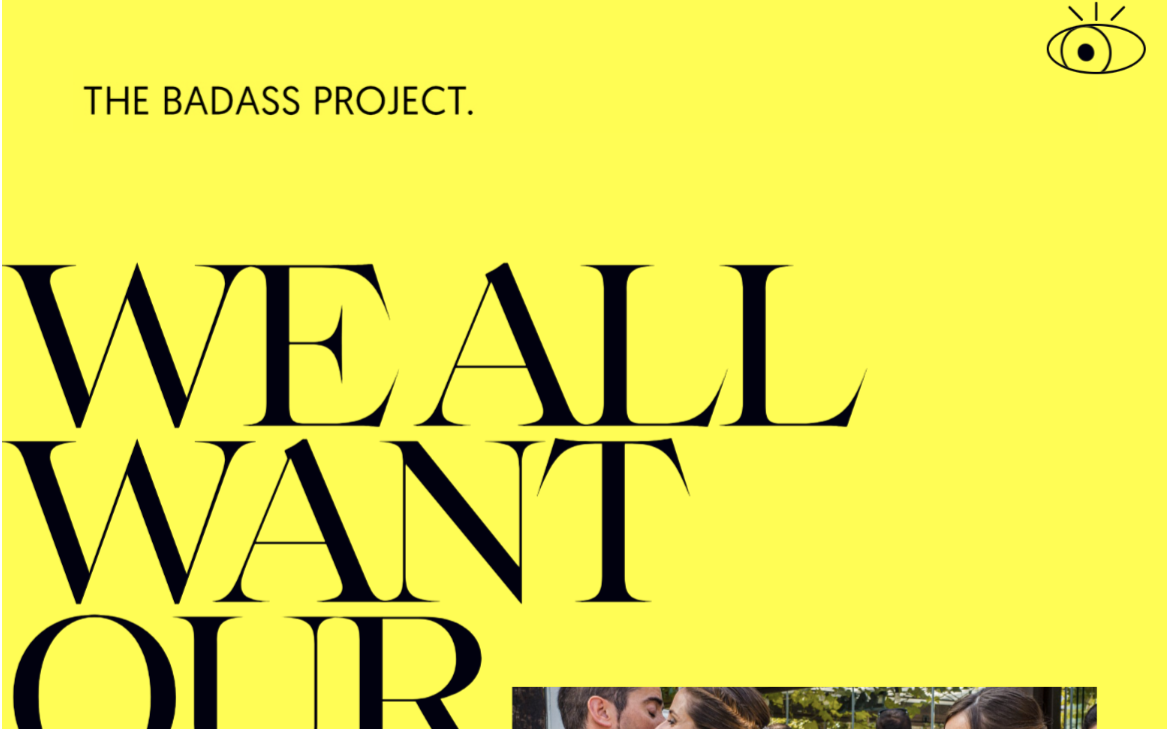
The rather conceptual site Badass Project uses a creative icon in the interface in the form of an eye that moves after the mouse cursor. To make it more believable, his pupils even dilate.
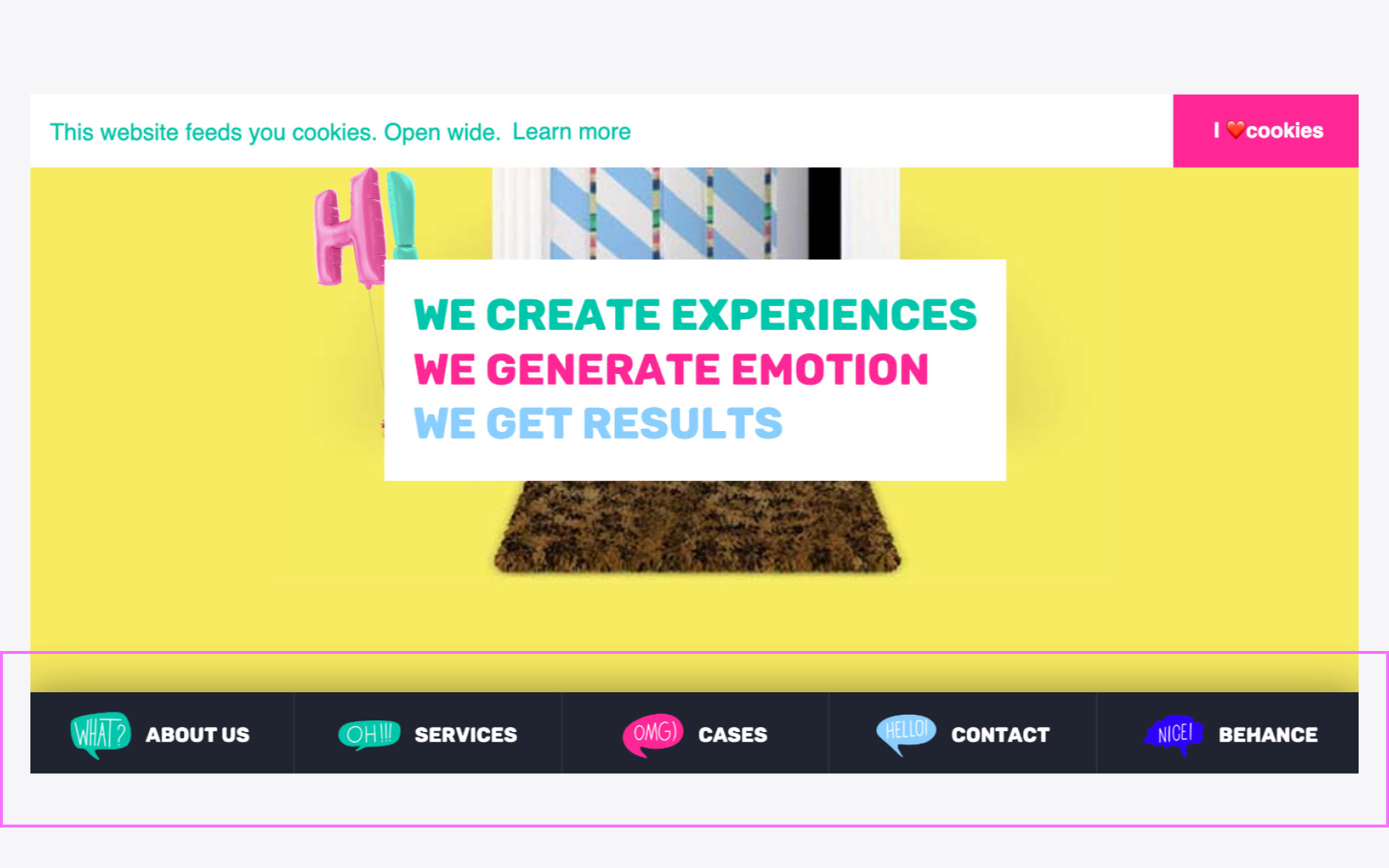
And here we see an unusual way of designing tabs - the names are supported by graphically presented interjections: “WHAT”, “OH”, “OMG” and the like. Apparently, these are exactly the words that users say when visiting each of the pages. You immediately want to come in and have a look, don't you?
Another example where icons (more like mini-illustrations) work as a complement to text. Unusual art objects, like those on the Tigermilk website, will definitely not leave users indifferent.
Playful images in the interface can also be found at the Back Market online store. To break up the strict style of the site, they added a block with smiling icons, which immediately sets the tone to a light and friendly one.
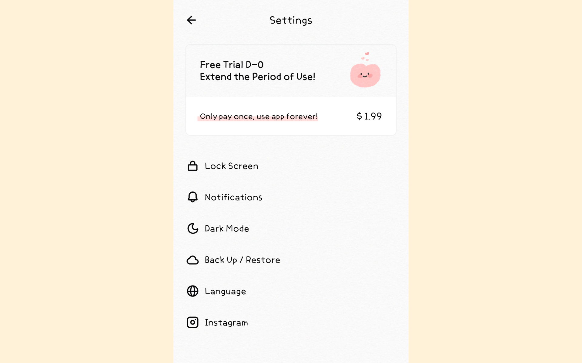
The creators of the Haema application also used the same method - not the most positive moment in UX, when you need to inform about the end of the trial version, they reinforced it with a smiling weirdo, which slightly smoothes out the annoyance of the end of the trial period.
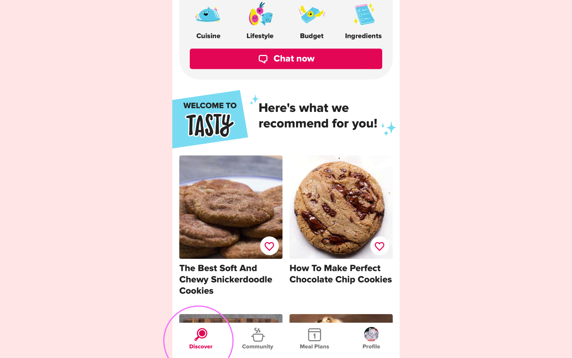
The Tasty app, unlike recent examples, itself looks very positive. But the Discover icon on the tapbar deserves special attention. It combines both a magnifying glass and a frying pan at the same time - aerobatics in design!
ILLUSTRATIONS
The easiest way, besides icons, to add a good mood to a product is to use funny illustrations. The dosage depends on the general concept, the target audience (we previously wrote about the specifics of humor and design in general in the East) and the final goal. For example, various NFT collections are full of humorous illustrations and use humor openly both in the visual component and in the text. If the site or application does not aim to hook the user in this way, then funny pictures should be used within measure. For example, place them in empty states (a page without data with an image and small text, for example, when entering an empty query in the line), on default avatars, 404 pages - where they will not be so noticeable at first glance.
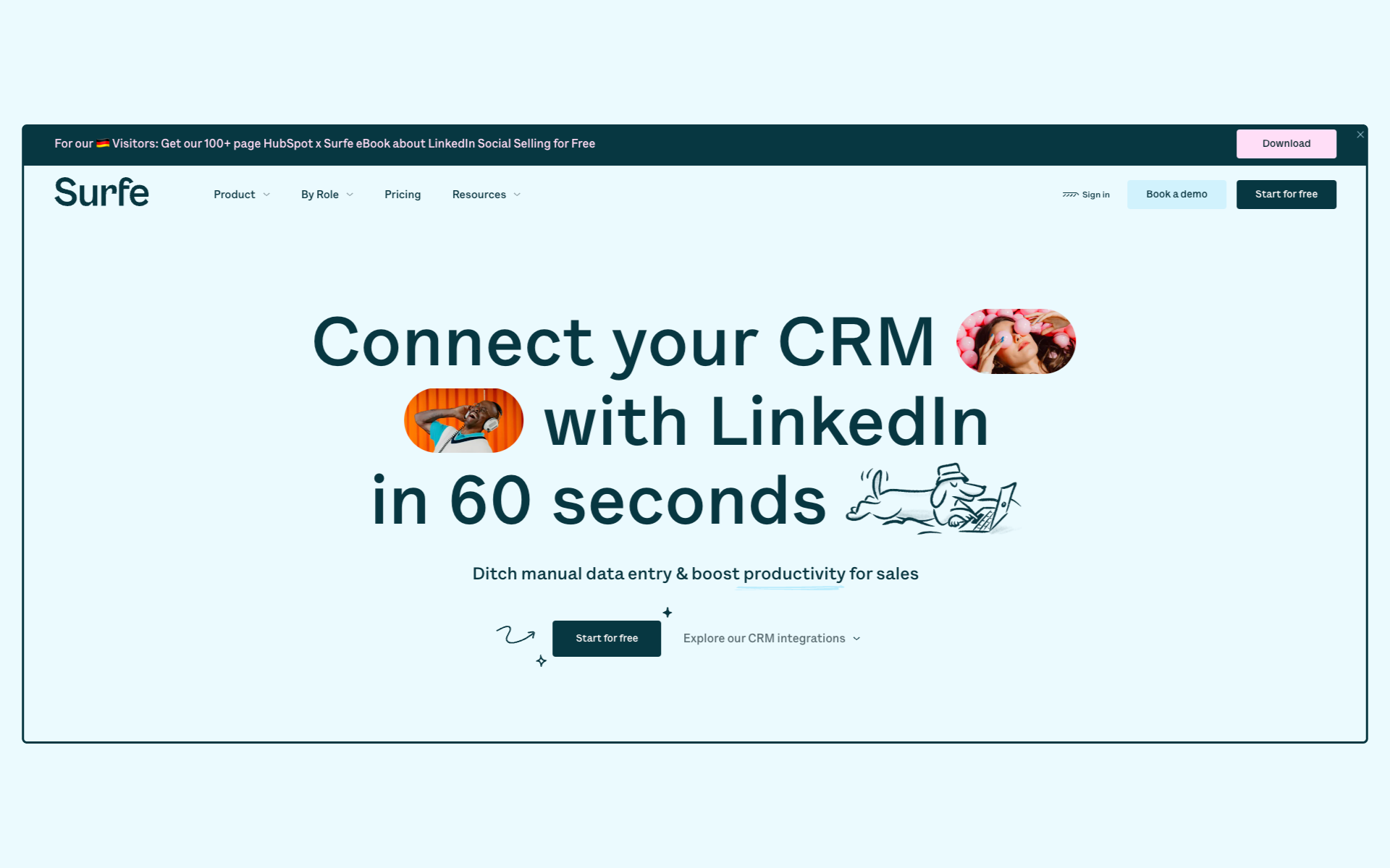
Thus, the website of the Surfe product, through funny pictures drawn by hand in a casual style, creates a friendly atmosphere and encourages further friendship between the user and the brand.
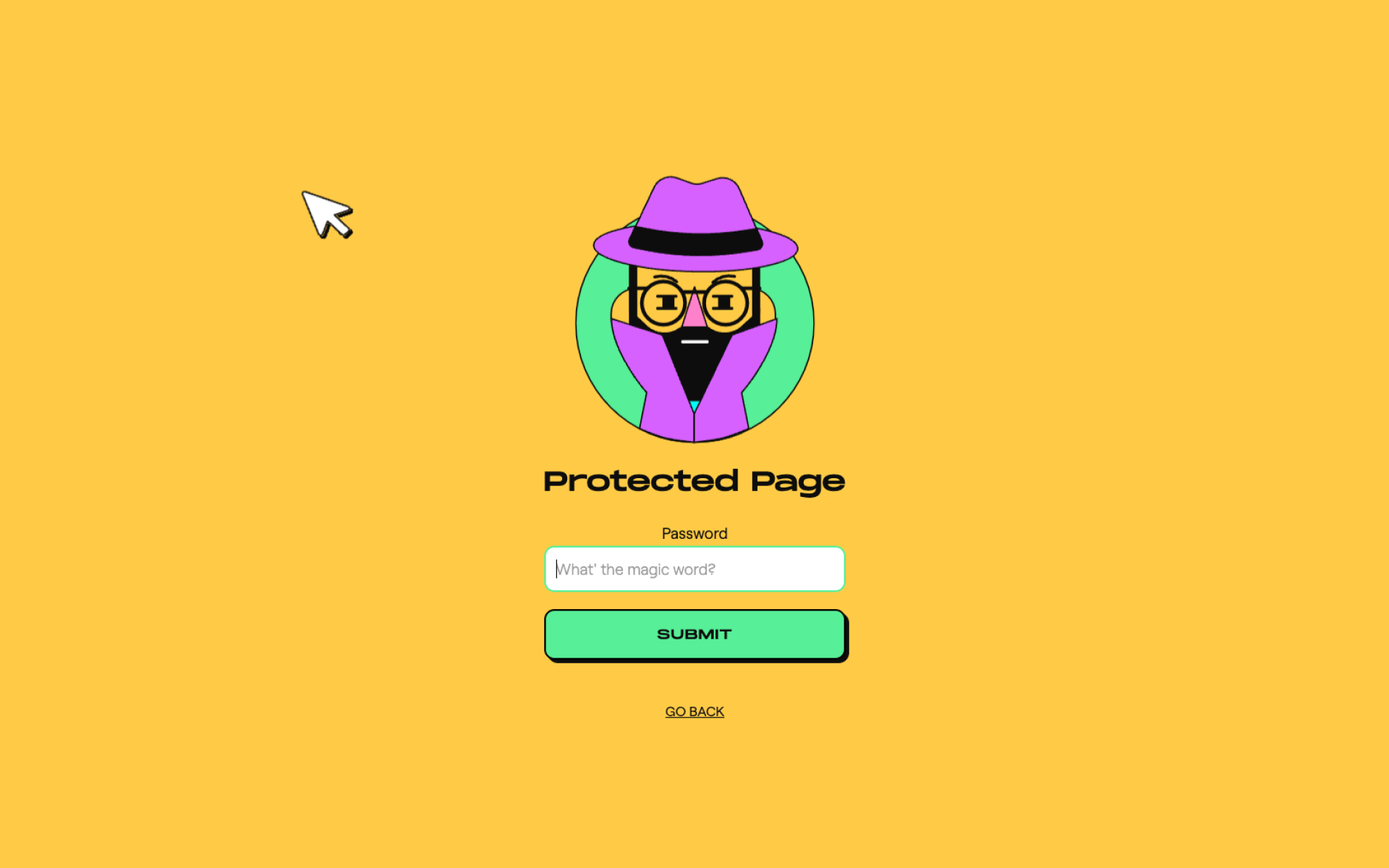
We can see an equally interesting portrait on the portfolio website of Rubens Kantuni. To prevent the author's works from being stolen, they can only be viewed by those who have access to the site. For users who do not know the password, this experience will be negative, because they will never see the work. But the funny animation of the suspicious designer softens this moment a little.
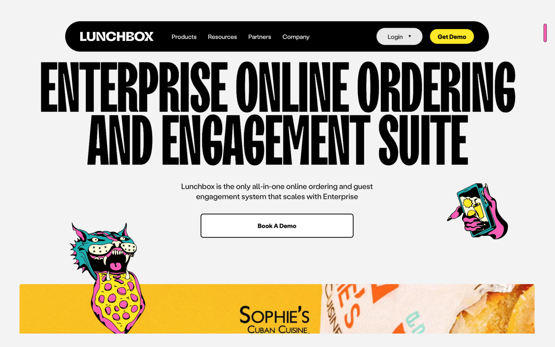
The LunchBox team showed that food delivery can also be funny - their website in a daring style is complemented by equally brutal images (which makes them even funnier): a wild cat with pizza, a cut tomato, a wise man and other slightly mystical images.
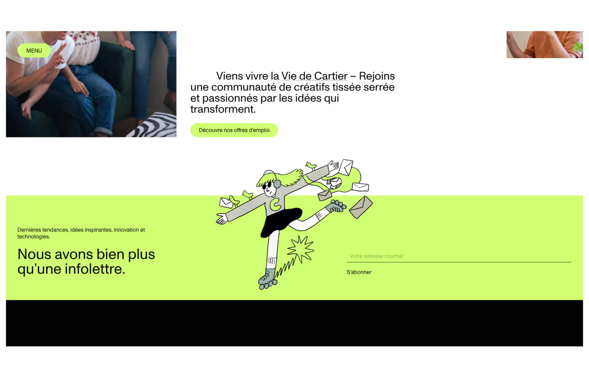
The Cartier agency is a clear example of a classic European site, but that is until you scroll all the way to the footer (bottom of the page). There's a funny illustration hidden next to the news subscription. This approach will certainly make the user smile at least once.
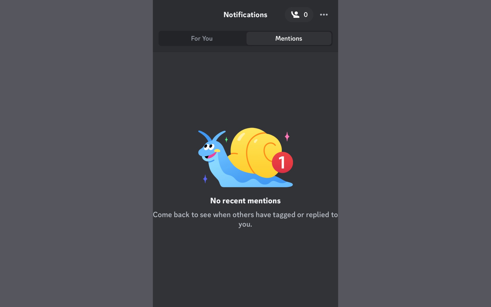
You can't just walk past the Discord app (chat platform). The product itself is very “light” due to the fact that it is aimed at young people. It is not replete with illustrations or humorous wording, like various NFT collection sites, but uses them very cleverly - for example, as a placeholder for an empty state in notifications.
PHOTOS AND ANIMATIONS
Not as popular methods as illustrations, but tools used to attract attention are photos and animations. Recently, on websites you can see memes or familiar images in a new interpretation, including animated ones. This approach conveys nothing better than clear examples. So, let's go!
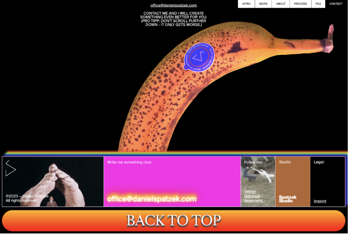
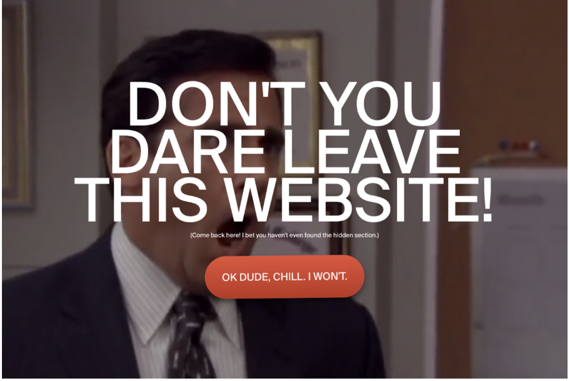
The personal website of a creative person is always a field for experimentation. This abundance of animation from memes is not only demonstrated by designer Daniel Spatzek, but that’s not all…
If you switch from his site and return to another tab, you will see a full-screen ironic GIF with a playful rebuke, “Don’t you dare leave this website.”
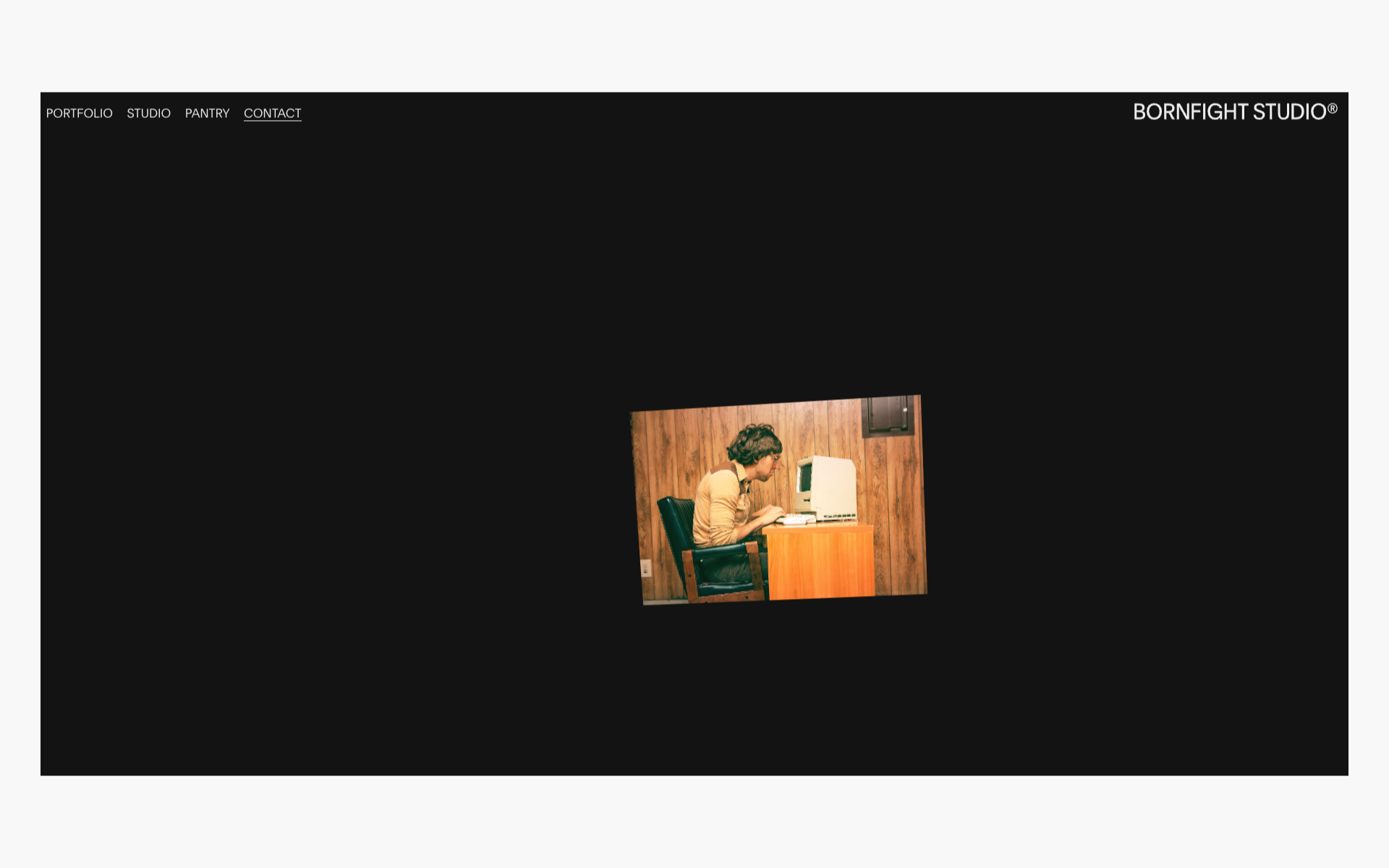
BornFight uses the same element of surprise in its content as Cartier. But instead of illustrations, there are memes here, which are much easier to implement than custom images, but the impact on the user is no less.
The site from the Evron “UI Kids” studio is completely built on the ironic presentation of interface elements as individual characters. It contains all the details of humor: funny titles, comical characters, and animation.
Let's summarize:
- Irony is subject to the concept of the product, the tastes of its users and business goals.
- Choose the dosage of humor depending on the goals of the product - the greatest effect is achieved when the user accidentally stumbles upon a funny moment in the interface.
- There should be one style, but techniques can be combined: be it drawing, photography or animation.
- Don't be afraid to be funny, either in life or in design. Moderate, subtle humor will make your product stand out from others and attract new customers to the brand. And we are always ready to help with this.
March 4, 2024