
How website redesign affects its conversion: our company’s experience
Over time, any IT product loses its relevance and, as a result, the number of leads interested in it decreases. In this article, we will use our own example to analyze how to increase conversion on a company’s corporate website through redesign, and what stages it consists of.
We always try to create timeless designs for digital products. But is this possible in the 21st century? In an age of technological progress and rapid change? More likely no than yes. To stay afloat and remain attractive to current and new audiences, website visuals must meet market trends.
The redesign stage inevitably comes.
Redesign is a comprehensive process of updating an existing product.
WHAT ARE THE GOALS?
A website redesign may include visual, functional, navigational and/or technical changes. The most obvious advantages, besides updating the visual image, that the company receives after the redesign:
- the site’s position in search results is strengthened → the amount of user traffic to the site increases;
- the external image corresponds to modern trends → users become more loyal to the site and the brand as a whole;
- the ease of use of the site increases (including adaptability/navigation) → the likelihood of taking targeted actions and increasing conversion increases.
WHEN YOU SHOULD THINK ABOUT REDESIGN
Marketing experts (the same people who know everything or almost everything about the market) advise updating your website about once every five years. We would not set a strict time frame - it all depends on the specific case. But you need to continuously improve and develop the site, like any other IT product, that’s for sure. The following factors may serve as a reason to think about a new look for the site:
- entering an untapped market and reaching a new target audience;
- scaling the business: expanding the list of services or goods;
- a drop in traffic and conversion due to inconvenient functionality and/or outdated design;
- competition for the client is very high and additional efforts are required to attract and retain attention.
A product that does not meet market requirements, trends and the company’s strategy differs unfavorably from competitors - it does not fulfill its business function: it does not generate leads and leads to the loss of an existing audience. In all of the above cases, website optimization can be a good solution to correct the situation.
WHY WE DECIDED TO MAKE REDESIGN
It also happens that the market and target audience remain the same, but the company itself changes, the strategy is reworked, goals and objectives are adjusted. All this inevitably entails changes to the corporate website, which, in essence, is the entry point for future clients and the beginning of interaction with the brand. This happened to us. 4 years after the launch of the corporate website, the company has grown significantly, and so have our ambitions, we have entered a new market, the package of services has expanded, we have set new large-scale goals, the implementation of which required an update.
REDESIGN STAGES
Product redesign doesn't start with a beautiful layout. It is based on strategic planning according to the company's goals. Most of the work on the project was devoted to organizing the process. And we spent only 40 percent of our time on developing and modeling the site.
To change something, you need to study it well and find weaknesses and strengths, barriers that prevent you from achieving business goals, and focus on the needs of your audience. Thus, we divided the redesign of our website into several main blocks:
I. Audit.
II. Data collection:
- competitor analysis;
- user needs assessment.
III. Formation of hypotheses.
IV. Approval of the structure.
V. Visual redesign.
I. SITE AUDIT
The first stage of any update is the analysis stage. Through comprehensive brainstorming with the team, we obtain the data we need and compare it with the trends of the modern IT services market:
- we examine the general structure of the site and the operation of all pages and individual graphic elements;
- we evaluate the relevance and uniqueness of the visual part;
- we check the ease of use of the functionality, etc.
II. DATA COLLECTION
1. Competitor analysis
Internal analysis is supported by external analysis. We go online and look, what do our competitors have? What blocks do they have, why are they located in one order or another? What keywords are used in titles? What does this give to the site, and how does it affect search results (SEO optimization):
- we collect keywords for which our site is most likely to be shown;
- we identify competitive sites by keywords in search results;
- we analyze the structure and content of competitors’ websites (including graphic elements, descriptions and headings of different levels).
2. User needs estimation
We decided on our competitors and studied their websites. But the main player in any field is the end user. Assessing the needs of leads will give a more complete picture of how the site should look in order to be attractive, convenient and motivating to take the target action:
- interview current/potential clients/your own team;
- describe the personas of future users (who they are, what they do, what their income is, their needs, pain points, etc.);
- analyze web analytics information: user behavior on the site (which blocks are visited most often; how much time they spend on the web resource; what possible barriers they may encounter) and traffic sources (traffic; where do users most often get to the site from: organic search results, advertising and etc.);
- formulate and test hypotheses.
III. FORMATION OF HYPOTHESES
With competitors, everything is simple - we have information about companies in our niche and data from search results for keywords, but with the motives of users, not everything is so clear. There is only one way to understand what a website should offer to clients: asking the question “What are people doing on the website?” and put ourselves in the potential client’s shoes to answer it.
This way, we focused more precisely on the pain points and needs of users and formed several hypotheses for further discussion:
“The value proposition for our clients will be our focus on saving them time.”
“Our proposal must include expertise for narrow segments.”
“Supporting the proposal with examples of work will create a credibility effect.”
“Showcasing video testimonials from our customers will enhance the social proof effect.”
IV. STRUCTURE APPROVAL
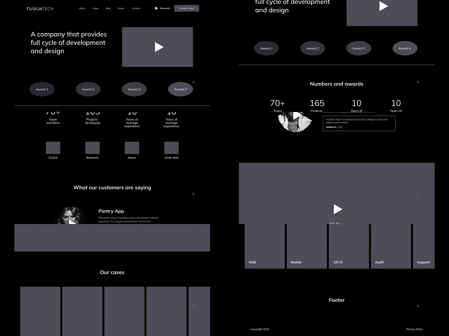
Is it possible to start working immediately after putting forward hypotheses? It's possible, but not necessary. Preliminary hypotheses need to be worked through again with the team. Together, we adjusted the proposals for the general structure in more detail:
- the posted cases must display statistical data on how our team helped the client’s business;
- the most striking works should be collected in a showreel as an example of an instant impression of the portfolio;
- the client must receive full information about our achievements;
- information about payments, tasks, industries and other important data can be compiled into a PDF presentation;
- the website must have a blog; it is interesting to users, which is confirmed by web analytics statistics.
Thus, as a result of the discussions, we have a clearly formulated strategy, commercial proposal, as well as the general structure of the updated website. It's time to start directly redesigning the visual part.
V. VISUAL REDESIGN
Changes to the visuals of the site affect many components, let’s focus on the most interesting:
- color scheme;
- font;
- style;
- content;
- design of individual blocks.
1. Color scheme
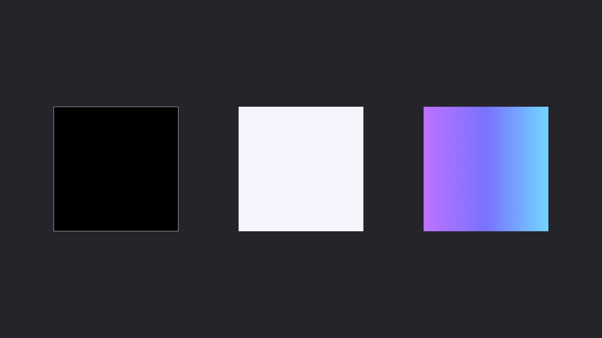
Since we did not change the identity, the main color palette remained the same. The main colors are black and white. Black reflects concentration on solving a particular problem and complete immersion in the client’s problem. White is the color of readiness to perceive the world in all its diversity, which emphasizes our flexibility and constant absorption of new information. The accent solution is a consistent gradient from purple to blue: this is both a bright element that catches attention and a symbol of the growth of our company as a brand.
2. Font
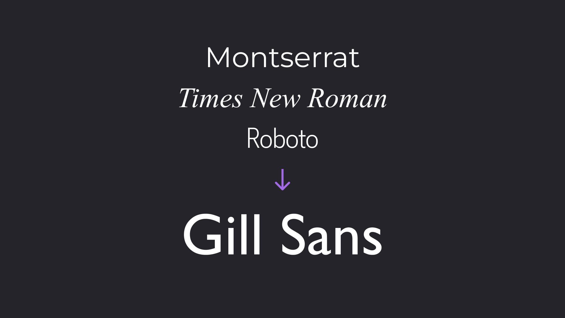
But the font has been changed. If we previously experimented with Montserrat, Times New Roman and Roboto, then in the updated version of the site we settled on the Gill Sans font - an elegant sans serif that gives the site the spirit of brutalism (priority of functionality over form). This is a very simple, minimalistic font without unnecessary embellishments, which draws the reader's attention to the content.
3. Style
In the stylistic direction, we decided to adhere to minimalism. The company's main focus is on large corporate clients. Typically, this category does not have much time, and therefore the focus of attention should be distributed efficiently: the user's gaze begins with the title → moves to the content block → and then in order of importance of information. No distractions, just follow the structure!
4. Content
The introduction and welcome text are the first things potential clients see on your website. Therefore, these elements should immediately provide an understanding of what the company does, what services it provides, and what its unique selling proposition is. To consolidate the effect and get more detailed information, we invite users to download our presentation. If the client does not have time here and now, he will have a file to view our proposal a little later. And then content comes into play: showreels, reviews, awards.
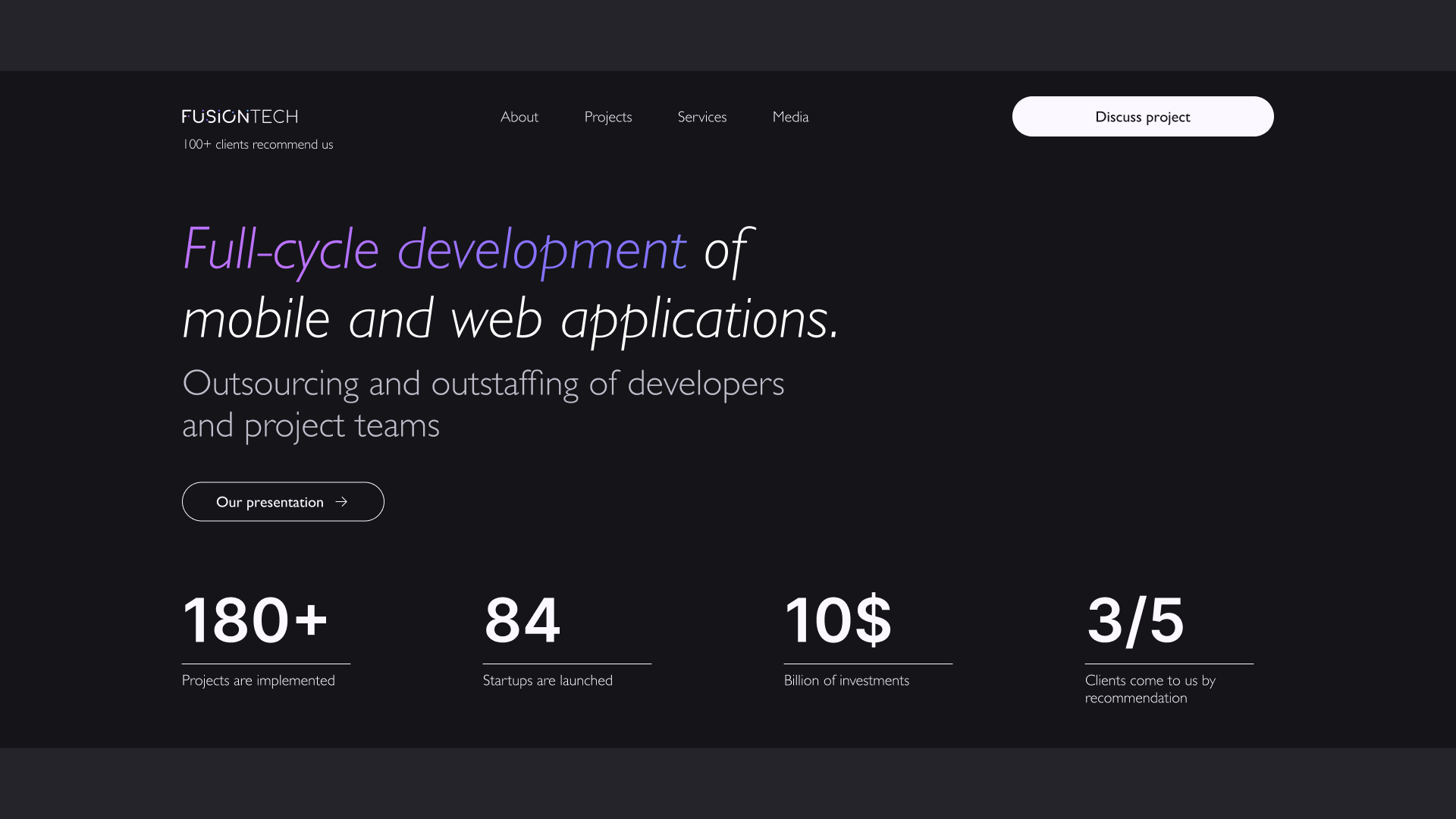
5. Visualization of individual pages and blocks
Each subsequent page of the site should be built on informative and relevant content, reveal the main goal and provide answers to the main questions of clients: “Who are we?”, “What do we do?”, “What could we do for our clients?”. This information should be logically structured so that users can quickly review and absorb the information.
! The page with cases deserves special attention!
Many iterations were done before arriving at what we thought was the ideal structure. Conventionally, we divided it into several semantic parts:
- the first block provides basic information to capture attention: a description of the project and what problem was solved by our team (for example, how many users were added after the redesign, how much the number of downloads of the application increased);
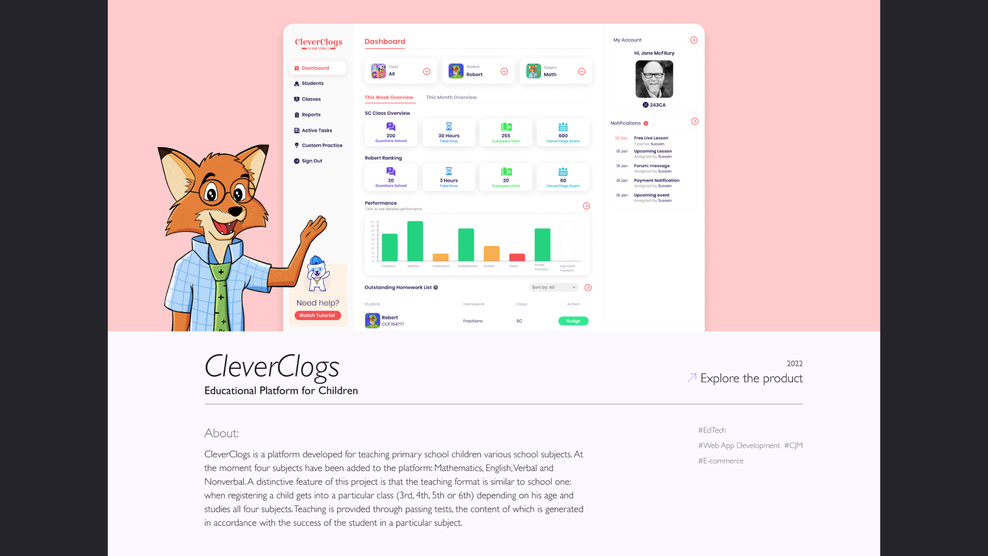
- the second block is a technical list of tasks;
- the third one describes the challenges that are inevitably present in any project;
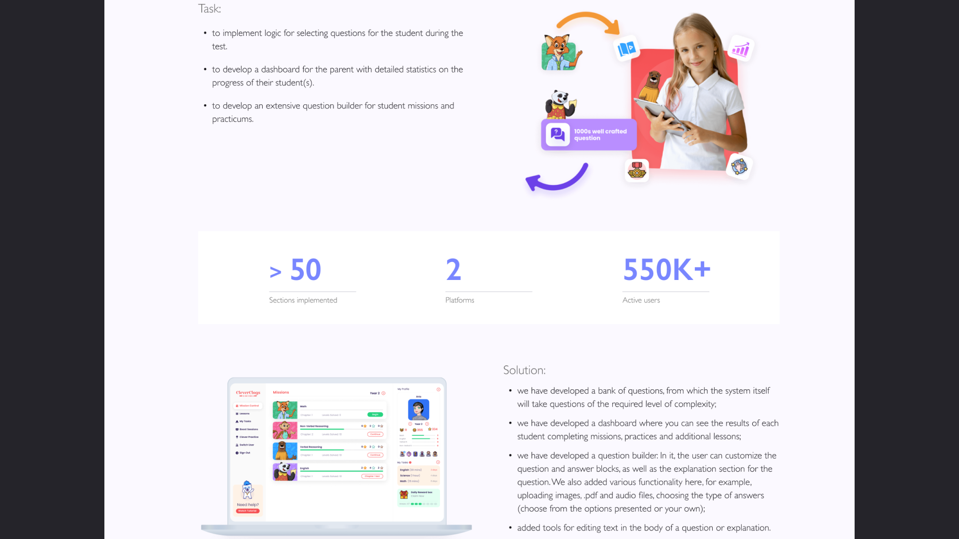
- the fourth block briefly describes our solutions and provides clients with statistics on resources: how long the project lasted, budget, team size.
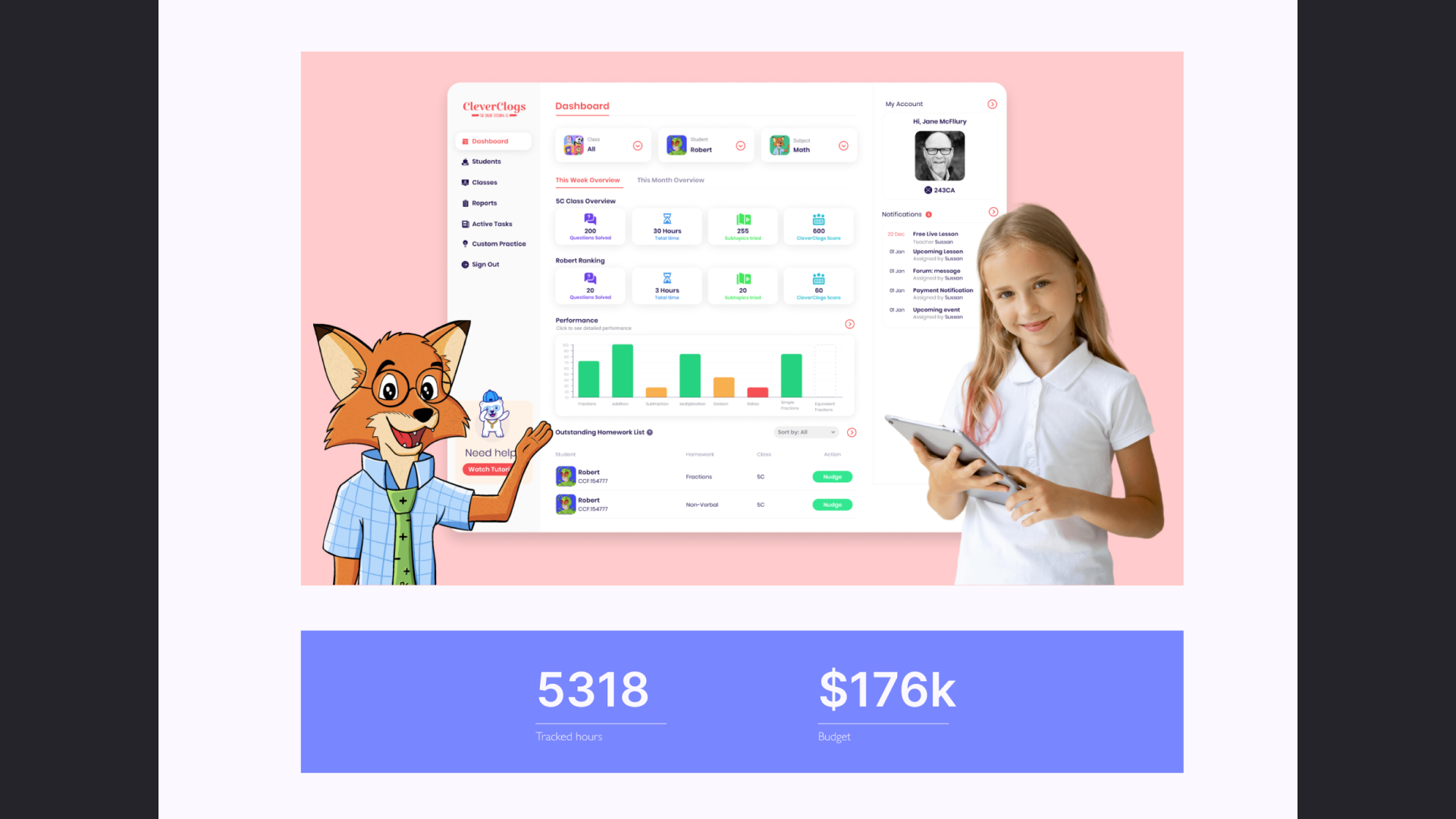
Why was this particular structure used when describing cases? This approach gives the most complete picture of the company’s work processes.
WHAT DID YOU GET IN THE RESULT?
As a result of updating the site, we received a new influx of clients and contracts:
- site performance has improved;
- search results have improved;
- traffic to the web resource has increased;
- the visual no longer looks outdated - it is modern, strict and clear;
- the product began to meet the current goals and objectives of the company.
The update process is still ongoing - we monitor metrics, how users interact with the site, which blocks they focus more attention on, where their path is more often interrupted, we conduct surveys and generate ideas on what else can be improved. For stable results and conversion growth, this process must be continuous. Advertising a brand through an outdated website is a bad idea; without a fresh look from the creative team, the effect may be the opposite.
You can rate our website and send us your feedback via welcome@fusion-tech.pro!
November 16, 2023
