
Aurora Design Case
As you know, several designers can be involved in the creation of developing and complex projects at different times. It is very convenient to use an organized system of elements and rules for their use while continuing to work on someone's project.
This is exactly the method that was needed for one of our projects, Aurora. Our task was to create a concept of basic elements in order to further build a full-fledged interface for a platform in the field of e-commerce management from them.
The client provided the Carbon system as an example, which includes the Design-Kit, colors, fonts, use cases, and more. As well as an analogue of their product. Additionally, I focused on Material Design examples, since their website has component options that can be useful in development.
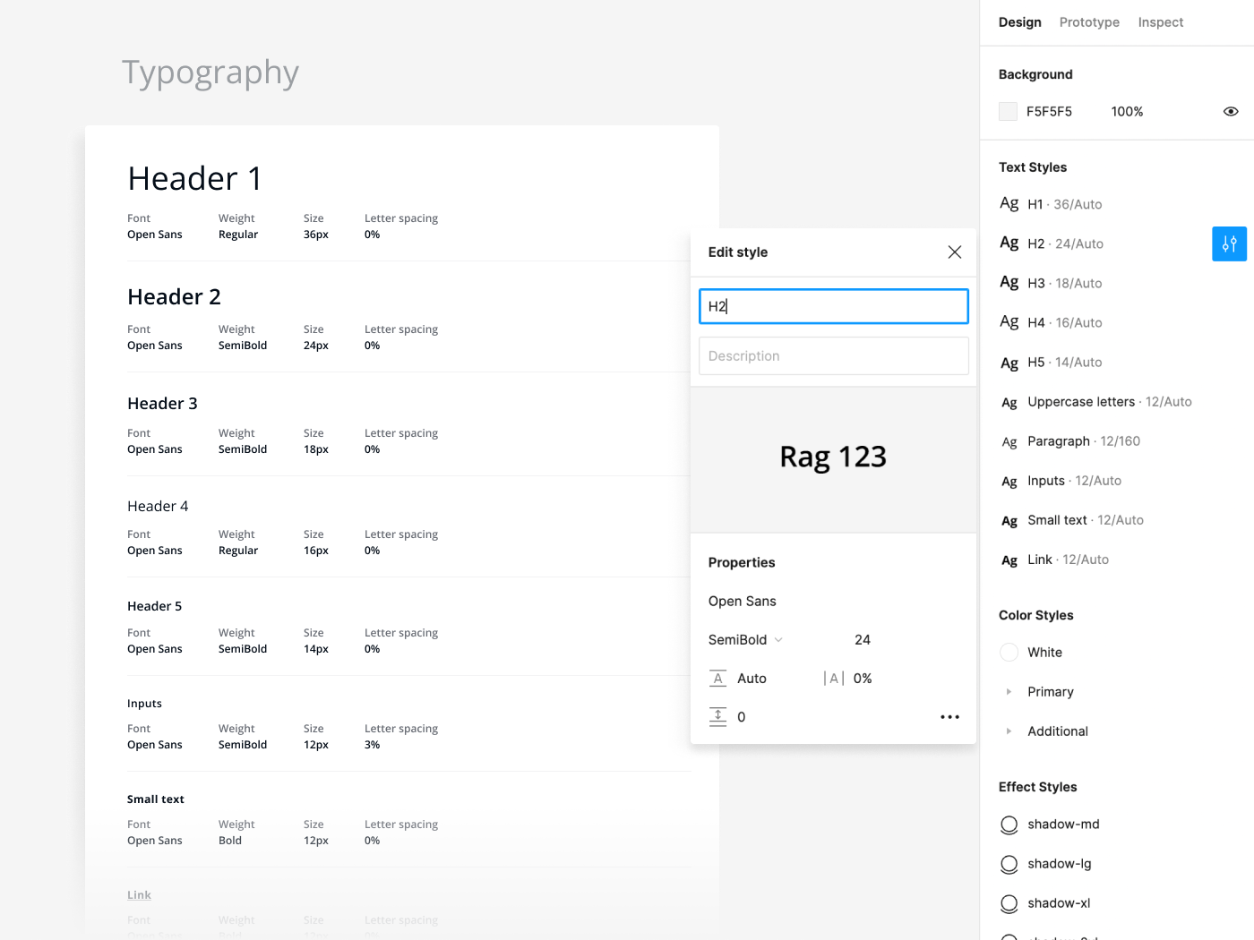
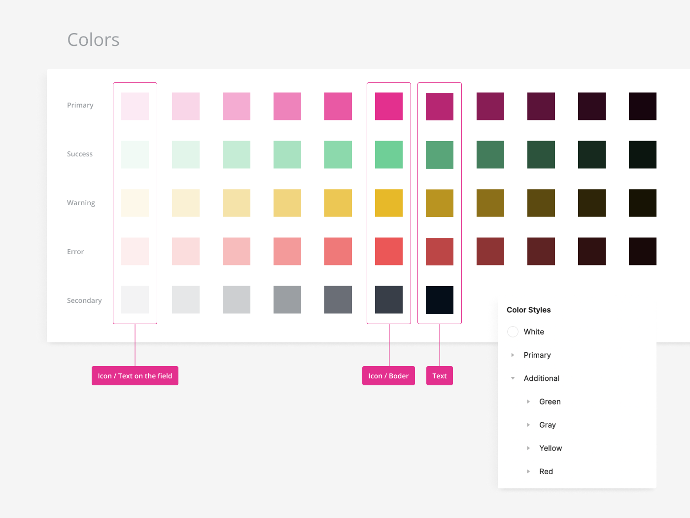
In the course of work, first of all, fonts, icons and main colors of the project were proposed. At the same time, I created sample buttons and inputs to show how the selected fonts and icons interact with each other. Based on this, the client chose the fonts, colors and appearance of the icons. So, one of the colors of the logo, pink, is used as the Primary color, and the second one, gray, as the Secondary one.
All used font styles with marked roles are saved in the styles of the Figma project and can be selected from the list.
The colors are preserved in a similar way. But they are divided into folders in the Color Styles section: Primary and Additional. To expand the color palette, I used the method of adding black and white to the selected color in different proportions sequentially (20%, 40%, 60%, etc.). The frame with the color layout also indicates the intended color roles.
In addition, several shadow options were added to choose from a ready-made set offered by the client.
Next, the appearance of the buttons, inputs, dropdown and the language selection button was chosen. All buttons are components, the appearance of which can be changed directly in the project, depending on the purpose. The icon in the button can also be changed in the Auto Layout menu.
The appearance of the dropdown button for selecting the language was slightly changed (it became more compact) after I created the sample Login page.
The input has 9 options and can be used with or without an icon. The password input field has more options because it can be used in different situations and has its own specific properties. For example, a scale that shows the strength of the password and elements highlighted in green if the user has entered the required number of characters. I also made a separate component for the verification code input field.
Next, components for the checkbox and toggle were created, as well as components for the same elements with text. In addition, I added avatars of different sizes, components with groups, tooltips and usage examples along with a dropdown list.
To show how elements and text work in real life, I created login screens, taking into account the wishes of the client. Later, a dark theme was added, for which I created separate components.
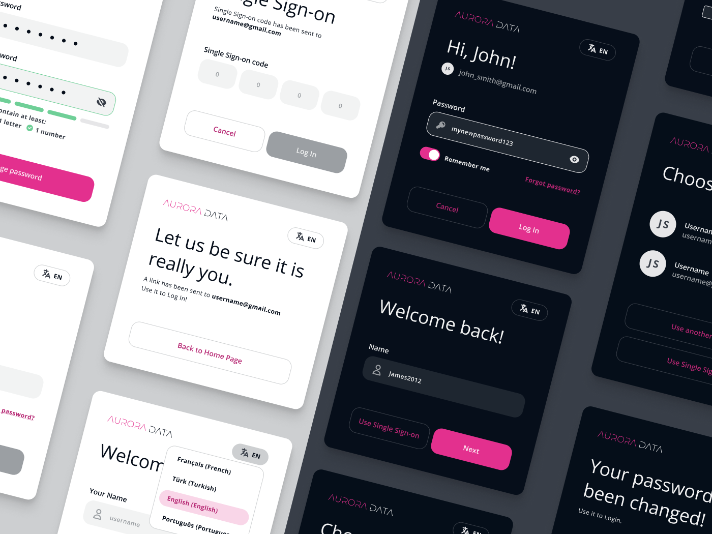
And to set up components for the dark theme, I used a ready-made login layout and selected suitable combinations of colors and transparency. For some elements nothing had to be changed. For example, for the Primary button.
Thus, in a fairly short time, the client receives a simple UI-kit with the ability to edit elements in Figma. This is a great way to showcase the main stylistic focus of a project without spending a lot of money.
December 5, 2022