
Koinly Crypto App
What is important for any UI/UX designer? You’re absolutely right - to be trendy! And I mean not only tools or techniques but also the case topics. We, at Fusion Tech, always try to be on the top of the wave. And this case is a hot-button issue. Only crypto, only hardcore - it’s our Koinly. Now let’s move to details!
Client and Project
Koinly is an application for tracking cryptocurrency portfolio assets, cryptocurrency exchanging/buying/selling and, most importantly, for helping investors to generate a tax report for all financial transactions with cryptocurrency. This is a key feature of the app, which makes this product different from all the others. And we managed to work on this unique product.
Our goal was to make the design more modern and clean, "refreshing" the interface for both the mobile and the desktop versions and also to develop a dark mode and the landing page.
Work process
Since the goal was to redesign the UI part of the product, we didn't have to rebuild the application’s logic. However, we still did some analytical work, comparing competitors, being inspired by their strong decisions and taking note of their mistakes.
We have selected the optimal color palette that works well in dark and light modes, providing the right contrast for easy viewing of information. However, the blue color is branded, so it remained unchanged, and for additional accents, turquoise was chosen.
We have redesigned the navigation of both the web and mobile versions, making the user flow smoother and more understandable. For the desktop version, all menu items are completely inside the sidebar - we did not involve the navbar, so that it works for other purposes (search, buttons, sharing etc.), depending on the application screen. In the mobile application, we actively used the topbar, but due to the voluminous functionality, we had to use the hamburger menu, placing more secondary screens there.
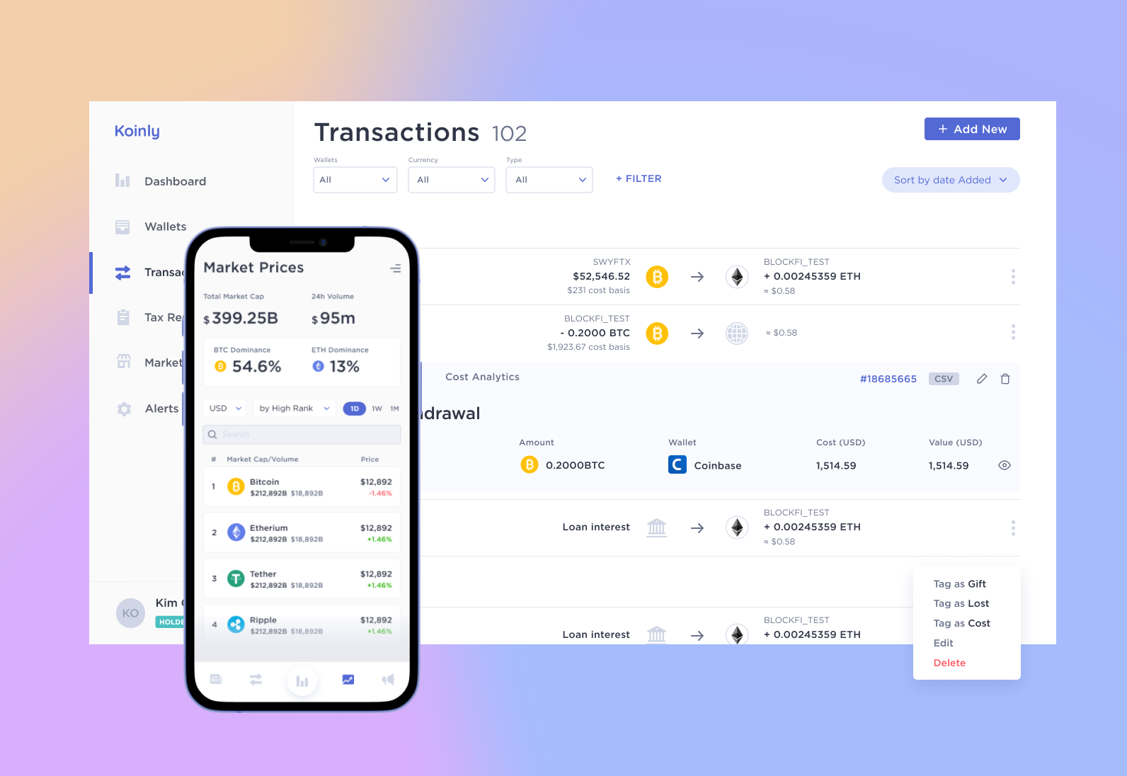
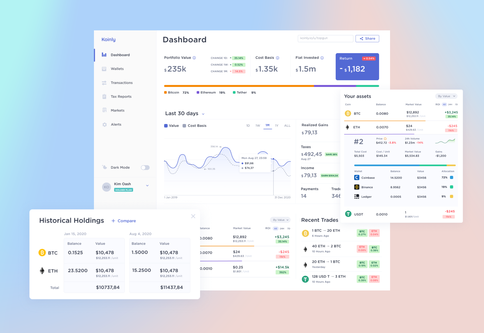
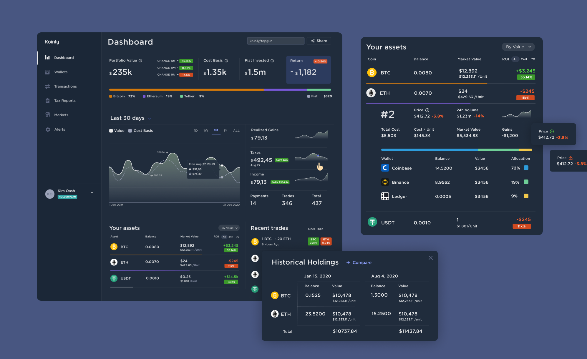
Dashboard
This is the first and the mainest product page. It’s also one of the most difficult pages, because it is filled with various, but important information for the investor. Our task was to display this information so that it remained clear and accessible. To do this, we used the power of headers, free space, and delimiters.
Globally, the page is divided into 4 information blocks:
1. Cards with general information on portfolio: the total value with changes depending on the time period, the base cost, the amount of fiat funds and the amount of income.
2. The graph of the funds’ flow depending on the time period with more detailed information about the type of financial operations.
3. Types and amount of cryptocurrency in the user's possession.
4. A list of the user's recent transactions.

For the mobile app, we were forced to hide some cards from the main page and leave only the portfolio value, the graph, and the user's cryptocurrency assets. But using tabs, we also displayed the recent transactions - this way we saved the main information, but at the same time avoided long scrolling and a messy content.
Dark Theme
We have designed a dark theme that meets the requirements of WCAG 3.0, making it possible to use the app comfortably both during the day and night.

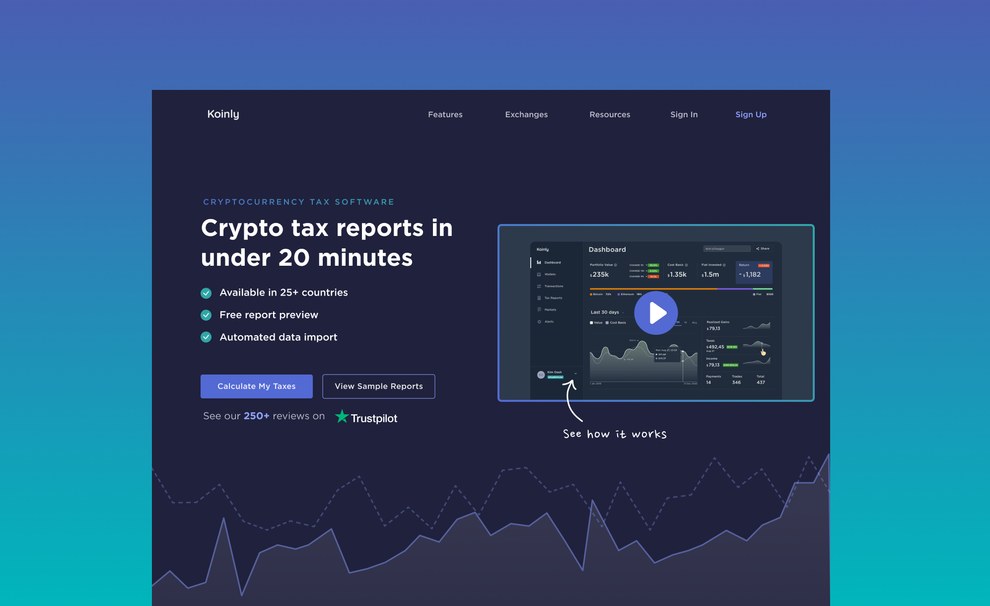
Landing page
The landing page of the product was supposed to maintain a recognizable identity, but also allow users to quickly absorb the main advantages of the application and perform the main action to start using Koinly.
Since the app is presented in both dark and light modes, the main idea was to combine light blocks with dark blue ones on the site pages too. Due to this, the site turned out to be balanced with worthy attention content. Once again, we used the power of titles and visual hierarchy to make it easier for the user to navigate the page and capture the main information.
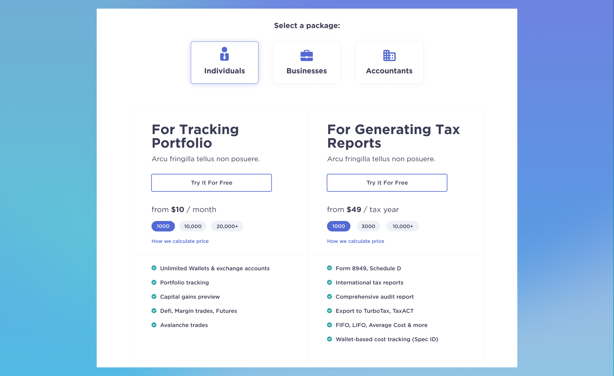
We paid special attention to the page with subscription plans. This is one of the main pages of the site - the user should have an idea of how much to pay, when to pay and for what. In total, there are 3 types of packages, for which we used tabs; and in each package there are 2 types of payments - basic and advanced. To show everything in the most understandable way, we used graphic separators, empty space and visual beacons.
We have adapted the design for mobile devices so users can use it on mobile devices too.
Conclusion
Eventually, we closely collaborated with the customer, so that the business goals were defined, as well as the weaknesses of the product that require our attention.
This project was a great experience for our team and allowed us to improve our knowledge in the field of cryptocurrencies, trading and tax deductions, as well as working with trending streams like data visualization, accessibility and dark modes.
In general, we have achieved the goal of making the app modern, clear and aesthetically appealing.

April 5, 2021