
Design that sells or how to catch the eye of the client
We are used to the fact that the word “design” is associated with a picture, beauty, fonts and color additions, unusual solutions and creative approaches. With something that reflects the visual component of the brand, introduces the essence of the product in the first few seconds.
The main property of a selling design is not only to meet these conditions, but also to motivate a potential client to stay on the site for as long as possible, make a purchase or use the company's service. Therefore, any experienced designer is not only a specialist in his field, but also partly a marketer.
Together with the Fusion Tech Head of Design Department, we will try to figure out how to use a marketing approach in design when designing online stores and other product sites. Catch the basic rules that you definitely cannot do without.
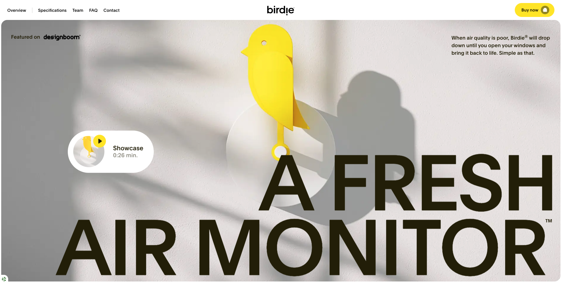
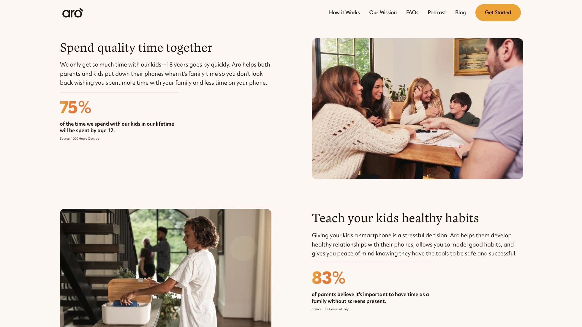
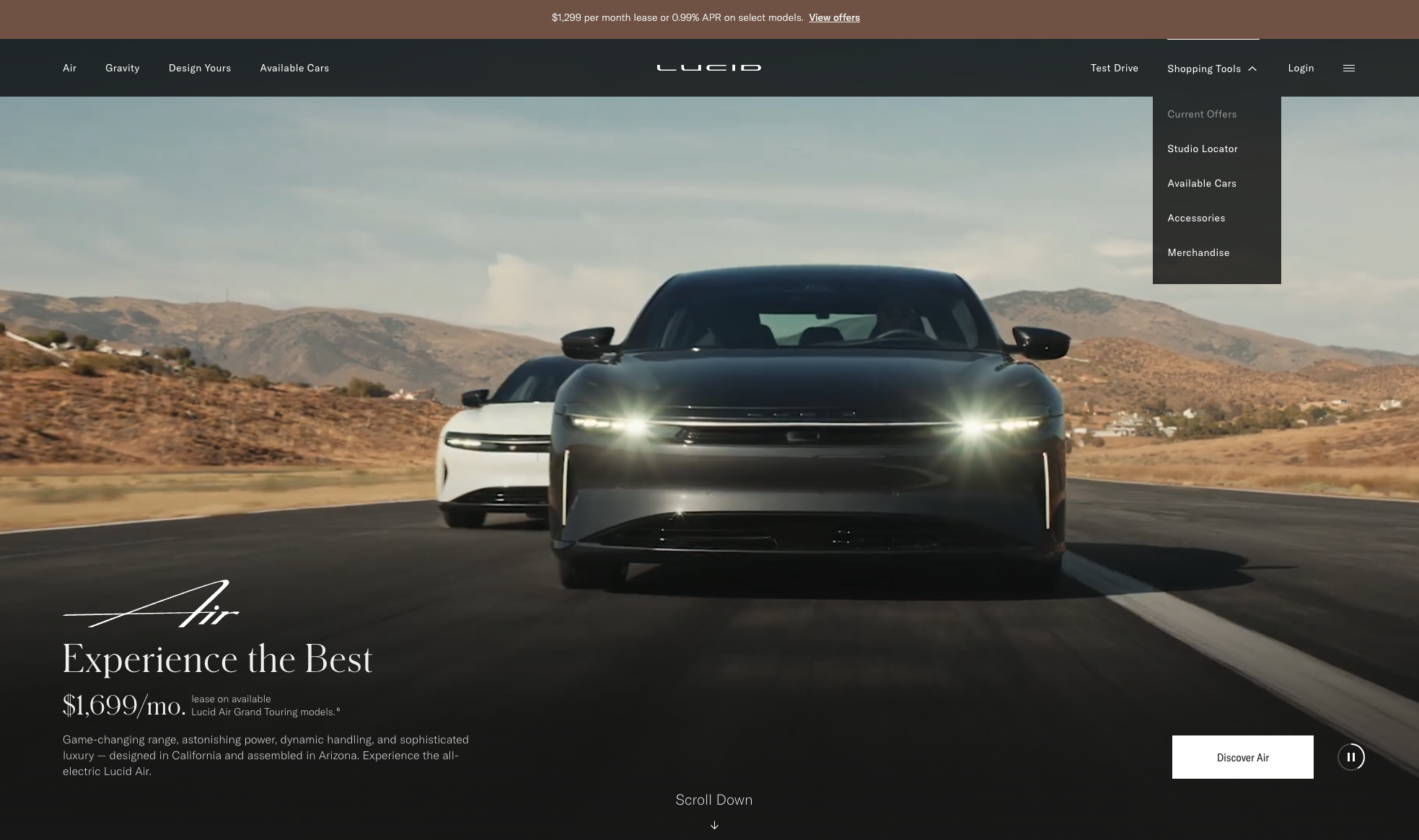
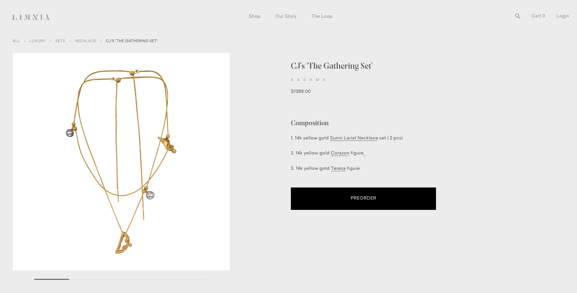
Main block (hero block). This is a kind of face of the site, a showcase, the first element that the user sees. Therefore, the main block should be impeccable - concise, informative and aesthetic. You should not overload it with information, it should be easy to read, and the title should briefly and meaningfully reflect the essence. It is better to limit yourself to only one CTA (call to action), otherwise there is a risk of losing potential customers who will get confused by the textures of the site.
High quality pictures. Communication with your potential buyers is carried out mainly through visual images - pictures and photographs, customers love with their eyes. That is why all illustrations must be of high quality. No matter where they are and what size - be it the main splash screen or a product thumbnail. For the greatest user immersion in the process, you can add a 360 ° panorama or video.
Text size. Provide the user with an easy perception of your texts: choose the most convenient font size. As practice shows, the size in the range of 14-16p is widely used for paragraphs. So the client will quickly study the information and, accordingly, will be closer to the goal - placing an order.
Noticeable headings. Heavier than the rest of the text, headings attract attention and increase readability. This can be achieved through contrast in size or style. Use an inverted pyramid approach - the most important information should be at the top so that it has time to capture the client's eye. Less important - leave below.
Clear information. Don't overwhelm your client with unnecessary information. Be concise and consistent. Place the most important data in a prominent place: information about the product, product availability, price, discounts and promotions. Also, don't hide delivery and return information too far, leave links in front of customers. Users are attracted to intuitive sites where all visual and textual communication is conducted in a friendly manner.
Bread crumbs. Online stores require deep nesting of pages. The user can come to the catalog, select a category, then a subcategory... And now he no longer remembers how he ended up on this or that page, but he needs to quickly return to the catalog. Wouldn't you like to force your client to press the "Back" button in the browser many times? You can try, but it's better not to. The problem can be solved with the help of bread crumbs, so the user can quickly jump to the level he needs. Bread crumbs are good for SEO as well, especially if you're listing short product names.

Product preview. Make product thumbnails visible at every step: whether the user is browsing the catalog, checking the cart, or has already started to checkout. At all stages of the sales funnel, the client must be sure that he has chosen the exact product that he needs.
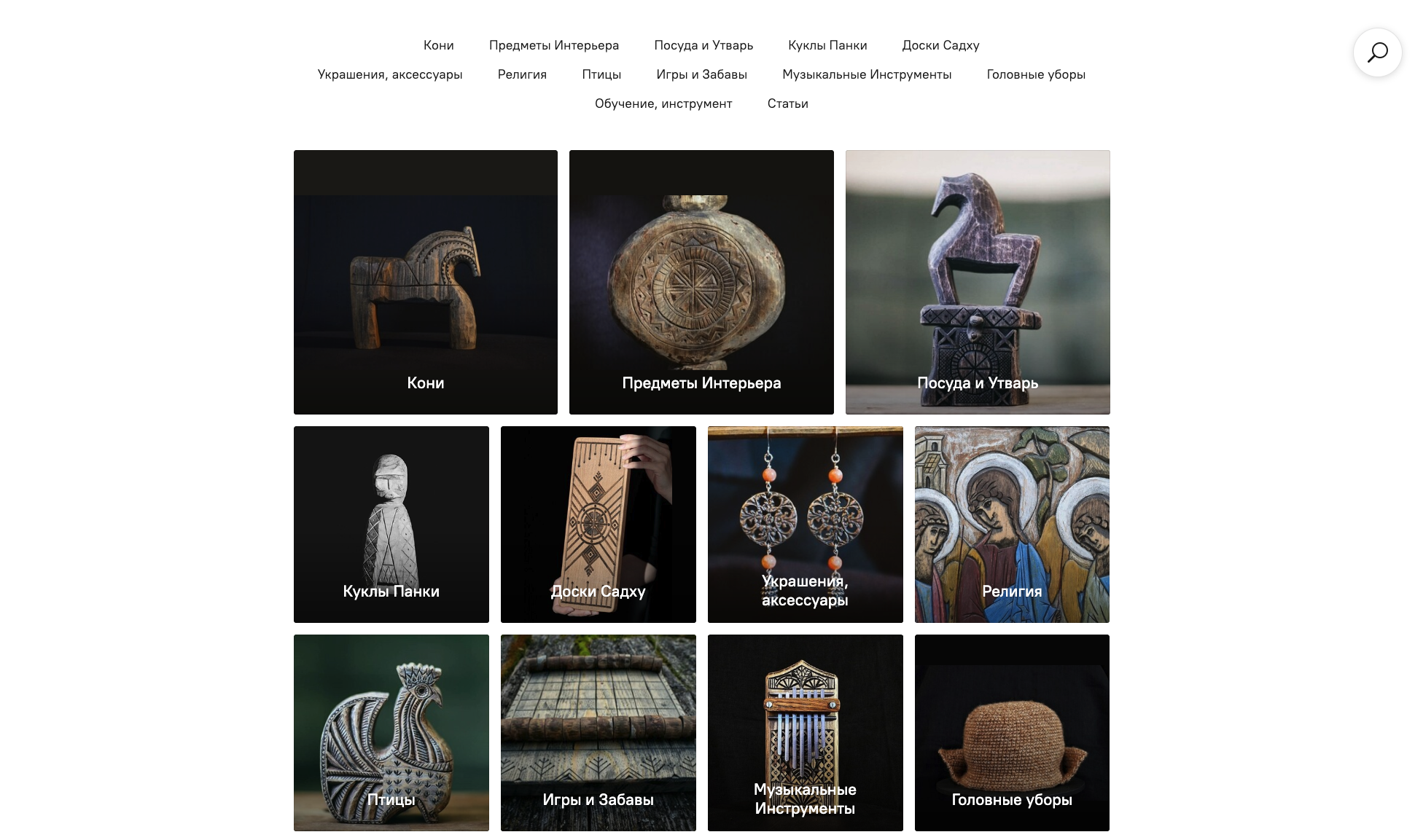
Directory segmentation. A large amount of information irritates the user - it is difficult for him to find the position of interest. A person's short-term memory is limited, so even visiting the site not for the first time, he is unlikely to remember the location of all the elements. If you have an extensive catalog of products, then it is worth submitting information in portions so that it is easier for the user to navigate the list. The key is to correctly name the categories and accompany them with suitable illustrations. This greatly simplifies the search for the buyer and makes the SEO task easier.
Intentional CTAs. Use simple words and phrases on the buttons that will relate to the title. The call to action should be short, clear, but at the same time catchy. It's good if you include elements of urgency in the text next to the button (how many items are left, how long the discount lasts, etc.). Thus, it will be possible to encourage the user to make a purchase decision faster.
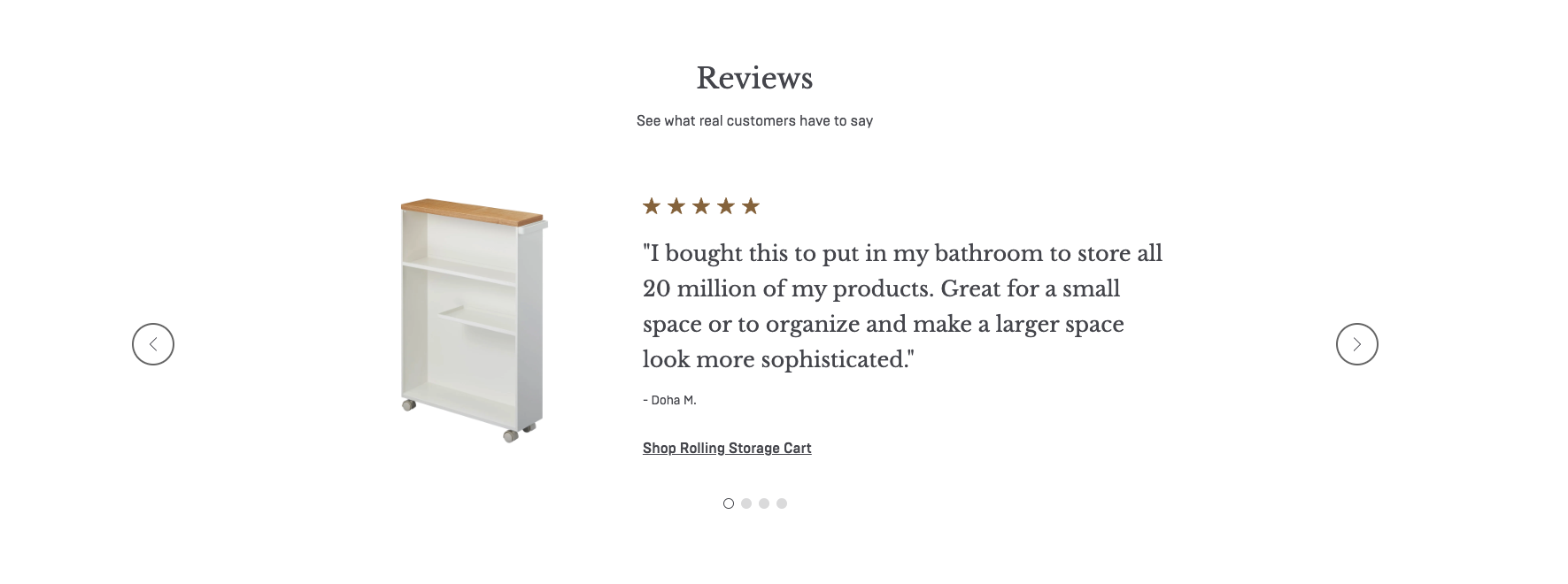
Social proof. Reviews and comments from real buyers are great for selling products - often the user relies on the opinions and experiences of other people who have already completed the target action. Through positive feedback, an element of trust to the brand is formed. Celebrity reviews and video reviews are especially attractive.
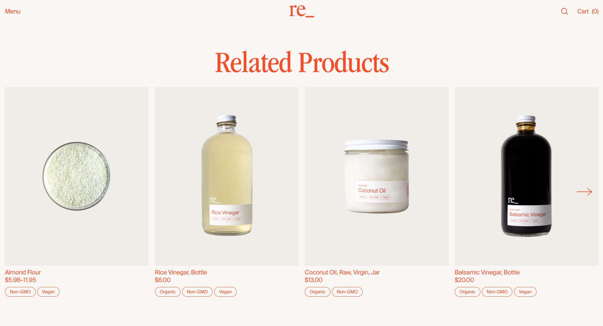
Related products. Offer a wide range of products. These can be personalized recommendations based on order history, similar products or products from a neighboring group. We can say that this is one of the main rules of merchandising. You may notice that in an offline store, a stand with tea or coffee is adjacent to shelves full of marshmallows, cookies and other sweets for a pleasant tea or coffee time. Online sales are no different.
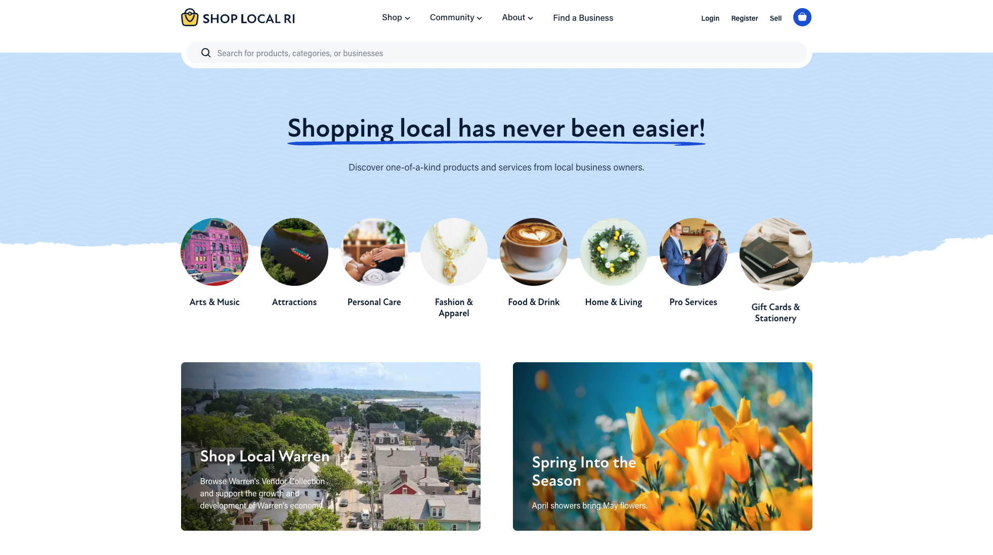
Search line. Potential buyers need to search. Sometimes it is impossible to find the necessary section immediately - this function greatly simplifies the process. Put it in a prominent place, add the autocomplete (autocomplete form fields) and autosuggestion (similar queries) attributes. Enable search by image in the options – a must have to personalize the purchase process and save the client time.
Availability. Ideal design meets the principles of inclusiveness, it is universal and convenient for all users. Font size, readability, contrast, visually impaired version, alt tags for pictures - something that should be given special attention when designing a site. The design should be minimalistic, clean, without visual strain on the eyes - online stores already abound with a large number of colorful goods. An excellent assistant for these purposes is the Figma plugin - A11ly.
Of course, this is not the whole list. After all, each project is unique, everywhere there are pitfalls and places for detailed analysis. We tried to highlight the most significant and common points when creating a selling design. If you follow these simple rules, you can be sure that a potential client will not run away from the main page and reach the stage of placing an order with the goods he needs, and you will get a new loyal customer and profit streams.

June 15, 2023