
Intersections App
Preface
Creating a design that covers the entire possible audience is a difficult and occasionally impossible task. We can just only get closer to success by following the requirements of accessibility and inclusivity. And sometimes it's not enough for the text to be clearly visible and for the buttons to be distinguishable. In the context of growing globalization, we also need to keep in mind the culture, language, gender, religion of the user in order not to lose a part of a product’s audience. By paying attention to all users, you strengthen trust in your product and increase its commercial delivery.
Intro
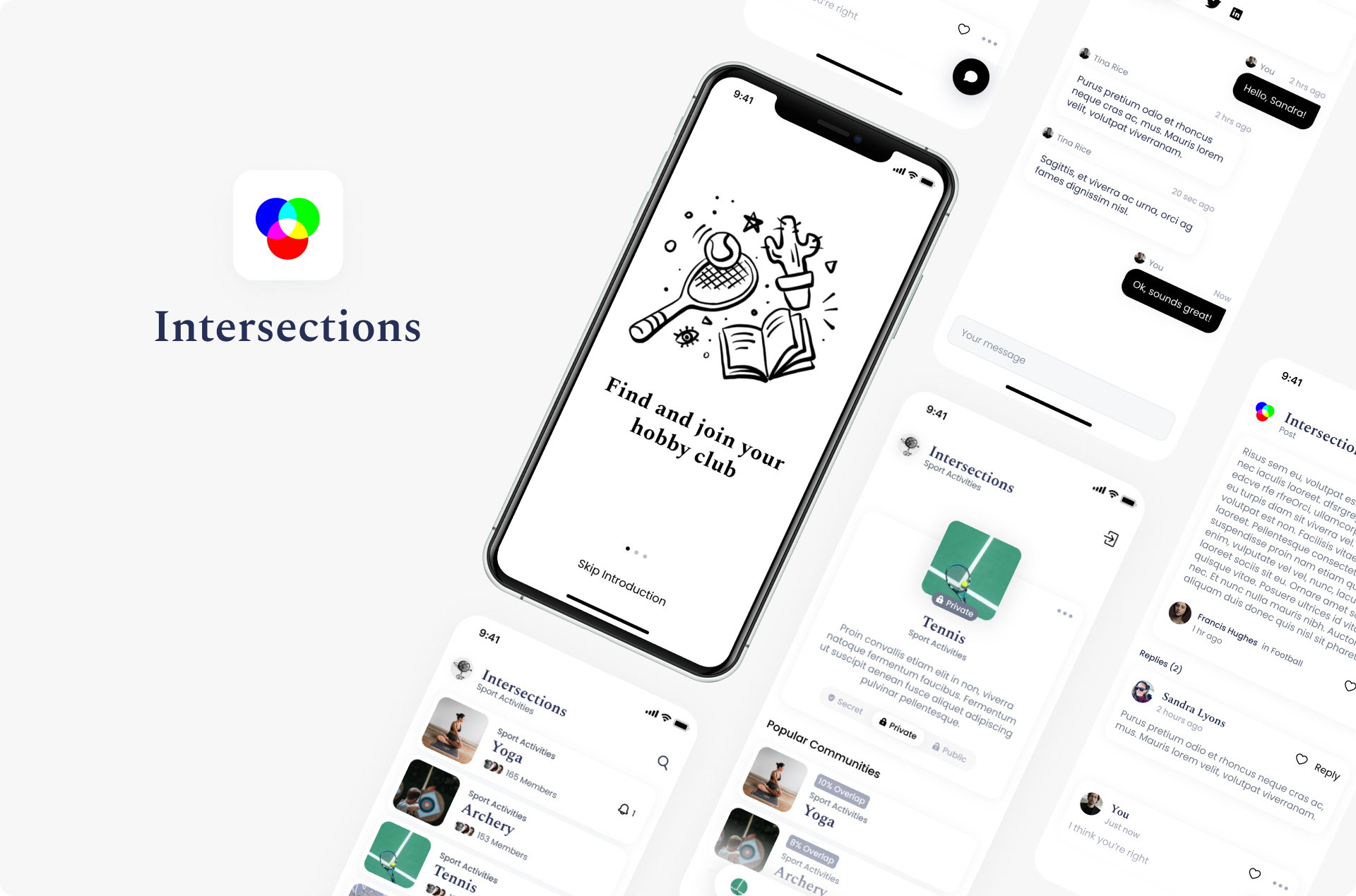
Using the Intersections application as an example, we will try to consider the main aspects of accessibility more in detail.
Intersections is a web application that allows users to communicate within a community. Such communities are created depending on interests, it can be billiards, healthy food, help to homeless animals, etc. - a kind of interest clubs where people can share news, create events and simply correspond with each other.
Cultural-aesthetic dimension of color selection
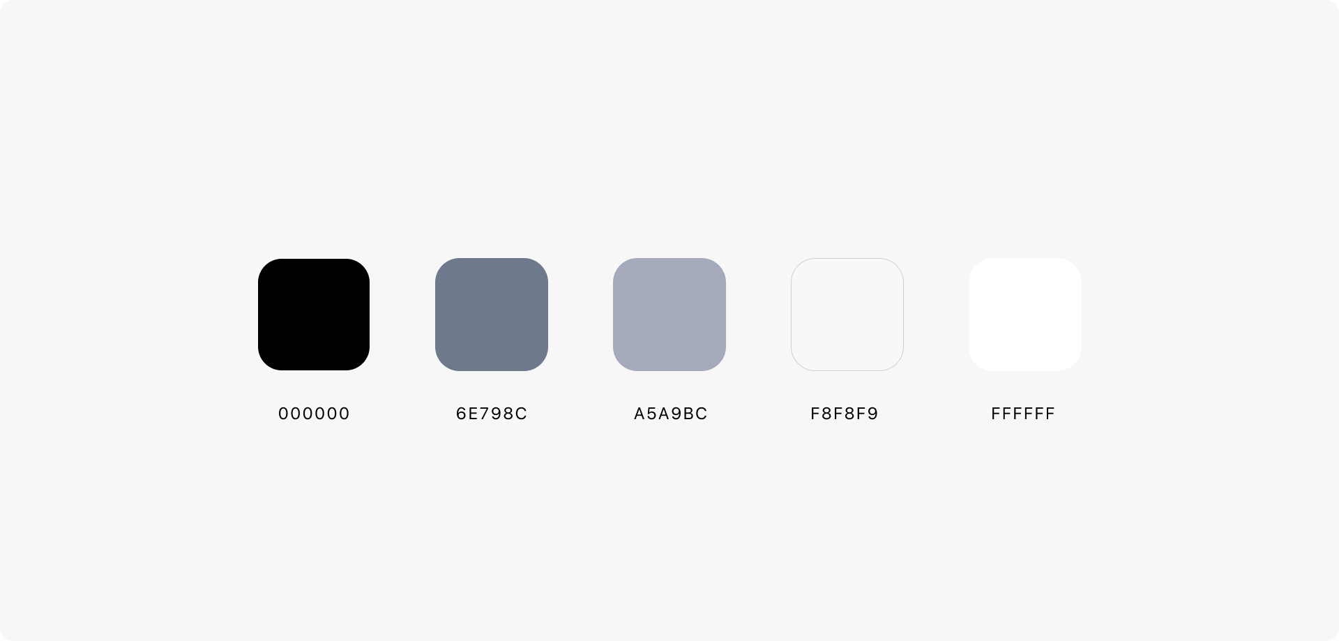
Since the target audience is very extensive and blurred, these are representatives of all genders, races, and ages; the first basic task was to choose colors. The color palette in this case should satisfy the needs of readability and aesthetics. Also, do not forget about gender and cultural aspects. That is why we chose the monochrome design.
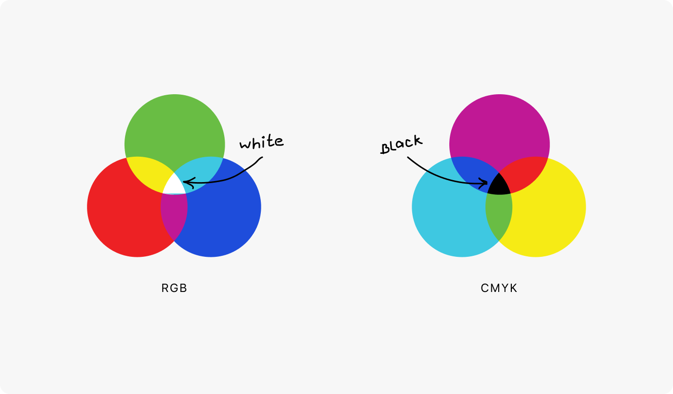
But it wasn't just the neutrality of the colors that determined our choice. The main reason was the app’s logo, which symbolizes unification and has 3 main colors. It would be impractical to use the entire spectrum in the application, otherwise, it would turn out to look like a rainbow. As long as white is the unity of all colors in RGB, and black is the same in CMYK, we could keep the philosophy of unification.
Besides the fact that the monochrome color scheme makes the design more elegant, it also has a positive impact on readers - people get used to receiving information on a white background because this is the traditional paper color all over the world.
The black and white color scheme works as a minimalistic design. Its simplicity makes the product easy to use, but not easy to create - because then you should rely more on visual balance, information hierarchies, and the content itself to attract attention (color avatars and covers). It is not necessary to use color as the only tool for providing information, because it is unreliable. And information that does not depend solely on color will be available to colorblind people.
Worldwide, there are approximately 300 million people with colorblindness.
Readability
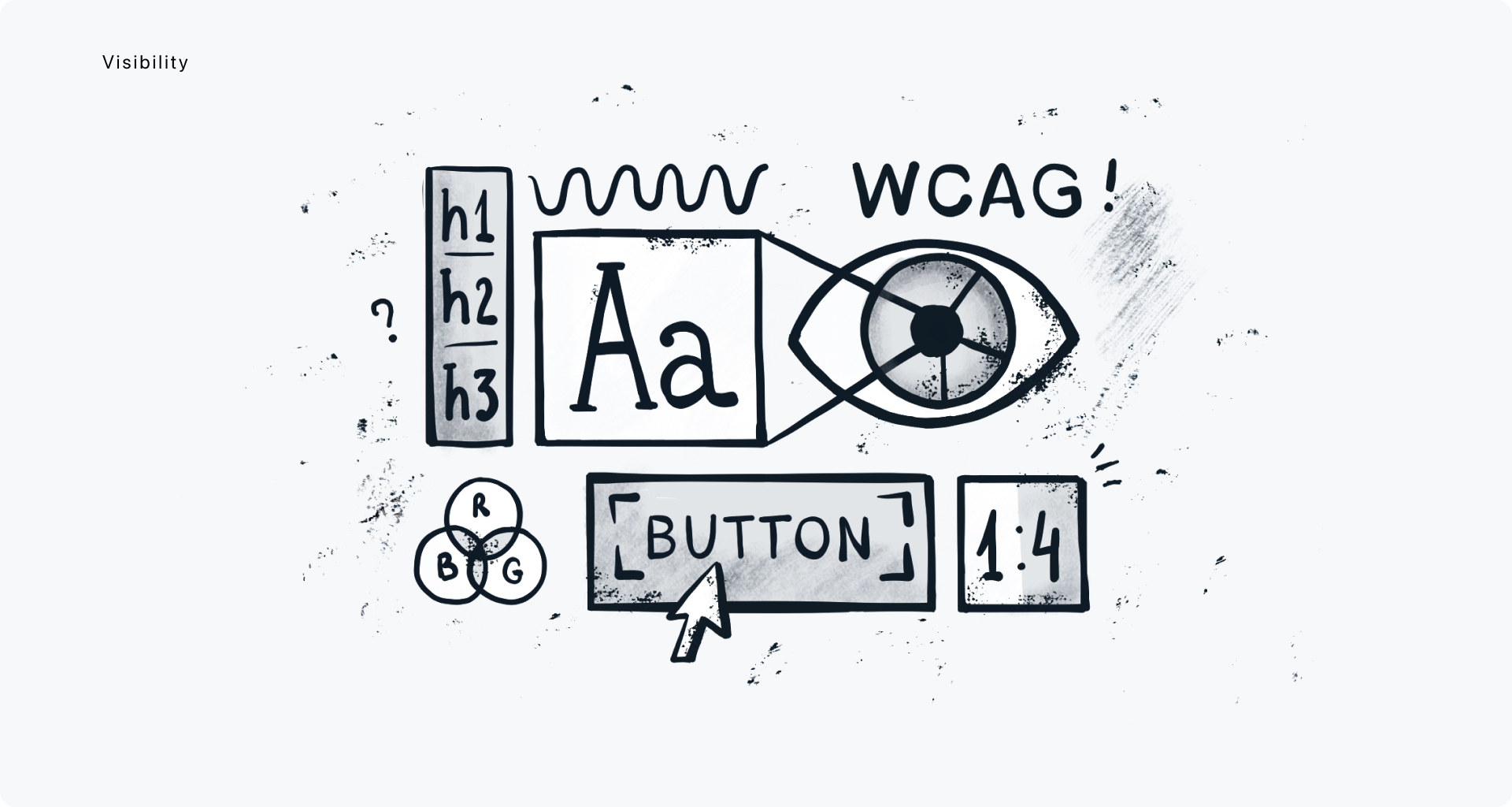
People with vision problems and word blindness may need increased contrast, bolder text, or reduced transparency.
By focusing on such things and respecting these preferences, we increase our level and improve our karma :) To ensure a positive experience, it is necessary to create applications that all users can enjoy. Knowing all about accessibility, we have what it takes to make accessibility the priority, as it should be.
First of all, check the contrast of the entire application, whether these are titles, paragraphs, links, or buttons. Colors must have sufficient contrast between the color of the text and its background (technically called the brightness contrast ratio). This also includes text on covers, icons, and other images. The colors used to convey information on diagrams, maps and other types of images should also be distinguishable.
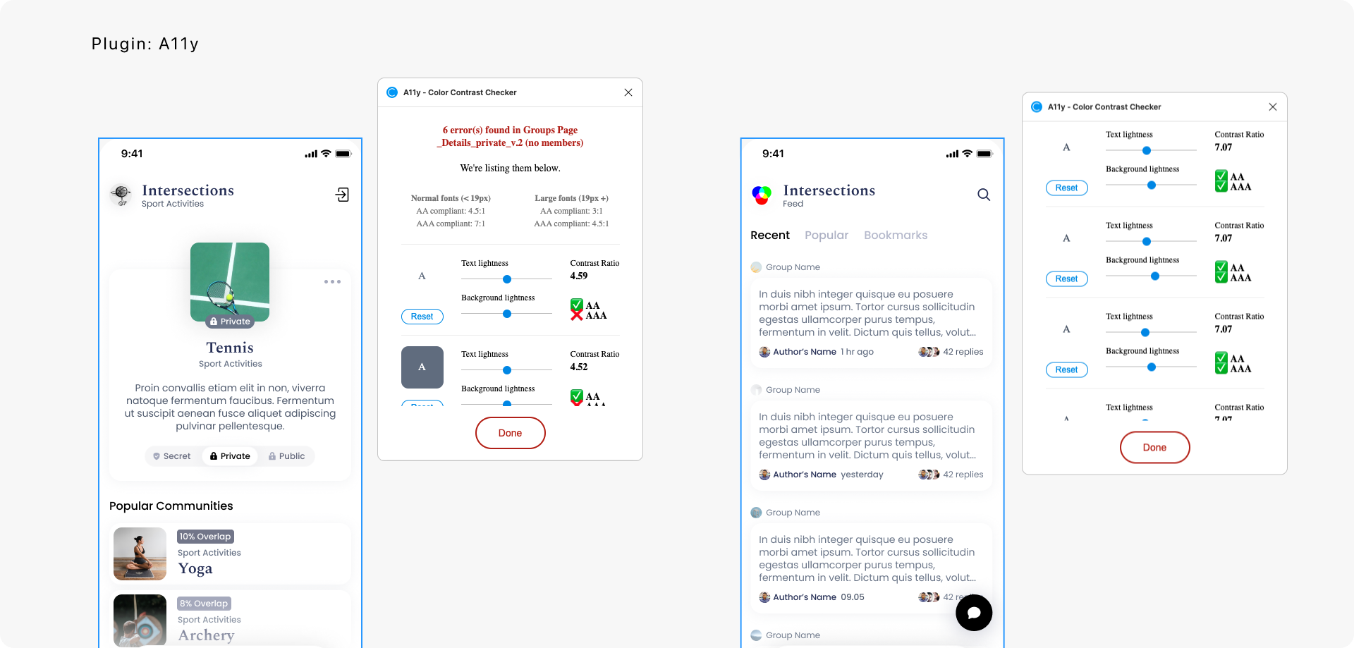
But first of all, a good design means sufficient contrast between the foreground-background and colors, so the colors used must be checked for both contrast and color blindness.
"WCAG defines three levels of compliance: Level A, Level AA, and Level AAA:
Level A is the minimum requirement for digital accessibility and in most cases is usually considered as "below acceptable".
The AA level is a standard goal that most businesses and organizations in the field of digital accessibility strive for.
The AAA level is the strictest level, which, however, is not required as a general policy for all sites, because it is impossible to meet all the criteria for the success of the AAA level for some content.”
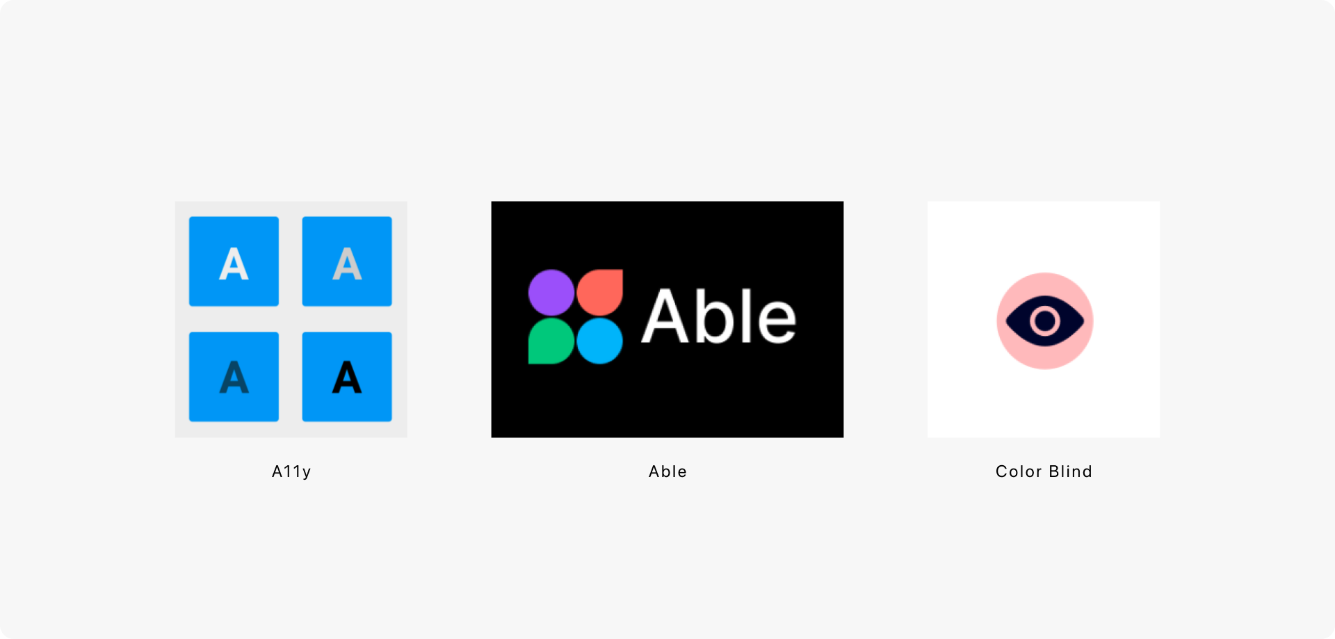
During the workflow, you can test your design using plugins or special services. The most popular ones are:
Figma - A11y - Color contrast checker
Figma - Able - Friction-free accessibility
Figma - Color Blind - Color blindness checker
Colorable
Accessibility
People with cognitive disorders and attention disorders need to be informed about which part of the application they are in, what they interact with, what actions are required of them. But it is also a basic requirement of an interactive experience for all users, especially when it comes to providing the same experience for everyone.
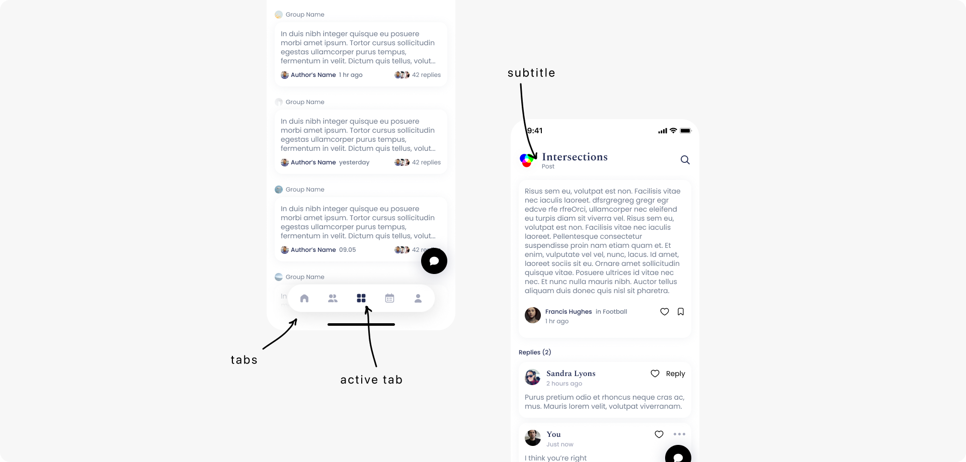
The different parts of the application should be easily detected and identified. Navigation menus, links, and buttons should be in predictable locations and consistently recognized.
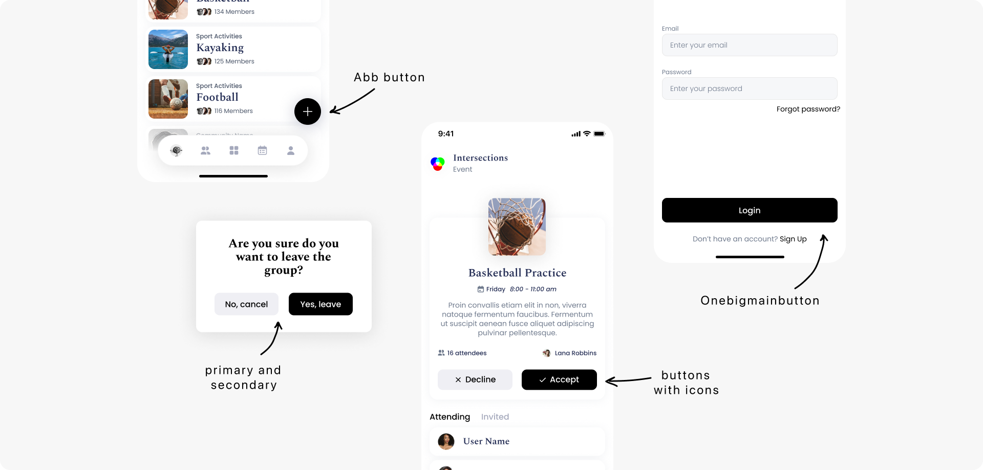
The information and components of the user interface should be presented to users in a familiar and understandable way. The button should be recognizable and look clickable. Everything should be functional.
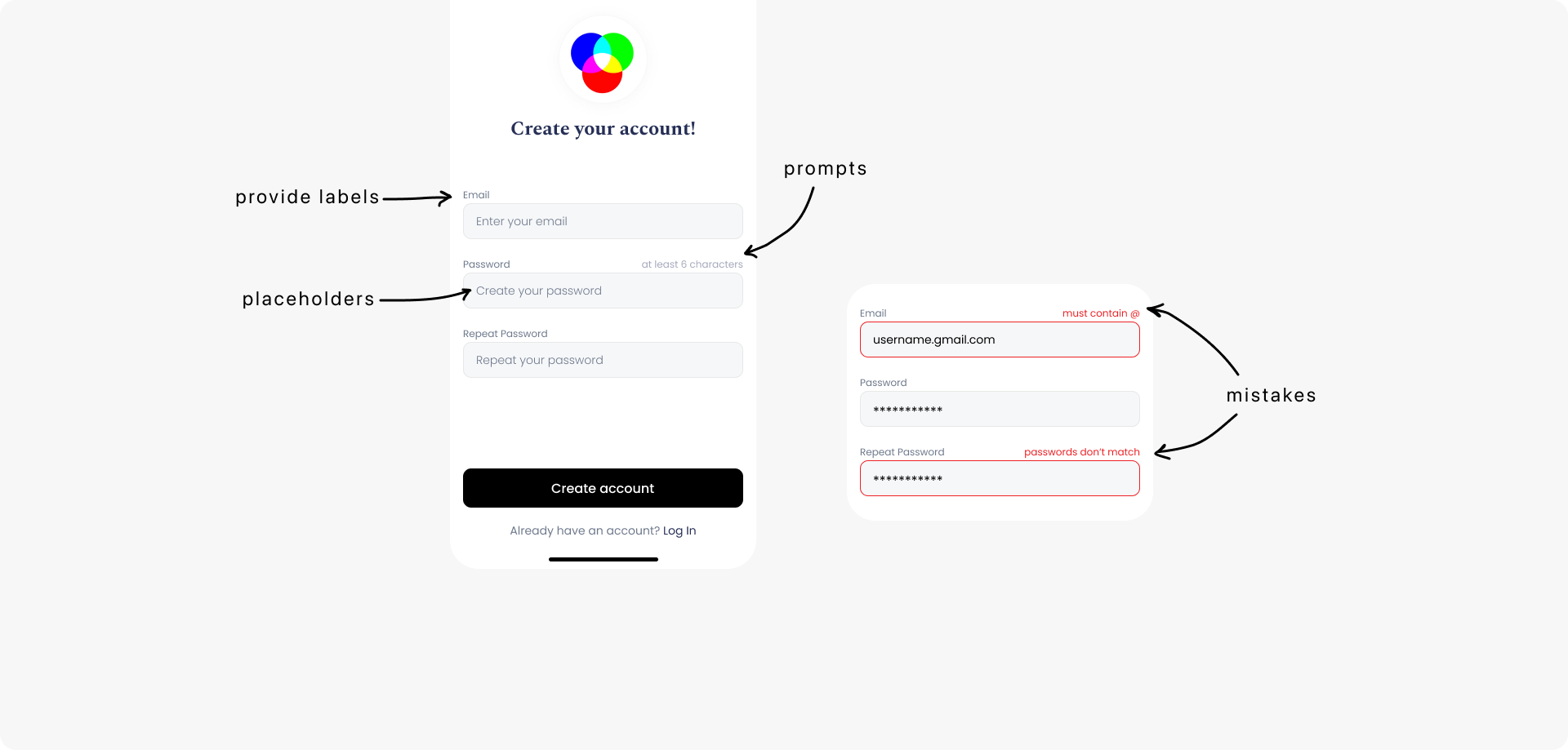
The information and operation of the user interface should be clear. If something requires user input, hints are needed as descriptive labels, tooltips, or instructions so that people understand what to enter. Labels should be understandable for people with intellectual disabilities and vision problems.
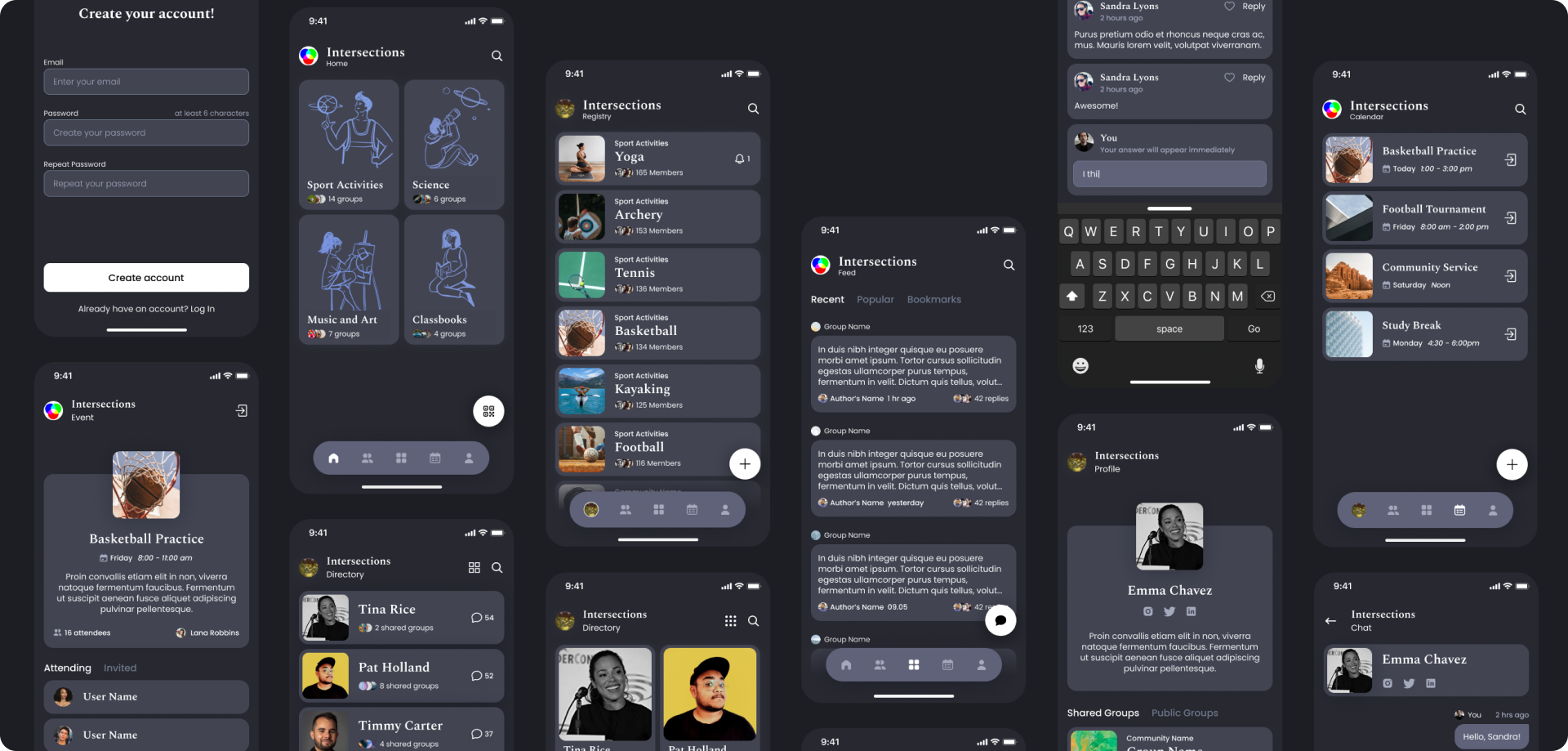
Provide users with a dark theme so that the product is convenient to use regardless of the time of day.
Conclusion
The work on Intersections showed how great the influence of design on commercial delivery is; it helped us to learn the basic rules of inclusive and public design, as well as to draw conclusions that could be useful in future work:
1. Do not use color as the only means of transmitting information.
2. Predict what impact your color palette may have in cultural, religious and gender aspects.
3. Check your design for color contrast and accessibility for all types of users.
October 15, 2021
