
UI/UX Case Study: Drill It
Foreword
Creating a selling site is always a complex and time-consuming process in which all aspects must be taken into account, especially the marketing side of the product. It is necessary to study the target audience in detail, think over the versatility and ease of use of the product.
- What is Drill IT?
Drill IT is a service for providing psychological assistance through unique training programs and courses in the fields of social engineering and personal development. These courses contribute to successful social communication of students in any situation.
- The main task:
We had to design a process through which the user can establish a trusting relationship with the teacher and himself. Keep in mind that Drill IT sells its own unique courses and training programs, because of this, it was important to build the marketing foundation of the platform in the first place.
- Tools:
Figma, Principle, Adobe After Effects, Adobe Illustrator
Part 1. Design Process
We started the whole process with studying the target audience, full information about the training programs and the intricacies of the company.
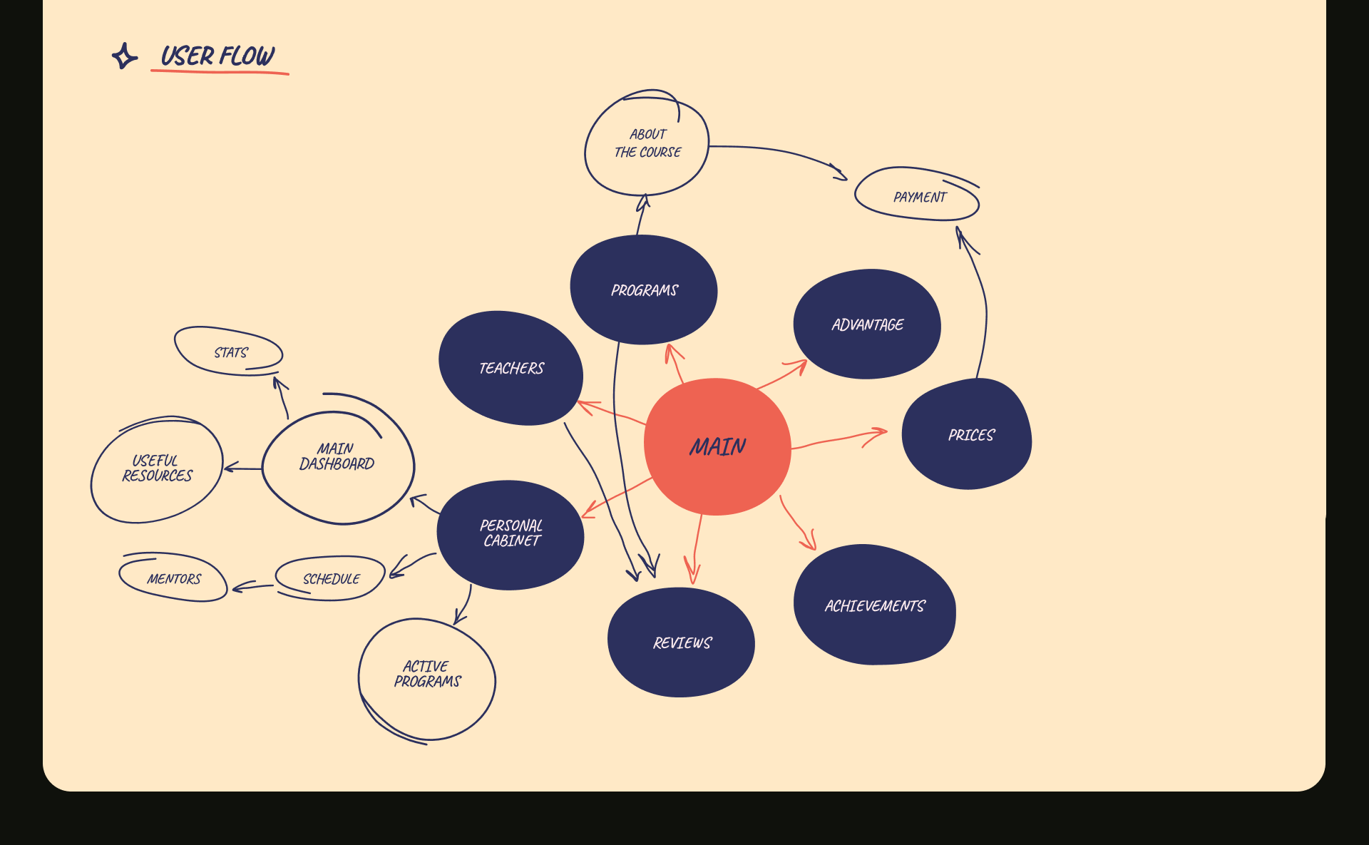
Next, we took on the development of User Flow. Here we have paid great attention to simplified and compact navigation, for easier use of the service. Everything should be visual, simple and native for the user. Despite the large amount of information that is important to structure and not turn into a long, unreadable canvas.
Content Definition
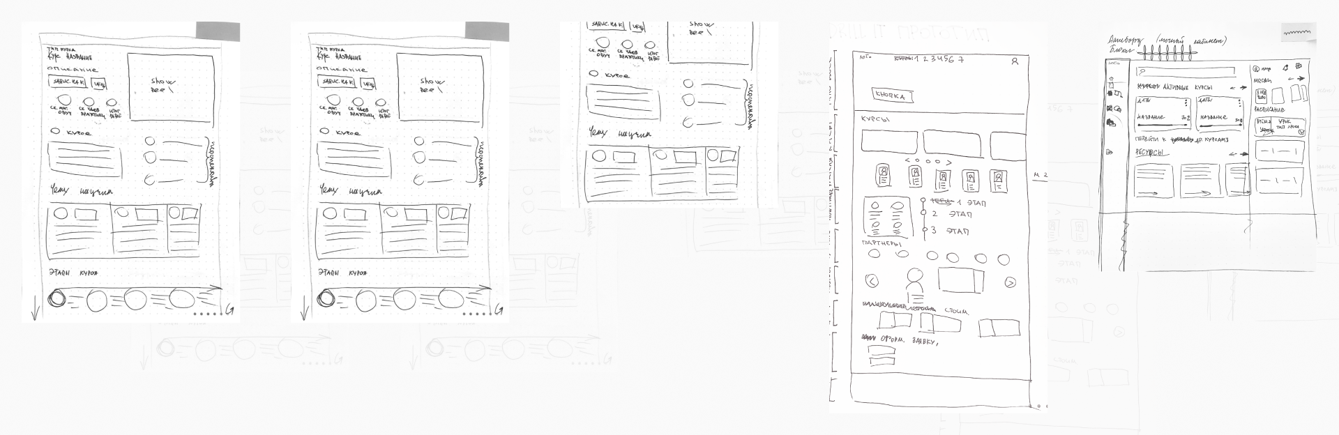
Using the Crazy 8s tool commonly used in design sprints, we created the first wireframes.
Low fidelity wireframes provide a simple picture by organizing blocks that show the space allocated to media and mimic the content used to get a rough idea of the various blocks of content.
Part 2. Visual Design
Visual Research
- Mood board:
Before moving on to visual design, we needed to determine the general mood and atmosphere of the project.
This part of the process is great for gathering ideas about how certain features should work and look. This is an important step towards the final design.
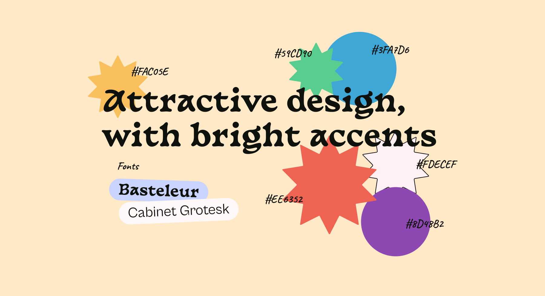
- Color and typography:
We really wanted the service to look open, cheerful, but at the same time trusting. To do this, we used a voluminous palette of colors for bright accents, but left the main prevailing colors as standard for the user, slightly modifying the saturation. For typography, we used two fonts: Display Basteleur for headings and accent text blocks. And Cabinet Grotesk for body text. Cabinet Grotesk provides excellent readability for text.
- Graphic elements:
To highlight important areas, license plates and more, we used graphic elements similar to each other.
Also, instead of illustrations, we used standard iOs icons. Emoji were used to bind a friendly atmosphere and earthiness. The user should associate the one he chats about his experiences, ideas and thoughts with a friend.
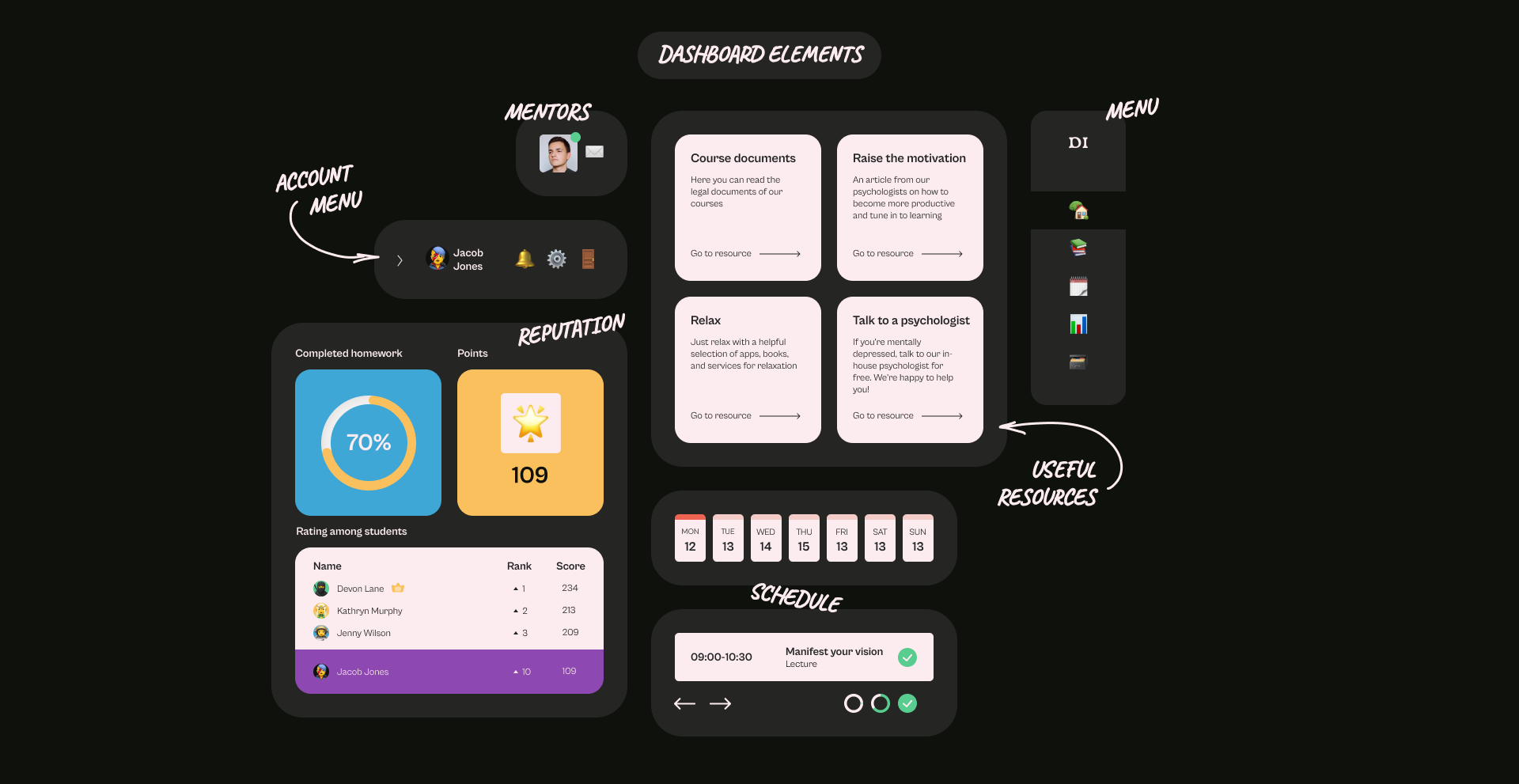
Dashboard
Dashboard design is a pretty common request these days. Like any other view in the product, the dashboard has a specific purpose that it is designed to serve. An erroneous understanding makes all further efforts meaningless. It was necessary for us to fit on the dashboard a large amount of information about upcoming lessons, the standings, active programs, useful resources, and more. We decided to make all widgets more calm and non-focused compared to the main site, so that the user can easily interact with the elements and understand what is happening in his personal account.
Conclusion
The “Drill IT” case turned out to be bright, recognizable and stylish, which is what we originally wanted.
It is important, despite the first impression, to study the problems of the product in depth. Initially, the project seemed easy, because there are a lot of similar products on the UX market, but more immersing ourselves in the intricacies of technical specifications, we identified several blockers for myself that made me look for answers not on the surface, but in analytics.
Our conclusion and advice: do not be afraid to spend a lot of time on analytics, this is the main foundation of a successful marketing project! Having studied enough the scope of sales, you will be able to correctly summarize all your thoughts and concerns for the client.
Happy UX and may the odds be ever in your favor!
May 13, 2022