
UI/UX Case Study: iOS App Design for Travellers
What is the Plannetic?
Plannetic is the application as a multifunctional companion aimed to help travellers to plan trips starting from managing time to sharing impressions in internal social network.
The Main Challenge: to design the process a user goes through to plan a multi-destination tour and help travellers to create an itinerary that connects multiple points of interest. It should consider their desired length of stay in each location.
Skope of Work: UX Research, CJM, User Flow, User Persona, Wireframes, UI Design
Tools: Figma, Mirro, PS and curiosity!
Timeline: 5 weeks
Design Process
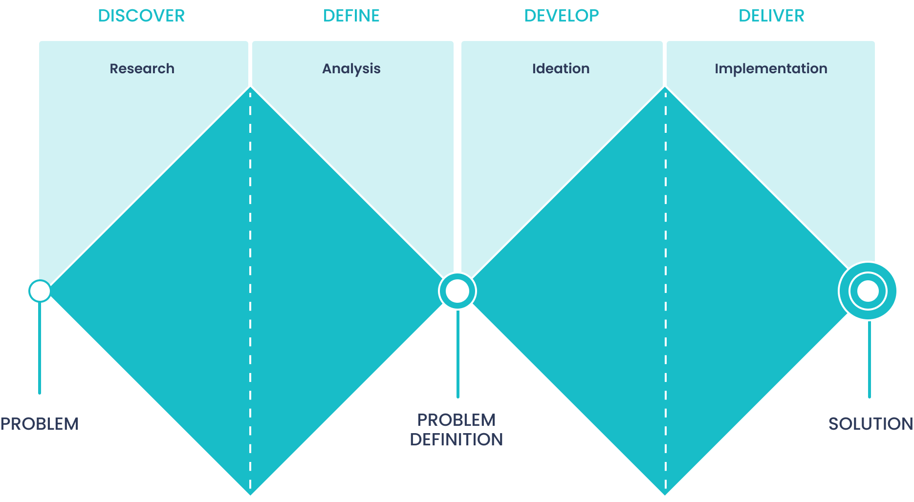
The project was based on Design Thinking methodology: Discover, Define, Develop and Deliver.
The «Discover» stage provides deep diving into the problem which needs to be solved. The next stage «Define» is for generalized analysis of information, then we can determine the main problem. On the «Develop» stage it is possible to find one or several solutions and choose the best one for implementation on the «Deliver» stage.
We’ve made a decision to combine two last stages due to reducing the time on development.
Stage 1. Discover
Brainstorming
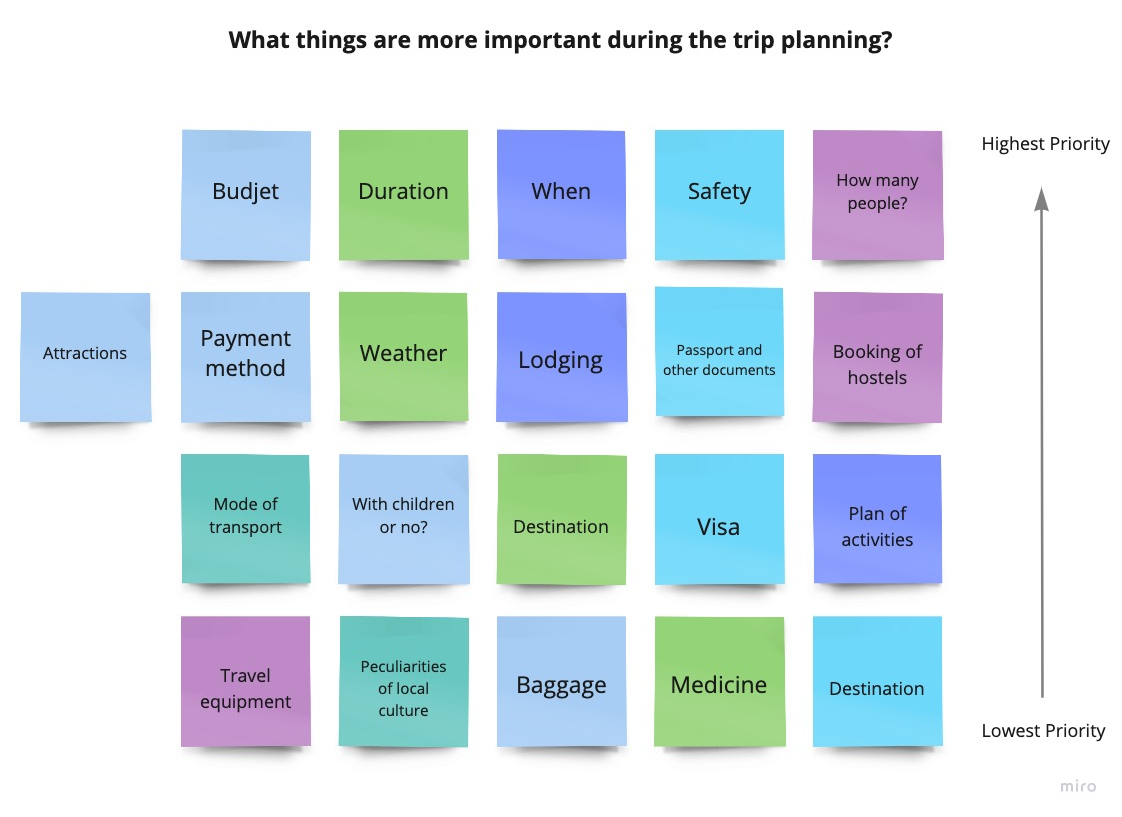
At first, we started with brainstorming. This phase allowed me to gather all my thoughts together and helped to have a clear definition of the target problem.
We wondered what things can be significant for an average traveller during the planning process. Then we arranged all variants from lowest to most critical priority. So this is a nice way to reveal the most requested features and refuse those ones which would distract users.
Сompetitive Analysis
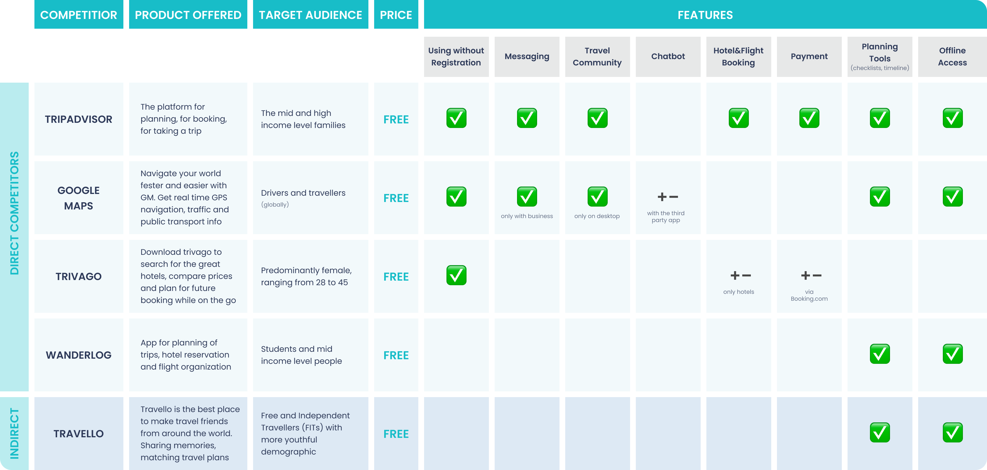
Certainly we pursued goals to make an app more convenient, therefore we have produced market analysis. Direct and indirect competitors are represented in my table. Almost all of them successfully develop on the tourist market.
And as a result we got valuable insights: who uses those apps, their ages, useful features, which can be implemented in my product. Similarly, the reviews on AppStore helped me to find out what is possible to improve.
Stage 2. Define
“Define” stage is a foundation for the project. Exploring the problem is followed by the phase where we identify common patterns and create initial hypotheses that define the problem. It’s crucial to ask whether the original problem is still relevant or whether any new uncovered issues have more potential to improve the user experience.
Questions & Hypotheses
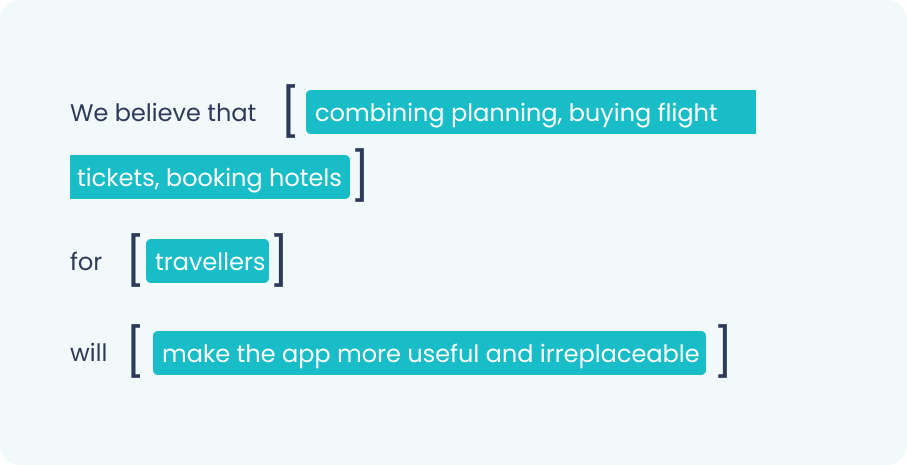
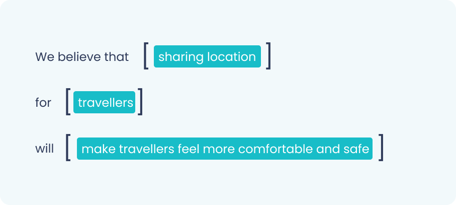
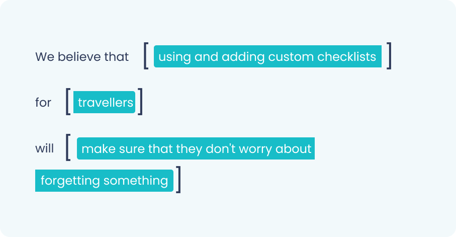
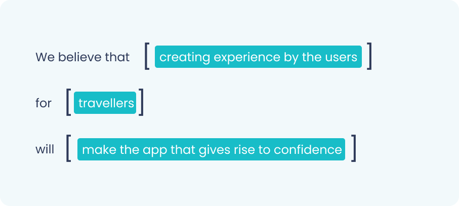
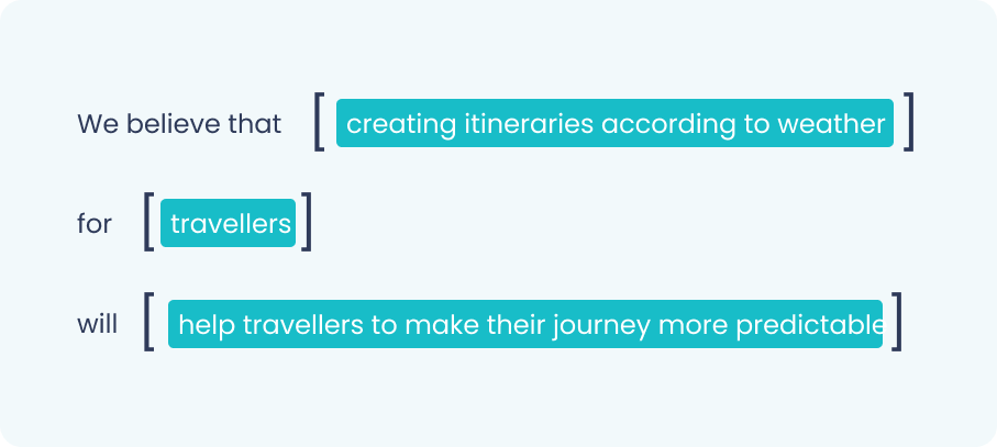
We started with making up the questions by framework HWM and turning them into hypotheses. Hypotheses-driven design will help to navigate through an unknown space so it will be easier to come out at the end of the process with actionable next steps.
- How might we ensure travellers feel comfortable during the trip?
- How might we make the app more useful?
- How might we make sure that the user has no worries about forgetting something?
- How might we help users to plan the day considering weather conditions?
- How might we help users to find associates with similar interests?
- How might we make the app that gives rise to confidence?
User Persona
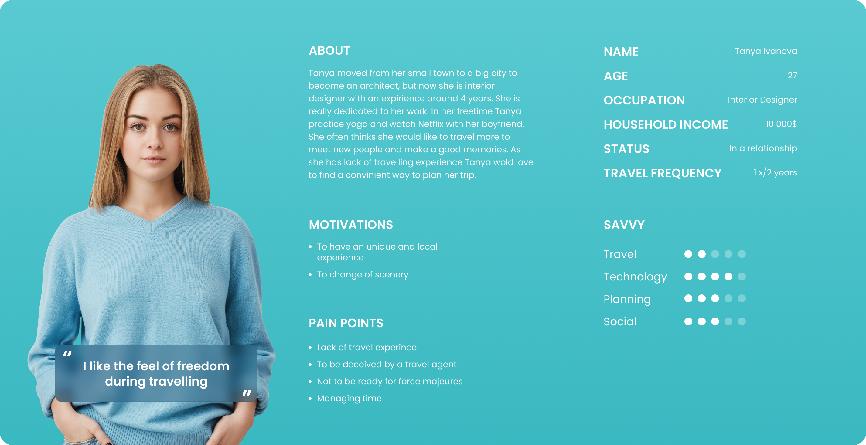
This UX-design and marketing tool is developed to create a product with a specific target the user has in his mind rather than a generic one. Based on my insights from previous stages, we’ve created a persona of a user who might use the Plannetic app. This persona demonstrates the key user goals, desires and pain points.
Customer Journey Map
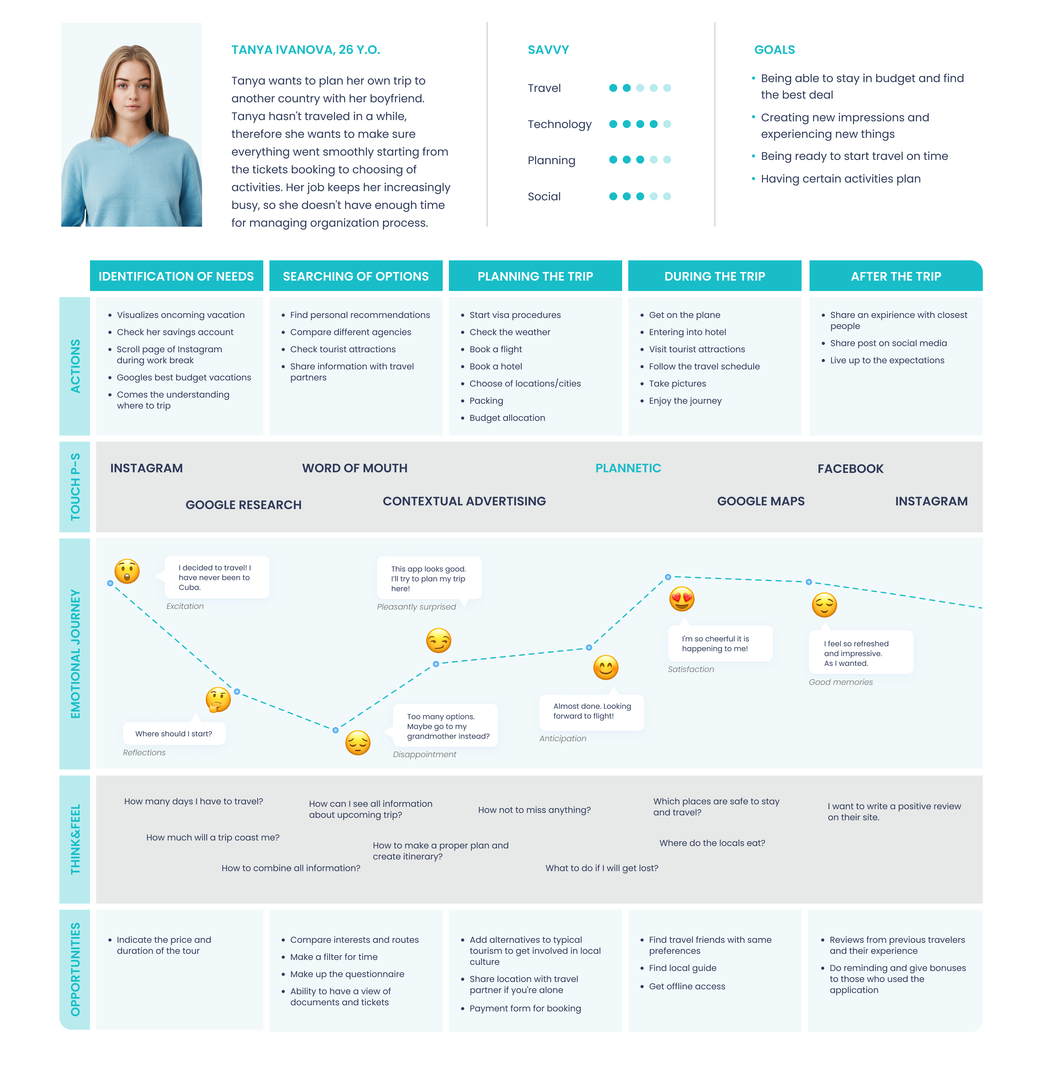
After creating the user persona, we moved on to making a customer/user journey map having the timeline of all touch points between the user and the product.
Information Architecture
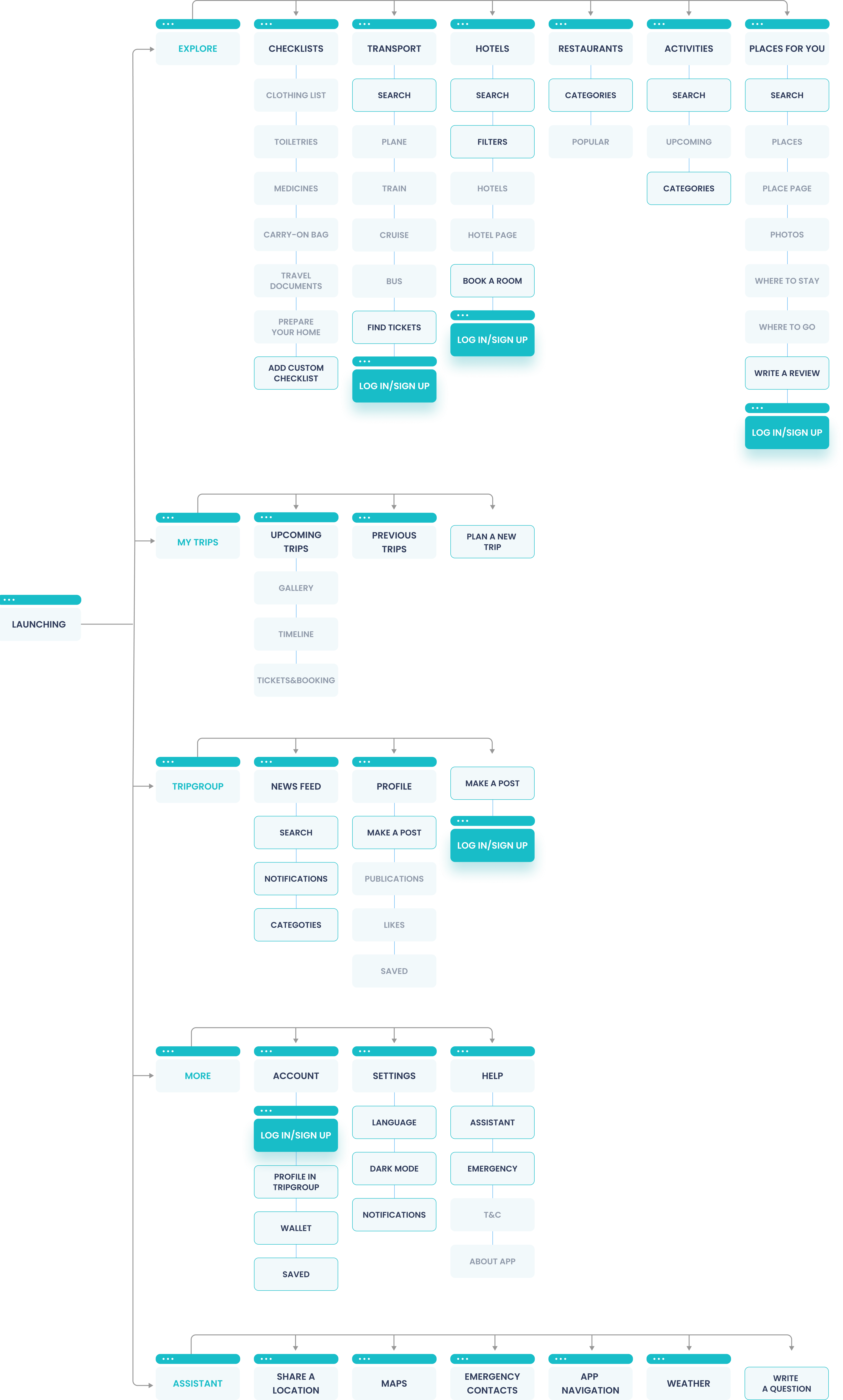
At this stage the project has become carefully thought-out. The primary goal now is to organise and structure all the content from the research phase. We created an IA of app so that users would easily adjust to the functionality of the app and could find everything they need without big effort.
User Flow
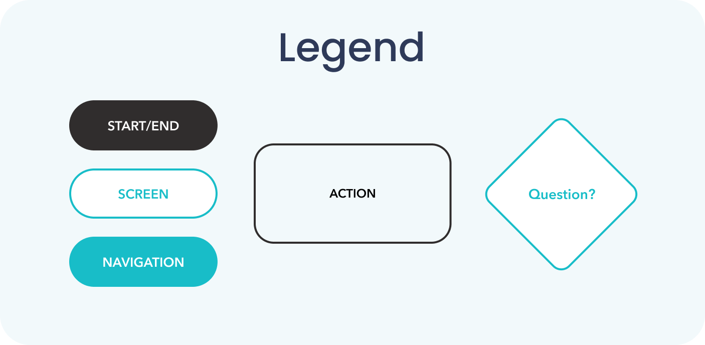
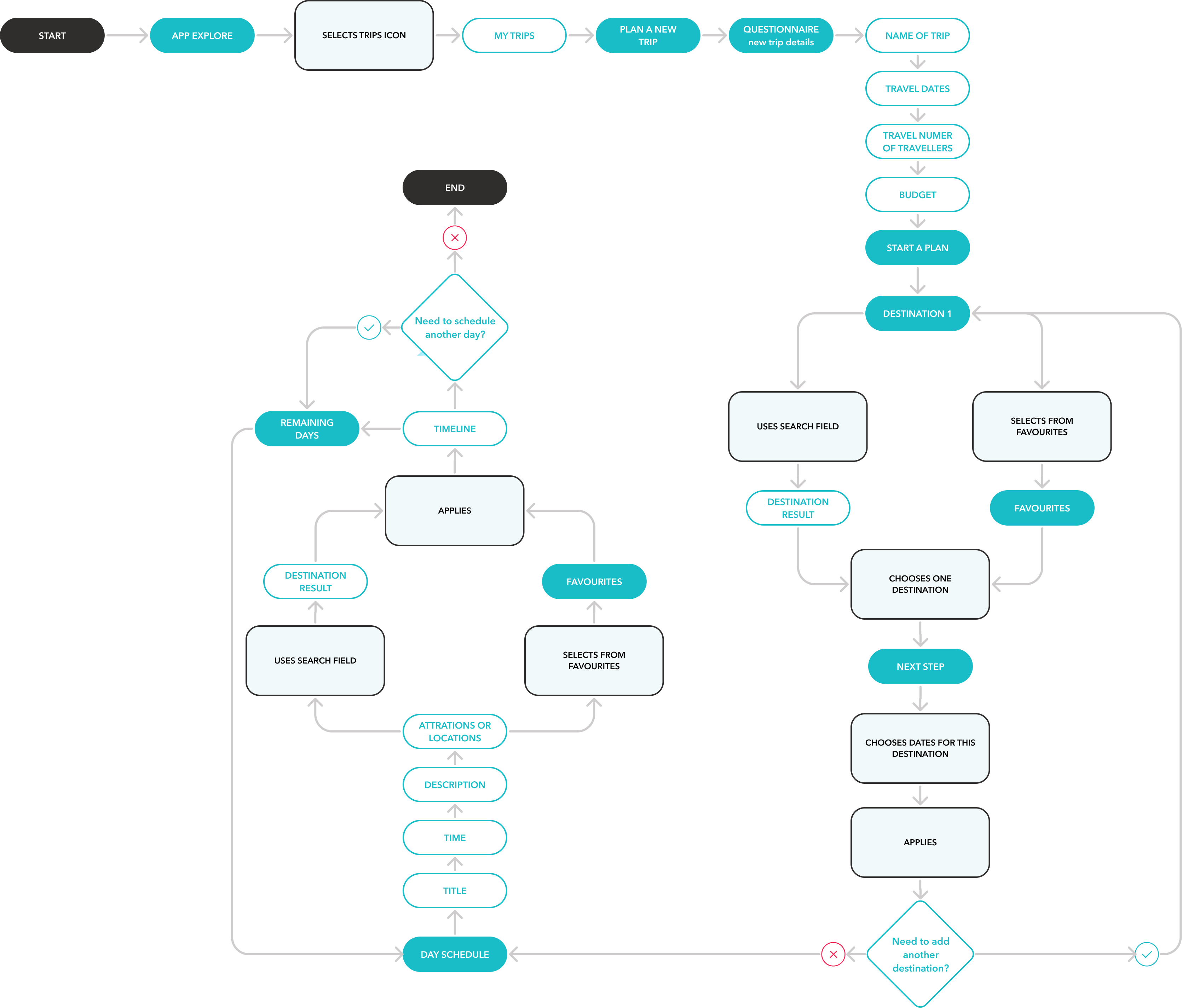
According to the key goal of the project, we tried to create as intuitive user flow as possible. The task was to plan a trip and draw up a schedule for one day. However, my designs were revised several times and user flow was changed too. The final version is presented down below.
Stage 3. Develop&Deliver
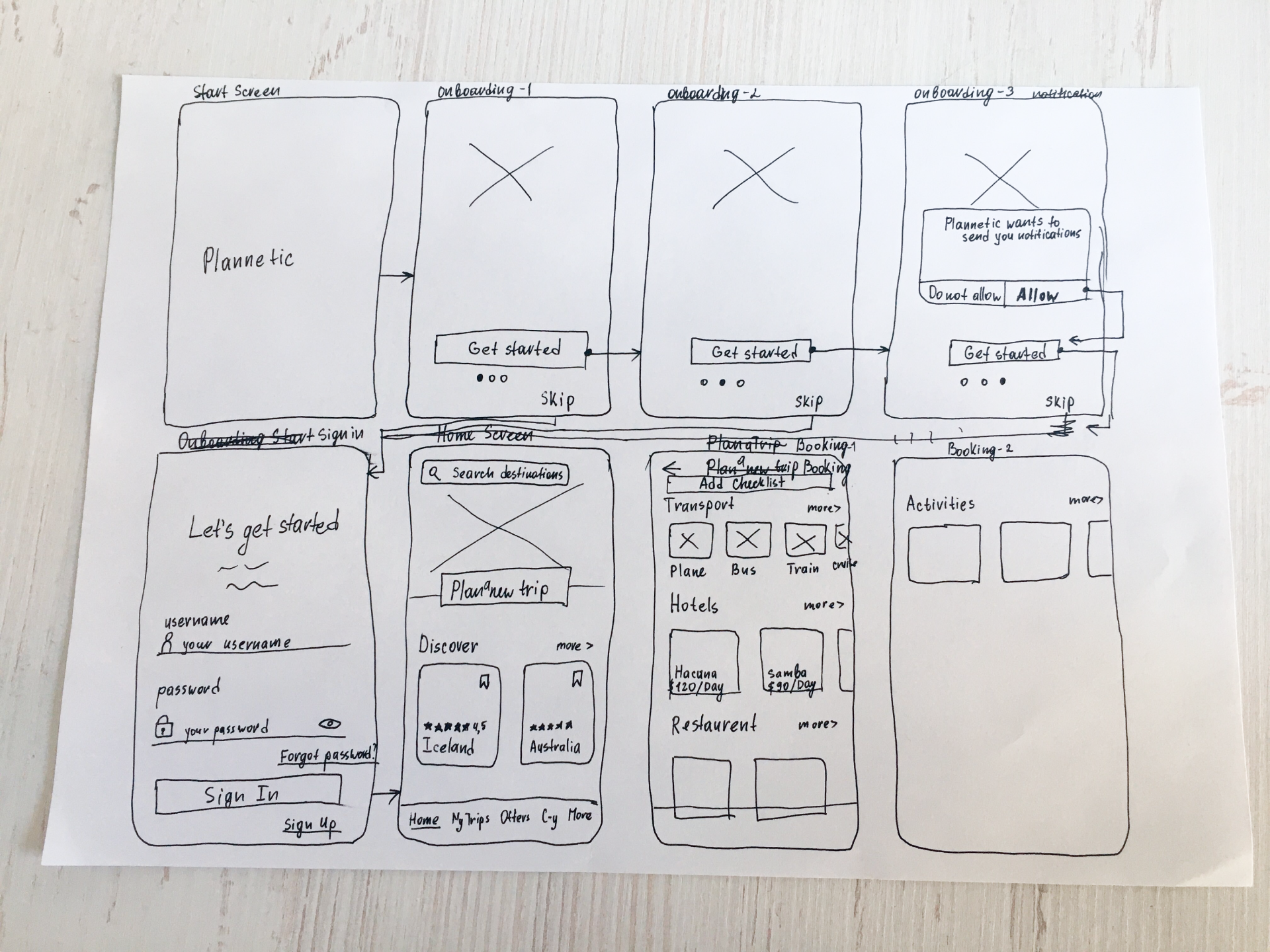
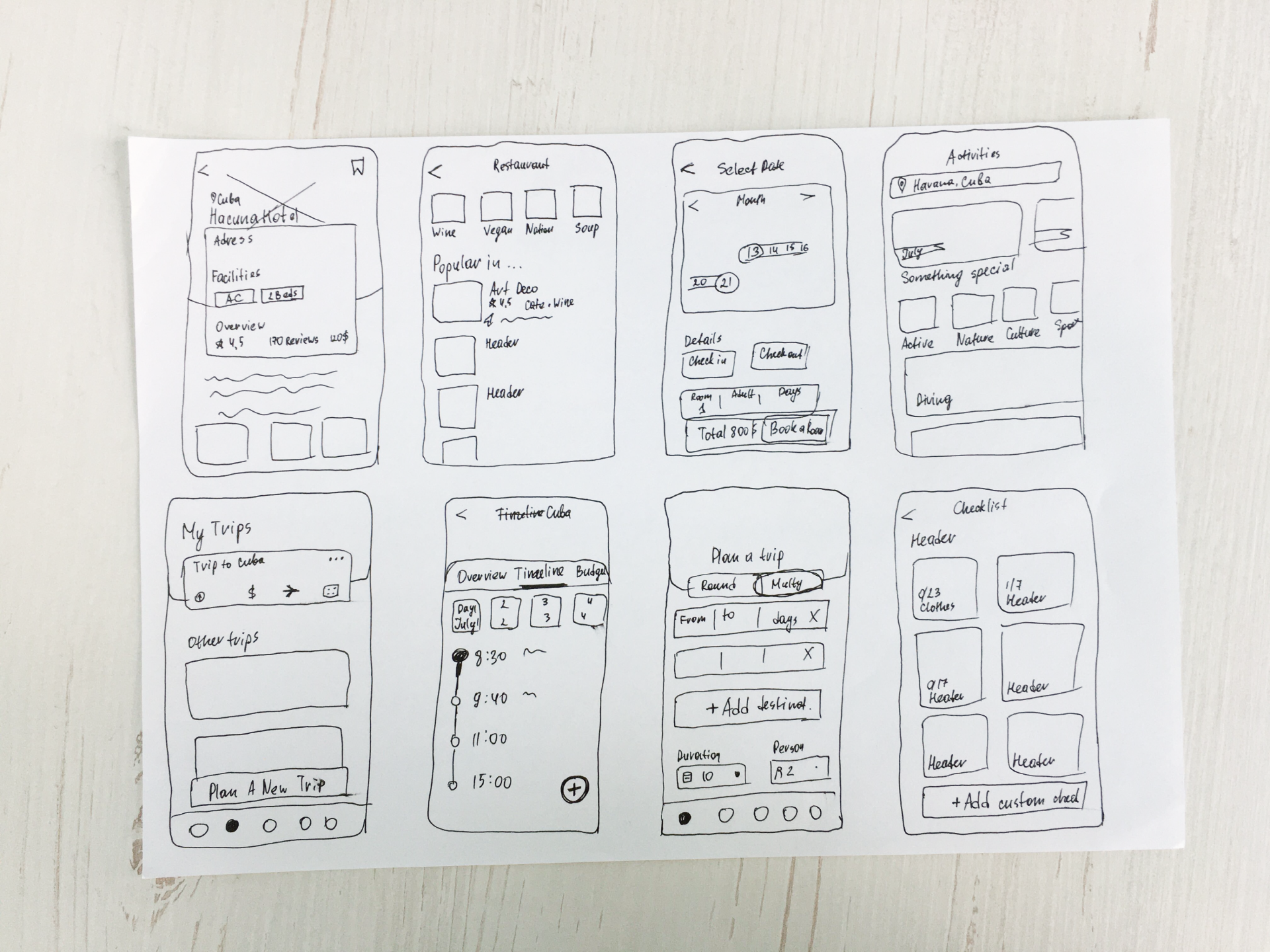
Sketches
We arrived at the final stage of the process. Using the structure of the app, we drew out lo-fi sketches.
Wireframes
We arrived at the final stage of the process. Using the structure of the app, we drew out lo-fi sketches.
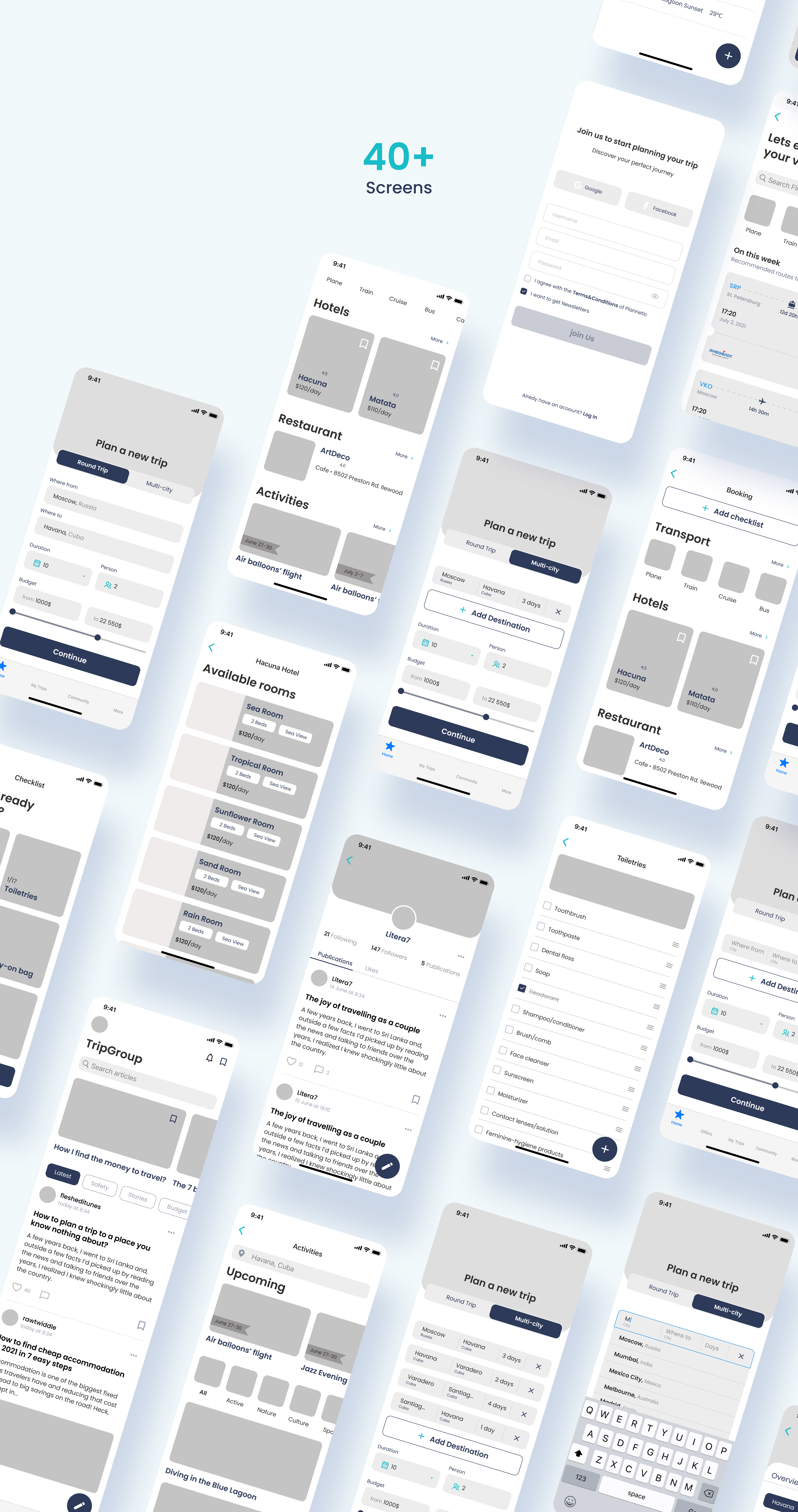
We made hi-fi wireframes to create the core interaction in the app. We improved this design as you can see in the wireframing image, where some elements were changed. On the mockups you can see the final screens.
Learnings and key takeaways:
- In the initial stages of the project it really matters to ask the right questions and dive into the problem more. You should be ready to take the time to manage a huge amount of information and try to learn more about the target user.
- It should not be neglected by your team members’ opinion — it will help to get an idea from a different angle and find out the best solution.
- The product is of minimal value without any user research. One important thing should be kept in mind: a good product is always user-focused.
- Can’t be afraid to destroy your design. Something really beautiful might appear on the ruins of your old decisions.
October 27, 2021
